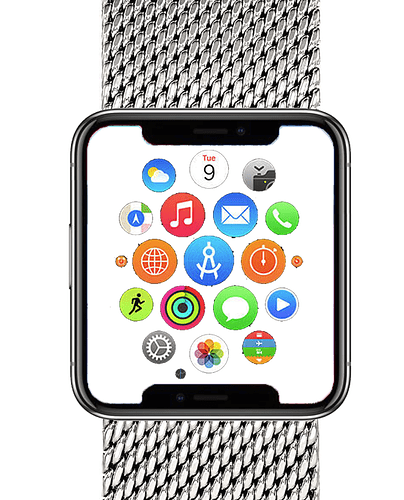
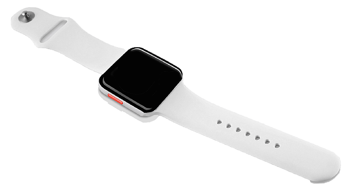
Nice! What would you all like to see in this new watch? We can forward this thread to Google and maybe your craziest wishes will be fulfilled 
Screen:
- Higher PPI - Between 500-800
- Different Size Screens - 42-45mm Regular, 46-48mm Large, Square
- 1.4" on 42-45mm Regular case (500x500 - 800x800 = 505-808ppi)
- 1.55" on 46-48mm large case (500x500 - 800x800 = 456-730ppi)
- 1.65" on 42mm-45 square case (656x525 - 875x700 = 509-679ppi)
Sensors:
- Accelerometer
- Barometer
- Gyro Sensor
- Heart Rate Monitor
- Ambient Light Sensor
- Advanced Fitness Tracking (24 hours log, steps, floors, calories, distance)
Bezel:
- Narrow Bezels - Like Huawei, with no markings
- Touch Sensitive - No rotation, just capacitive touch
- Thinner Case
- Protection - Min IP67, prefer IP68, MIL-STD-810G if possible
Other:
- 3 day battery life
- 3 buttons
If they did three designs:
- sport version - larger case; plastic/ceramic (ex. TicWatch S)
- fashion design - standard case, Stainless steel; multiple colors (Stainless, Space Grey, Matte Black) (Ex. Huawei)
- Square design - (Ex. Samsung Gear S, Apple Watch)
Dont’s:
- Hybrid Watch
Don’ts: Hybrid Watch 
A feminine style watch that doesn’t sacrifice on performance!!  I love my GearS3, but EVERYONE comments about its size on my tiny wrist. It looks absurd
how big is too big? Do you have some examples? I can figure out the PPI and screen resolution that might produce some good results.
I couldn’t give measurements, as I’m not too familiar with all of that, but I could provide examples. I used to have the original, classic silver Huawei. I felt that it was small enough that I didn’t look like I was wearing a “Man” watch. I made an effort with some of the more feminine watches like the Michael Kors and Fossil styles for women, but they were terrible when it came to functionality. You can’t make phone calls or listen to music from the watches, and (more importantly) my animated designs were choppy or didn’t perform at all. I eventually gave up and got the Gear S3 Classic. It works fantastically, but I don’t like that I’m missing out on all of the Google Wear apps. The Tizen store is extremely limited. My faces render beautifully on the watch, but as a customer at work told me last week, “It looks large enough to be a clock!” (Rude customer, but not wrong  )
)
I will say they render beautifully on my Gear S3 except on Dim mode. I tried to respond to a Facer forum about the issue, but I never got a reply 
Hello  Can you give us more info on what the issue is with the dim mode? We can look into it!
I’ll try to find the original thread that was created a few months ago, but essentially the Gear S3 watch is going TOO dark on dim.
Another user created the thread, so it seems it’s not an isolated issue: I have created a few faces that carry more info on dim than awake, but even with my brightness turned up to 100%, always-on turned off, and setting the transparency of my dim background image to as high as 80% in the Facer Creator, the watch is too dark to see on dim; it’s nearly black.
So far this has been the most annoying thing with my new Samsung. Tizen is a dim screen Nazi. With my Huawei, I could use the Staylit app to keep things how I liked it. I still can’t figure out the S3.
So I thought the StayLit app prevented the watch from going into Dim mode at all? I’m not sure if that’s what you’re referencing. The watch going into Dim mode is fine by me; my concern is that with the Gear it’s going extraordinarily dark upon dim, beyond how dim my Huawei ever got. Is that your experience as well?


