Hello all, I’d really like some feedback on how this face performs on watches other than Samsung S3 Frontier (Which I can test), especially want to know the following:
Does dim mode work?
Battery drain, does number of complications dramatically effect this?
Legibility of text especially the small stuff?
Do the analog hands distract or enhance?
Any other feedback positive and negative gratefully welcomed
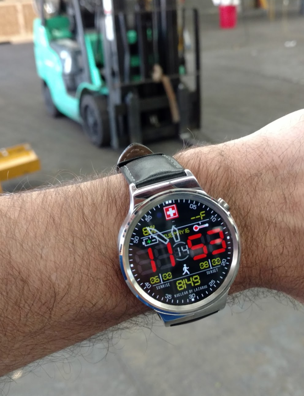
I know that square screens are not that popular, but as a user of one, those black fields in the corners look really empty.
To be honest, the analog hands are surprisingly not distracting, but I feel like the minute/seconds marks next to ticks are a bit of an overkill.
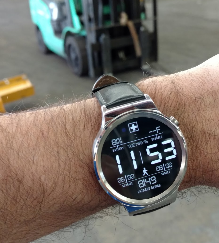
I’m not sure how to turn the dim mode constantly on on my watch, but from what I can see every time I open the face it looks good.
All the text looks clear (on a 320x320 screen), you could think about enhancing a little bit the lowers one (Nuclear Swiss by Lazarus) - it is visible and readable, but it could be bigger.
I actually like the mins/seconds ticks because they are framed by the round watch dial.
I’ll second Mellin’s font comment. In dim mode the Lazarus Design text looks appropriately sized, easy to read, looks good. However in full mode the NUCLEAR BY LAZARUS is hard to read.
I like how the battery and temp switch between icons and text in the different modes. cool.
I’m always up in the air about analog arms sweeping over digital text. I’ve built a few of those already and I’m never quite happy with my results - maybe I’m just old and prefer easy-to-read stuff. I’ll leave the analog arms under digital text decision to others. I’m definitely not the expert.
In full mode, your digital time has that old-school look in red where you can barely see the other LED elements that are not lighted - cool. I might suggest adding those super-dim LED elements in dim mode because without them, certain times (like 11:53) make the watchface look off-center. Do you see that?
Nice face - I like it!
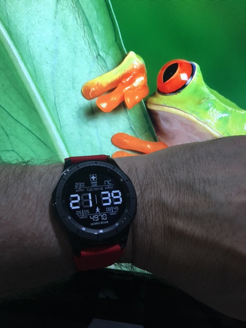
dont mind the missing weather info - I’m forever having problems with syncing weather data on Huawei
Hi John, thank you for taking the time to look at the this, the photos look great. Fully agree re the dim mode shadows of the LCD and the unbalanced off centre look without them, my whole rationale for the shadows in the first place was for balance, i’ll add them in to the dim mode.
I’ve always had problems with the dim mode on the S3 until the recent software iteration but now I’ll be able to enhance the dim mode too.
Agree re the LAZARUS line of text that both you and Mellin have commented on and I’ve now changed the text and made it larger. Also agree re sweep hands, but strangely with the translucency changed it kinda works and helps those who have trouble understanding the 24hr military time, might even help them master it.
BTW good note re the weather and the Huawei watch, I’m going to bear that in mind for future designs and possibly offer version that cater for this issue, are there any other notifications that don’t sync with the Huawei?
Looks good man. Btw, I just realized I took my photos with our forklift in the distance at work lol. So with regard to taking photos with weird stuff in the distance, I like the frog heh heh