Hi
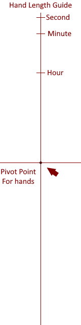
Does anyone know if there is a ratio in size between the hours, minutes and seconds hands
For example the hour hand is 3/4 the size of the minute hand, etc.
Comments appreciated
Hi
Does anyone know if there is a ratio in size between the hours, minutes and seconds hands
For example the hour hand is 3/4 the size of the minute hand, etc.
Comments appreciated
I don‘t think so that there are specified in ratios but i may be wrong. You should ask a real watch maker.
What is the definition of a real watch maker; Merriam-Webster defines as : one that makes or repairs watches or clocks
… @GAUSS with every thought, stroke of art you create, color you add, you are making a watch.
You my friend ARE a real watchmaker…
Enjoy,
~SIrhc
Hi @ozarour , I have not found a definition for the specifics or any standardization for the ratio, while I have seen blogs where they claim this or that to be correct.
I think the best approach is to be the author of your standards for the hands, the length, color and shape is up to you, in this aspect you are the creator, you are the watch maker! The best art does not follow any standards presented, everyone has a style, use yours!
Enjoy,
~Sirhc
Very good statement, @cdownie1967! I like!
What i found at my research: „The tip of the minute hand should be near to the indices.
Some say that the hour hand should be 3/4 of the minute hand, others 2/3…
My style is to have the minute hand tip on the edge of the index (if its not numbers). The hour hand is 1/3 wider and 1/3 shorter
I find this ratio to be more defining of the hands to distinguish them
For me, I find that I change the size of the hands based on what’s under them. To me, the time is an afterthought and sometimes seems to just get in the way. That’s just my style. I often shorten them or adjust the opacity so more of the background shows up.
I think that there is a(n old) standard, but I don’t know what I did with my horology books to refresh my memory. Whatever it is, I don’t go by it and the ratio of hands to face design is one of the things I find hardest to nail. Since my design philosophy (if you can call it that!) is to make things as easy to read as possible (usually!), I make sure there’s a noticeable distinction between the size of the hour and minute hands so that its always obvious which is which, and that the markings are close to where the hands end, but are not obscured by them. This doesn’t always happen, but its what I aim for.
Have you ever used different colors for the hands just to set them apart more?
In my opinion, the hands should be such that you can use them to identify time, otherwise they lose their meaning.
Different colours for Hands are always used.