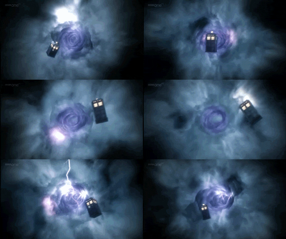
This is what I was hoping to achieve and it seems to work well so far with the support from all above, thanks
Any recommended improvements welcome, I have the X axis using:
(340+((((#DWE#/10)-(floor(#DWE#/10)))*-580)))
This is what I was hoping to achieve and it seems to work well so far with the support from all above, thanks
Any recommended improvements welcome, I have the X axis using:
(340+((((#DWE#/10)-(floor(#DWE#/10)))*-580)))
Looks good @benkidds. Hard to test yes? I would wear it for a while and check other weather conditions. “Partly Cloudy” is much longer than “Rain”
thanks yes longer ones just about stay on the screen as it starts again so may increase the value to compensate for that.
Just working on steps to miles conversion now but want to restrict number of decimal values so miles looks like 1.15 rather than something like 1.15434326598 and so on !!
WOW! Excellent design @benkidds.
I’d hate to be in LA when it’s 84C outside. Death Valley had the world’s highest recorded temperature of 56.7C — LOL!
How would I do this if I have a very short string (i.e. current time) and want to have a copy following it? Can I set a delay to the copy?
Example: Scrolling text element 1 is moving on a 3 second repeat. Scrolling element two follows behind element 1 with a 1.5 second delay.
My example is using the Y axis: (68+((((#DWE#/3)-(floor(#DWE#/3)))*120)))
I have the clock falling into the donut and disappearing. I included a Size change using this: (44+((((#DWE#/3)-(floor(#DWE#/3)))*-30)))
That way it looks like it get smaller as it falls in. The reason I need the copy is as the text gets smaller, it gets harder to read.
My current alternative is creating a copy that fades in. Kinda looks cool:
I may try adding in an interaccel to delay the fade in.
You can, at least in this case.
Change “#DWE#” (both of them) for something like “(#DWE#-0.5)”, while not changing any other parts of the script.
This will make that script think that it’s earlier than in reality.
Brilliant that’s great thanks for your help! much appreciated
thanks for your help that’s greatly appreciated! looks good!

How could I make the screen not remain empty, I mean that the letters come back, while they come out?
Thanks!
Make a second text that moves in when the first one moves out.
Only problem with that would be if you have variable text lenth (i.e. the weather text, where “Sunny” is obviously shorter then “Mostly Cloudy”). You would have to account for the graetest lenth to not overwrite the prior text. If you allways use the same length you would be fine.
very nice. Instead of the dimmer dim side, you should have a bunch of bites taken out of the red part leaving more black.
thanks! actually, I just used the expressions in your tutorial on creating an animated gif effect in my latest watch so I think I could try making a watermelon watch design with bites now  I’ll work on that version next…
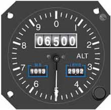
Hey all, I could use some help as well. I have the formula but can’t see to get mine to fit into the watch face. What I want to do is have scrolling numbers such as altitude gauge like the 6500 in the image below

using this… See next post as I can only post one image per post
When I load it into facer, it’s way to small and if I increase the size it’s all distorted. Am I going about this the wrong way or is there a way to load an image larger than the watch face?
The images used do not have to be within the 320 pixel range that facer uses. The creator may scale it down if it’s larger but you can resize it back to the normal size if needed. This should keep it from looking distorted. Also make sure to check the box to maintain proportions.