Design number 2:
2 Likes
Hi @jebscc
Most smartwatches have an Always On Display (AOD) feature but this obviously uses more battery, so the idea is you have a dimmed version for when you’re not actually looking at or using your watch, that then switches to the active/light version when you do look at or use your watch’s screen.
Also the more use of brighter/white colours on the screen tends to use more battery power, so consider this when designing the Dim mode.
Thank you @dubblebee. I have updated my watchface to reflect active/lite depending on usage as you stated. This is defiantly a new experience which I love. Wonder why I didn’t start with designing for these types of smartwatches before. Why easier then Fitbit OS. Just need to figure out if it is possible to position text/icons based on if the watch has a circle/square interface. Currently, my design looks a little weird on the square displays.
Entry number 2
Turn dim mode on and off to shake
3 Likes
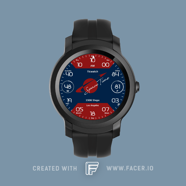
Here´s my 3rd entry for the “Space”-Theme. 
2 Likes
Yes it’s definitely possible, just use the #ZISROUND# tag e.g. for the X position:
$#ZISROUND=1?160:80$
(If the display is round, position the text on x:160, if its square, position the text at x:80)
Thank you for your help @dubblebee! I was able to modify and improve my watchface. It now supports both round and square screens and looks a lot better!
Not sure how this would look like on the official watch as the only smartwatch I own is the Fitbit Versa.
Did come up with the following formula to remove one of the text objects which should improve battery usage. What I was able to do is to create one text object with formula $#ZLP#=true&&#ZISROUND#=true?139:#ZLP#=true&&#ZISROUND#=false?115:#ZLP#=false&&#ZISROUND#=true?274:300$
This allows me to detect if the watch is either active/dim mode and also move the text to another area of the screen depending what mode I am in. At least I would think having two text objects on the clockface to read current weather condition (only one of them would display depending if we are in either active/dim mode) would effect battery life compared to only having one text object.
1 Like
4 Likes
1 Like
1 Like
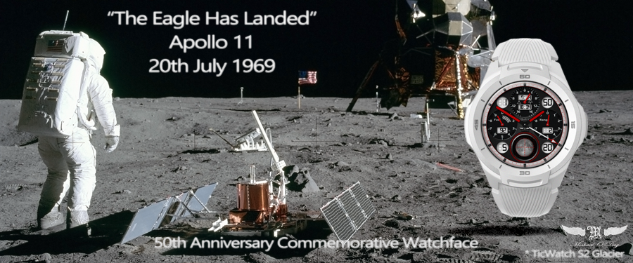
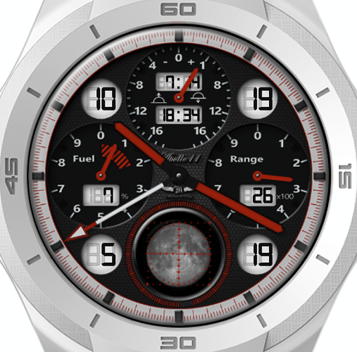
Apollo 11 - 50th Anniversary Commemorative Watch
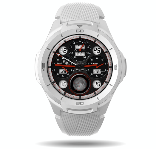 ( TicWatch S2 Glacier )
This Apollo 11 watch commemorates the 50th anniversary of first landing on the moon by Neil Armstrong and Buzz Aldrin on July 20, 1969.
Pride of place in the bottom centre of the watch is a view of the moon through a reconstruction of the command module’s Crew Optical Alignment Sights (COAS). In 1969 this was a key tool for confirming correct navigation, on this watch the COAS shows the moon as it changes phase during the month and the outer progress bar indicates the degree of illumination.
Other features of the watch include an equation of time dial ( top ), watch battery and steps dials and digital LCDs values for ( clockwise from top left ) hours, sunrise, sunset, minutes, steps, date, month and battery charge %.
I hope you enjoy this commemorative watch.
6 Likes
3rd and final entry for me:
4 Likes
{ EDIT: This post became quite long as I worked through a problem. I have now reduced it to just the findings … }
Hi Marcus
There appears to be a problem …
…
It looks like there is an issue with the way the TicWatch development web site handles a font.
Here is the font displayed correctly on the web page:
and here is the font as it ends up on the watch
The same test watch build on the Facer website works ok, it is just the TicWatch one that does not.
The problem font is the Patopian 1986 regular font.
My entry for the Space contest.
Toggle the Dim mode to see the loading effects.
5 Likes
Very nice! I really like the concept and the wonderful implementation. Well done an another great design 
1 Like
Thanks Mike, that’s very kind of you.
I’ve only just taken the time to view the other entries. Yours is really classy, a great blend of analogue & digital. Nice one!
2 Likes
Cheers, thanks for that - much appreciated.
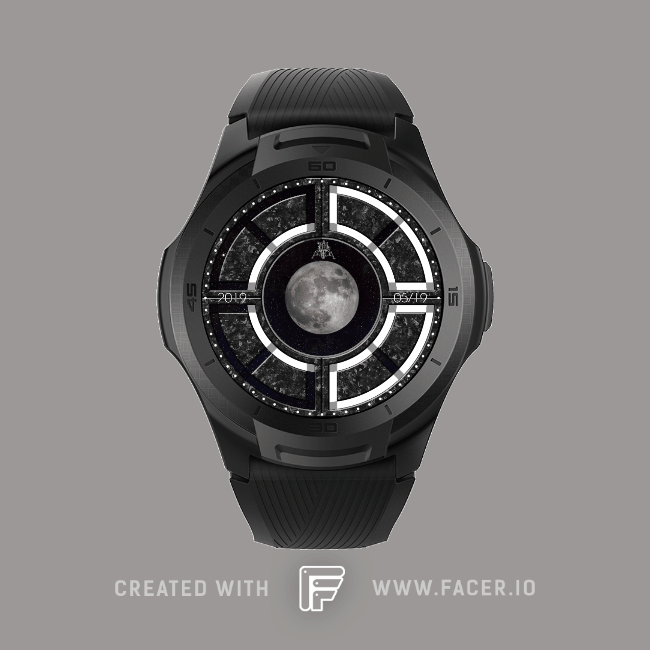
Second entry
Real full moon photo with useful data!!!
1 Like
My 2nd entry…
More light-hearted this one.
3 Likes