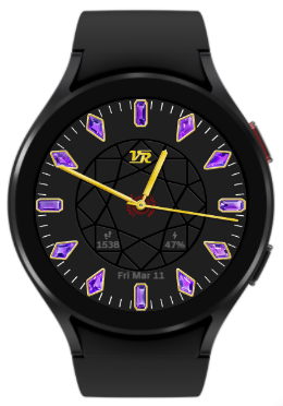
OHHH ITS A DIAMOND! LOL I did not know what you were going for but now it all makes sense.
@kourosh. I recognised the pattern In the center but it would be nice to make mor of it. If the lines were transparent you could have some thing mysterious happening underneath it. You do not have to go so Dark with the background. The complementary colour to the gems is Advice I have been given. But a different tone obviously.
Please inspect this for something happening under you crown.
I like the birthstone concept. I think the font needs to be larger in the first sample. It is difficult to see especially on the light background. I prefer the dark faintly textured background. In general, I have never cared for gemstone images on smart watches because they don’t look real to me, but that’s just me. Yours, however, are some of the best I’ve seen. I can tell that you took a lot of time on those. Keep up the good work, and see what your followers have to say. That may guide you as you create more.
Yep I picked the outline of a diamond… a far cry from the engineering and I.T. background I came from 
I like the dark one with the silver instead of the gold.
And you don’t HAVE to have info on there, it’s your watch face 
My favorite creation so far is still one with just 2 hands (and a moon phase)
Thanks, you just gave me more ideas! It seems that it might be best to make black/white/silver/gold all options in the same face, to appeal to most tastes-- although that would make it a premium face and I don’t know what the demand is for free versus premium faces. Plus at that point, might as well have the means to toggle info on and off while still keeping a minimalist look.
Your design above is very elegant, I like the spiral! The finish of the silver areas reminds me of gold and silver bead components we use in our jewelry products called “stardust.”
If you don’t want to go premium with the face, you can always just release 4 variants or so 
I do not know either, only made one premium based on one of my back then favourite, during the free test period. The ratio seems to be like 4:1 for the free ones (maybe even more, I did not make all the possible colour variations into separate faces).

Well… for now I think I have my final version for an all-in-one black/white/gold/silver design, making it a premi face.
@2 toggles metal color and @4 toggles dial color. Center spindle locks all interactions to prevent accidental toggles, with a red indicator around spindle when lock is off. The step/battery/date complications fade out after 4 seconds to slightly reduce clutter.
That’s brilliant, well done, I love it 

Yeah. That works well done. 
@kourosh I have made a Transparent Background png Template for you my friend, I will message you with it to use or not use as you wish ok, plus an example of how it could be used 
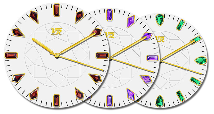
Working on additional months now. The gemstones will invariably be shaped different based on availability if I continue using actual photos of each gemstone, giving me their natural colors and keeping the stones looking all different.
Garnet Amethyst and Emerald, for January February and May respectively:
Looks like it will be a lovely Collection my friend, well done 
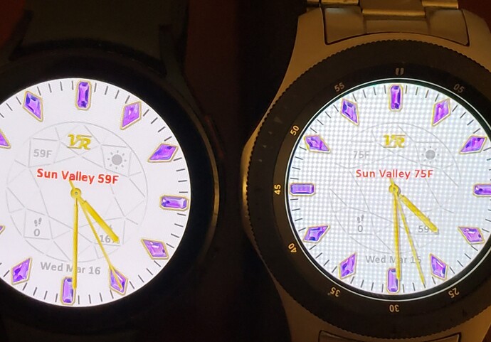
Interesting new development. So I thought I’d add some weather info, faded just like the existing steps & battery. Wrong??!!
Two watches with the same face, millimeters apart, cannot agree on the temperature! I thought there might be a location permission issue and each might be looking at a different location, so I added the red text in the photo using #WLC# #WCT##WM# to test. Sure enough, the locations do match. GW4 @ left, GW1 @ right. 


Is this normal?

Maybe check that all Permissions are On for all the necessary Weather Apps on Phone and both watches 
Nothing else I could of sorry, except for maybe a restart/reboot
Every single permission has been on for both! Even the built-in weather app of each watch, whilst showing the same (and more accurate) location, was showing 61F (GW4) and 58F (GW1) which is disturbing enough for the weather app.
So I rebooted both. Both still showing the same “approximate” Sun Valley location (which is a few miles from my actual location), now they’re reading 58F and 59F respectively. I guess it’s 1F warmer on the right side of my room. 
PS-- the built-in weather app is still 3F off even after the reboot.
Maybe they just update the weather info in different moments as it develops during the day.
@kourosh . One degree is close .  24 difference is not . I think the watches request data every 20 minutes but it could be longer than that . The CURRENT reading is going to change from minute to minute and watch to watch . Day and Night temps and all that . MAG and others , use #WFACT# #WFACI# #WFAL# #WFAH# for Todays weather . As it is a forecast it is not so jumpy . All the tests I have done bare out what he has said . But as always with most things said on here it is up for debate . At the end of the day the answer is Test Test Test and Enjoy.
Or in some cases… test test test and curse curse curse! 


