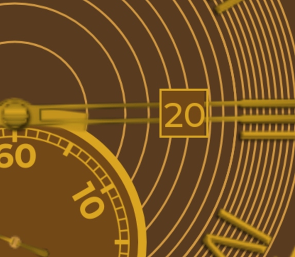
Hey everyone, looking for a bit of guidance as to how to make this particular face pop. I’ve messed with the colors a little, but I still feel that something is missing. I’m thinking about spacing the outer circles out a little more. Thanks!
You could add shadows to the watch hands…
Maybe duplicate the bottom yellow circle and set it to a darker circle placing it underneath, giving it a shadow (you may have to increase the size slightly or move it one pixel off to simulate shadow)
Alternately, make the bottom inner circle a slightly lighter shadow of the brown to make it “pop” and suggest 3d… as it is the whole watchface feels like it’s one layer… like it was drawn. You can improve the way it feels by making slight changes to suggest 3d depth.
Lighter colors vs. darker contrasting… darker fade to the background, lighter to the foreground… that’s why the darker shadow (be it black or darker brown) helps it to feel 3d subconsciously.
Hopefully that makes sense 
Hey, thanks a lot! I have been toying with the design a lot since I’ve posted it, but I will certainly attempt to make some of those changes! 
Hello @csbennett, that’s a pretty good looking face you have there and I’m sure with some of thoes edits it will look even better. My first suggestion is to make sure that your hands are always highest up on the layer list when making traditional/realistic analog watches. Right now they run underneath the date as you can see in this screen shot.
Also can I ask what type of software are you using for these graphics or are you building solely in the creator? The only other suggestion Is have right now is, personally I’d like a but more contrast in the hands or maybe even a different color. For me they get kinda lost in the design.
~Orakix
Hello csbennett,
You’ll love it here! Everyone is always very glad to help newcomers.
The other guys have pretty much covered it with their suggestions and questions. I like the chocolate idea, and agree that more contrast and 3-D effects are needed. Perhaps using a metallic for the gold would make the face “pop” and look more realistic. There are some good tutorials in the community for creating shadows. I think what Orakix was eluding to with his question was that it might be easier to design your basic background image in PhotoShop or a similar application. We’ve had some discussions in the community regarding free and paid alternatives for creating graphics.
Have fun!
