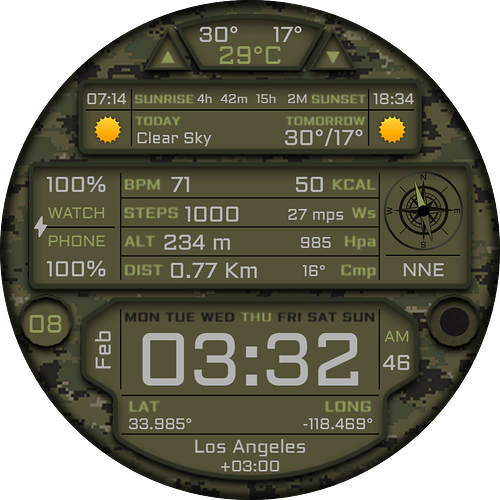
Hello friends. It was my first watch face experience in this category. I would be very happy if you could upload it and write down the parts that are missing or need to be corrected. I hope you will like it.
I published the edited version as v2. I hope you will like it.
3 Likes
Awesome design! Well done. I’d consider increasing the contrast between the background and the text if you can. At the moment, everything is quite dark so the text is a bit hard to make out (it’s also quite small, so I’d consider bumping that up as well). Keep up the great work!
5 Likes
Thank you for your suggestion. I will make an adjustment to the background color and text color.
1 Like
I just wanted to suggest the same about some more contrast and size to the tiny info texts.
Maybe alternating text cycling trough informations from same category each lets say 2 seconds would allow to make it bigger.
1 Like
I replaced the black text with a slightly darker shade of white. I reverse contrasted the weather icons from black and changed them to a dark shade of white. I changed the phone and watch battery icons to green text. How do you think it happened this way? It seems a little better.
3 Likes
I made some adjustments as you said. But I can’t change the font size  Because there isn’t enough space.
I think the contrast definitely helps make it easier to read, nice work. I think the smallest two font sizes there may not actually be visible on a real watch? Have you synced to test it? Up to you though 
1 Like
Thank you. I tested it on Samsung Watch 4 and Watch 6. It’s difficult at 40mm, but I can read at 47mm. Maybe my eyes are better 
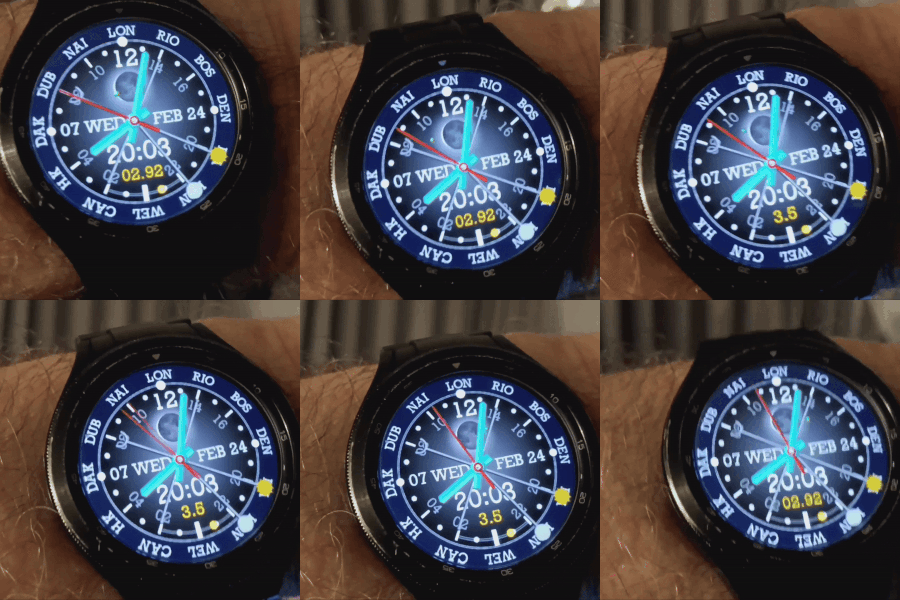
I meant something like this for example. If I wanted to show all the information at once, it would take more space or the font would have to be too small. Cycling trough the info can put more info in same place.
2 Likes
Very great work. Congratulations. I am learning new things thanks to you. The changing container feature on your watch face looks really nice. I definitely need to try this feature on a new watch.
1 Like
Then there is Gravity Fed .
.
.

2 Likes
I think you did a wonderful job and from a military perspective it would nice if you could add Zulu time. I would use it.
1 Like
Thank you. Frankly, I didn’t know how to add the Zulu time zone. If there is a code I can add it to, I will add it to the next military watch I make.
1 Like
This thread discusses how to integrate UTC/ Zulu time: World Timer – GMT/UTC Multiple Time Zones watchface
1 Like
Great. I’m starting to research this issue now.
1 Like

