Trying to figure out what the BEST Digital font is. I have some but they don’t work well when I’m putting them as a dimmed layer with “88:88”. I just trying to find the one that works best. Any ideas?
You need a Monospaced Font . You need one with One in the right place . Windows do a nice 5x7 matrix Font .
I think any monospaced (fixed letter width) font will do.
I used to suggest this one: https://torinak.com/font/7-segment
Meanwhile I made me few of my own like this:
10-segment Digi Ita | FontStruct
what I do not like most is, when the font only mimics segmented look, but then it has letters or digits with different segments and their placement off the grid.
Thank you, I’ll try these
Very nice slated font!
Yes . Peter has made some great fonts .
Does anyone know what font this is? I’ve tried WhatTheFont site but not showing nothing for this font

This is close but I think the 1 is in the wrong place .
.
.
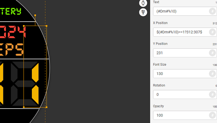
If you separate the digits and then use right justify on them, you can use an expression to line the one up with the 8 backgrounds. I just figured out how to do that with the digital font I use which is DS-Digi.ttf But the other digital font I use doesn’t require an expression to move the one into the correct spot and that font is called, SFDigitalReadout-Heavy. All you have to do is right justify it and it lines up perfect.
What is that expression you’re talking about?
Yes, that is the font. I have all the versions, but the boldest one works best. You only have to use the right-hand justification with the SFDigitalReadout family of fonts.

With the DS-DIGI family of fonts you have to use the right-hand justification plus an expression in the X box to move it over to the right a little like in this picture.
