Hi friends,
Yesterday I took a beating trying to even notice the change in the art’s positioning… today I’m going to start early so I can see for myself!!!
“Always fight, never give up!”
I think I see what’s wrong.
The image for the right wing is the unedited version. I posted it as an example of how you need to delete empty space from an image if you’re going to rotate it. With the extra space it rotates the entire image making it harder to find an anchor point.
Here’s the right wing you should be using:

Sorry about that and not explaining it better.
Let me know if you need any help or to explain things further.
2 Likes
Please don’t apologize, just for getting your help and teaching I have to thank you!!
Thank you very much !!!
2 Likes
I think everything is ok now!
When opening the screen he appears flying, I personally thought it was beautiful!!!
My intention is to make an analog screen, date and battery, I saw in the teachings that there is an owl screen after the animation goes, sorry if I’m wrong but, if the user leaves the screen always open, the animation movement could be seeming to have a certain frequency regardless of the time?
It’s just an idea and, if it’s possible, what do your friends think?
By the way, I thought about it but I don’t know how to do it!!!
Thanks
2 Likes
By the way, I notice you still have to change the height and width on the right wing. You can change it to match what the left wing is set to so they both grow at the same rate.
As for the 2nd part of your post, ideally what you would do is make your analog screen/date/battery on new layers positioned below the other layers. That way when the layers above it fade/turn invisible, they’re revealed. The problem is there’s no background to the owl layers. So you have two ways of dealing with this.
-
Make a non-transparent layer between the owl layers and the analog layers that turns invisible. You can do this using the same transparency settings as the owl so it all disappears at the same time and reveals the analog face underneath.
-
Make your analog watch layers and set the transparency to do the opposite that the owl layers do. Meaning, the owl layers start visible and turn invisible… you’ll want the analog stuff to start invisible and turn visible.
Both ways are valid, so its up to you. I just mention it as it gives you practice making something turn visible instead of invisible which you can use in other watchfaces.
Technically, there’s another way, and that is to create layers and keep them “off face” until they’re needed. Meaning, the center of a watch is X: 160 and Y: 160. The boundaries are X:0 and X:320 and Y:0 and Y:320. Anything outside that boundary will not be visible. So you can put an image at X:-320 Y:-320 and it won’t be visible until you move it to where it can be seen aka (X:160 Y:160) You’d do that the same way we change the size of an image by putting that formula in the X and Y fields. So instead of getting bigger at a certain rate over 2 seconds, it moves the image from off screen to on screen in 2 seconds.
In other words, formulas can be very powerful and lead to a lot of versatility. So its worth playing around with them and learning how they work and how they affect each field they’re put in.
This is getting long so I’ll make another post going into philosophy of Always On and more.
2 Likes
Anyways, yeah, people here are split over Always On displays.
For some, animation drains the battery if it’s always on. Personally, I charge my watch every night even if it’s not needed. My view on smartwatches is that while I can mimick a “realistic” watch, I got one because 1) I want to change it’s look constantly and 2) I want to do something static watches can’t, hence most of my watchfaces are some form of animation.
Anyways, the idea of this watchface is to have it so when the wearer looks at their wrist, it wakes up, shows an owl flying at them and fades out to the “regular” watchface. So, users get two watchfaces in one watch in a way. It’s also why I tend to make a lot of randomized watchfaces. I view watchfaces as “art”, it should be eye catching and something you can have displayed. I often have my watch docked on my charger at my desk, so I can see the watchface without it going into DIM mode.
I think what you’re asking is if there’s a way to make the owl fade in and out constantly so it kind of loops. And the answer is yes. I have it in my notes somewhere, unfortunately I don’t know offhand.
2 Likes
Hi friend cth4242,
I believe there is this divergence in relation to the battery consumption as it is always open so I will leave it as it is!
And, I would like to know what you think of some others, like an animation for the morning period, another for the afternoon and finally one for the evening!
I apologize for thinking about things I don’t know how to do, but it’s a way to exercise my brain.
I will make the changes you advised me!]
Thank you very much!
1 Like
Hey friend,
I’m struggling here but I can’t really understand, I’m sending you two models, if you could take a look for me I’d be grateful!
For the first watch it looks like you have to change the transparency of the hour/minute/second hands to start invisble and become visible. Actually I forgot, the tick marks are too wide to fit. You’ll want to change the width, which may be easier to do manually. I think both have X and Y have to be 320.
You’ve got everything working on the 2nd watch, so it may be easier to change that one. All you would need to do is change the transparency of the hour/minute/second hands to:
-(120-(interpAccel(#DWE#,0,2.5,1)*200))
Hope this helps!
3 Likes
Friend cth4242,
I believe it is now correct thanks to your patience and teaching.
When possible, please take a look and tell me if I can move on because I would like just the day and the battery charge in the center of the screen with a circle, what do you think?
Hugs,
Christian
Great work!
1 Like
That’s easy. you’ll need to add 2 elements:
Under Add Element, choose Progress and use these settings:
X; 160
Y: 160
Radius: 65
Inner Radius 40
And at the bottom change the color to #7ac950
EDIT: Forgot to add, at the bottom left under Presets, choose Battery level
Under Add Element, choose Text and use these settings:
X: 160
Y: 160
Font size: 12
Fixed width: 70
This should give you a good start to tweak it further. You’ll likely want to change the transparency settings to match the hour/min/seconds as well. Also, you may want to move the layer up or down in the order on the left side depending on if you want the hands to show or just the arrows.
2 Likes
Friend and Master cth4242,
I will continue here with my trials and errors, but little by little I am learning and, you are right, I would not like the bars to appear, but only the ends, because I thought of placing a “circle” figure in high relief in the center with the date, digital and charge but, with a meaning that maintains the colors that exist. What do you think?
Hugs,
Christian
1 Like
That was what I initially did and it looked great, IMO. (the battery circle on top hiding the bar so just the arrows are visible)
Play around, experiment and make a copy of the watchface if you decide to try something radically different, that way you don’t have to recreate the watch and fall back to an earlier design.
Part of the fun is tweaking and seeing how you can make the software do things without worrying about messing up your design.
3 Likes
Hey friend,
What do you think? Should I change something or is it ok?
1 Like
Looks good, although one thing I would change and another if to keep in mind for future watches:
-
The battery percentage is aligned diagonally which is different from the other pieces of text. I’d keep it rotated to 0 and put it at the bottom of the circle. If you want, you could put a small battery next to it or a larger one semi-transparent behind it (light green with the battery text black or something similar to stand out)
-
Another subtle thing is consistency throughout the watch. Meaning, using the same font throughout or the same size, unless you’re drawing attention to something. In this case, it makes sense to make the time bigger (it’s what you want to see first!) but other watchfaces you might keep this in mind.
I’d go for something like this:
Again, this is all your choice… there’s no right or wrong answers. Just offering what I’d do.
2 Likes
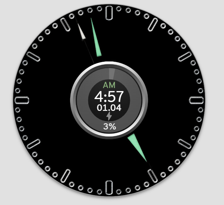
And now friend?
1 Like
Looks great! Great job!
2 Likes
Thank you my friend!
Can I please mention all your support and teaching and what should I do?
Hugs
1 Like
Friends, please give me your opinion, I created it with the help of cth4242
and, I would like to put this in the description, would he mind?
1 Like