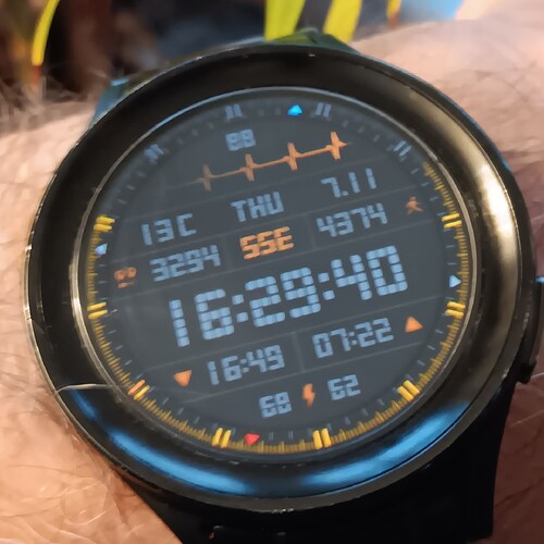
I see your point and can only guess. Maybe the filters that are available to Facer are not that advanced yet. The Premiums go through a review process. Maybe the expense of developing further would not be worth it for free faces. That would be a good suggestion to submit on the support form.
Next time the app asks how I liked it, I will mention this ![]()
Does timeshow require an app on the watch like Facer Companion? I couldn’t find any info about whether it does or not. Otherwise it looks like a decent competitor for Facer - although it doesn’t have ticmarks as a design option.
It sucks that if you want to send it to the watch, you have to do it via phone from the application, it can’t be done directly from the creator.
Does that mean there is no app on the watch like Facer Companion?
And is it true that Time show requires a monthly fee?
Yes, the watch requires an app. As for the fees, I don’t know. I haven’t researched it.
So I put it on again and I think it looks even better now. But I found some more flies. There is also a green version planned.
It looks good and flew it under Marvin’s radar as well. Just a side note, I have a watchface I made a few years ago using the picture a lot like the one you are using for your profile picture. Mine has blinking eyes and it’s a shame you can’t do that with your profile picture. ![]()
![]()
![]()
I’ve been using those eyes in my avatar for about 10 years everywhere I’m in a community and not just there. I have them on Messenger, WhatsApp, Discord… Everywhere.
It’s the Rebelito brand logo
A green version for green brains. ![]()
Punch the Numerals a Tiny bit More . Especially on the smaller ones .
The translator doesn’t take the first sentence away from me. He only translated it for me, especially for the smaller ones.
I guess it’s about the enlargement, I can’t enlarge them. The lines around them are one image, that would mean digging the whole thing up.
I think it was about contrast, they are dark grey on darker gray and small on top of that.
Yes @ekky.mi and @petruuccios . I should not have used Slang Language . I just meant the numerals should be a lighter grey .
I made the numbers on the clock lighter as the most important information on the dial.
I lightened it up a few numbers.


