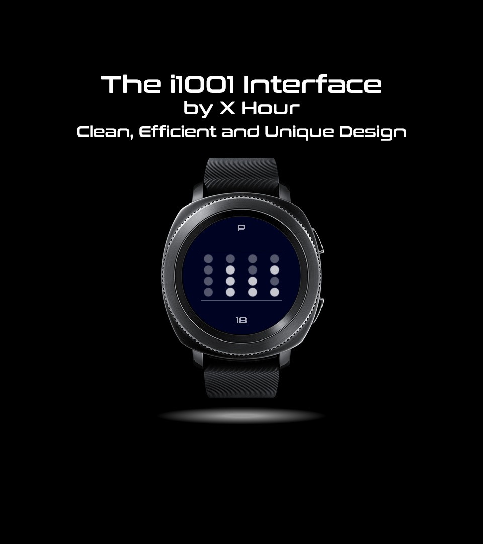
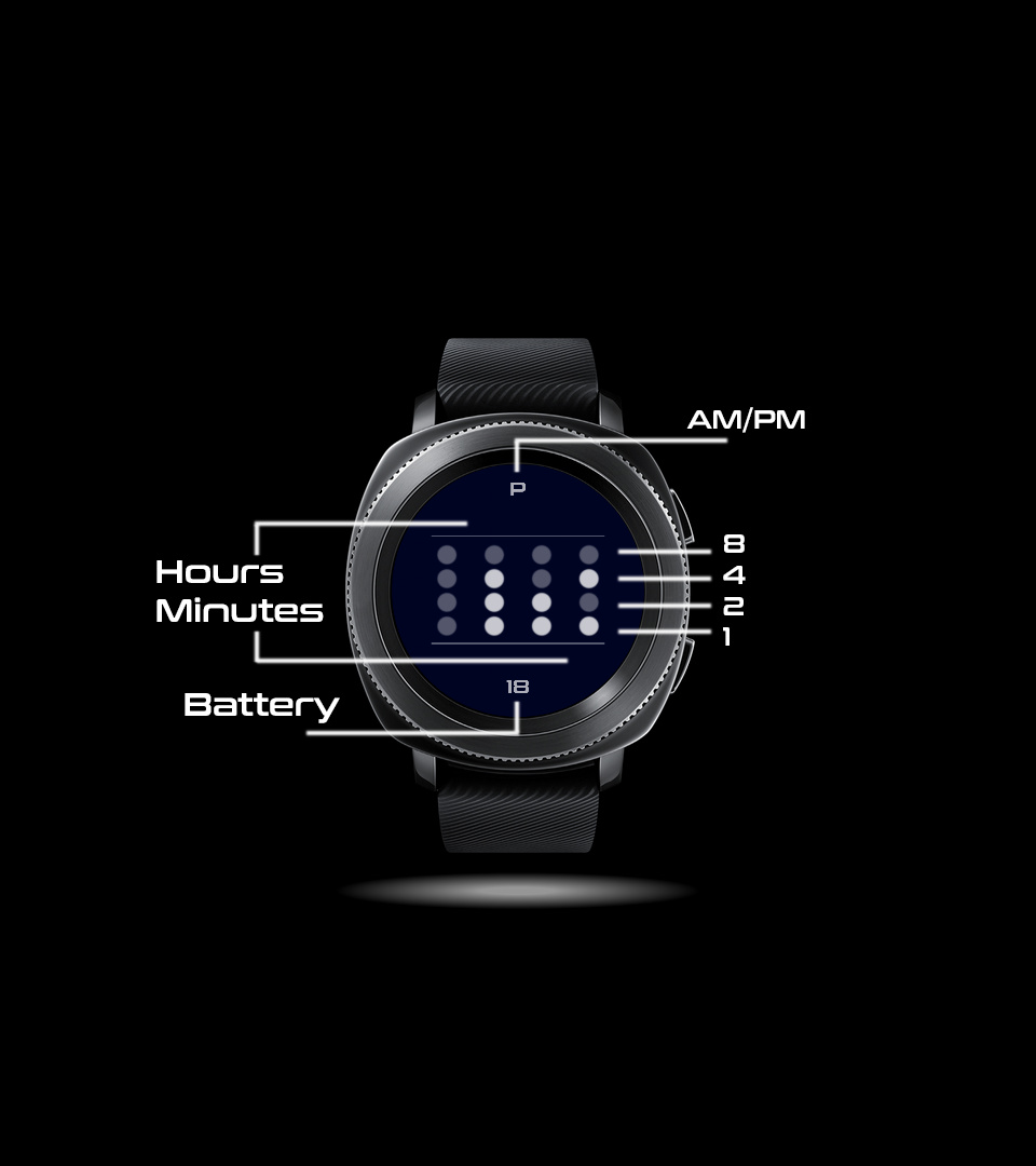
Fairly new member here. I came up with this minimalist design over the last several days. It is a throwback and a nod to early computer design, with a twist. Using binary hexadecimal counting, the four columns each represent the hours and minutes through the data dots: highlighted for positive and subdued for negative placeholders. Starting at the bottom of each column is an indicator for 1, 2, 4 and 8.
In keeping with the minimalist concept, the AM and PM indicators are kept in an A or P configuration at the top of the screen, with the battery presented in integers only.
One issue I currently have is that the “dim” or AOD mode ends up with a black background instead of the navy blue I selected in the active mode. Any help on how to resolve that will be appreciated. //Solved//
I note that you have not added background images. What I do is add two images at the bottom of the stack ( just above the “background” layer that I do not in fact need ). These two images become my background images for normal and dim mode. All I have to do is uncheck the visibility button ( the eye symbol on the far left below padlock symbol ) for the bright image in dim mode and visa versa for the dim image.
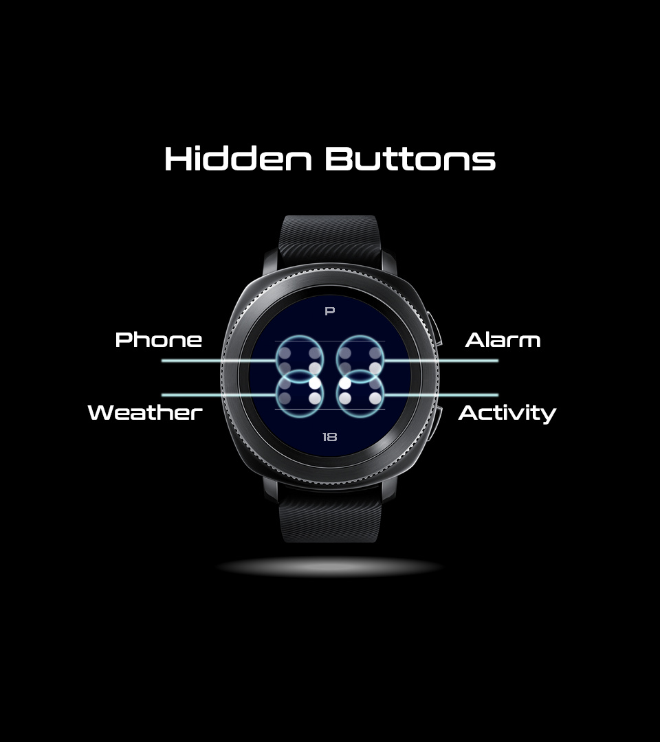
So, I have one sync on this watch face over two days. Could it be that it is just a design that nobody likes, or is it the paywall? I have interactive hidden buttons for the phone app, etc., so are these not really all that desired by most Facer users? Should I remove those features so the watch can be free to use? Even with that change, is it worth leaving it up if nobody is using it? I am open to suggestions.
I suppose you do not really have anything to lose by keeping it up. As with many items shared on the internet, success in terms of number of downloads depends on having well liked items and, most importantly, visibility. The more designs you have displayed in the widest range of categories the greater your visibility. This means that more people will come across you as a designer and go looking into your gallery and, over time, increase the total number of syncs you achieve.
You could create a copy of this design, remove the premium items and republish it with a note in the description saying that this is the free version of your premium design that has the following exta features (see link ). This would both give you another design that people can come across and also provide some advertising for the premium version.
Still, I sense your frustration and disappointment that the design that you have laboured over and like has not been as successful as you thought it might. All you can do is keep plugging away to increase your visibility and over time your unique designs will find the people out there who really appreciate them.
As designers, I guess we have a choise to make; do we try to make unique and interesting pieces that may have a small market or do we study the market and produce designs that fully align with the most popular taste and trends. If we don’t care about the numer of syncs then perhaps the former. If syns are everything then the later. And I guess we all fall between these extremes and need to find a balance; maybe we do both - some designs just because we like them and some with a nod to popular fashion …
Don’t let it get you down - just make another one!
Thanks for the feedback, mikeoday! I am still new to Facer, so there is a lot I have to learn. I will put up a free version of the face and see it that goes. I realize that a binary design is a stark departure from the conventional analog or digital designs most of us are accustomed to using, so I am not expecting it to be a huge hit. I was hoping, key word, that the design might attract more users. It’s all good either way, because I am using it and I really like it.
Gizmo, thanks for the compliment on the design. I see that you are newer here than me but you have several designs up already. For one thing, some of those images may be copyrighted, which means they might get taken down. If I may suggest, you could focus on layout and purpose instead the background image.
Okay, I may have screwed this up. I saved the design with a new name and removed the hidden buttons, but now my original design has been replaced. I changed the name back to the original name at this point. Also, a little star still sits next to the name, so does that mean it is not free? I am confused as to what other features make it premium. I have png images with tags for the time, and the AM and battery indicators are text boxes with tags. I added a blue image for the background. Pretty simple stuff, right? Nothing special. This is truly frustrating.
I would echo what @mikeoday has said about putting up 2 versions to extend the visibility, though I’m not sure what’s happened with the duplication problem you’re experiencing.
I totally get your frustration though when a design you think looks great and works well doesn’t “hit” with users after a few days. Stick with it though, sometimes these can get picked out by @Facer_Official for features then you may see the syncs rack up.
As I see it designs that are a little different in how they approach displaying time have a very niche audience, HOWEVER, I applaud what you’ve done here and in my opinion I’d like to see more people thinking of different ways to display the time. After all a smartwatch is basically a mini-computer strapped to our wrists so why not make the most of what it can do!?
mikeoday, I can duplicate the face, but it still shows up as a premium face for some reason. I totally get that niche designs are going to receive fewer clicks and syncs. I have decided that I’m just going to leave it as is for now. The design is so basic that if I change or remove anything else, it becomes either unbalanced or unworkable, in my opinion. Under the hood, this design is a bit complicated, so the return on investment based on my time spent is not worth it to recreate the face as a new project.
I have a Creator Pro subscription, but I made sure to exclude all elements that make this a premium watch, such as app launcher and promo images. To be honest, the fact that to be free I cannot upload any promotional images means that I cannot show Facer customers how to use this face to tell time. I mean, seriously, I paid for use of the Pro features, and I should be allotted some space to put these up even for a free face. Even if I would be limited to two images, that would be better than no images. This is an unreasonable limitation, in my opinion.
dubblebee, thank you for your kind words. You get me. I came here to make interfaces, not just time displays. A smart watch is an interface, not a display. I understand why Facer puts up certain limitations via a paywall, but in many ways, this hampers true creativity in so many regards. Nonetheless, I will keep plugging away. I have to feed my creative design needs and this provides me with yet another avenue to pursue my goals.