Hi, this is my last watchface design.
It takes a few days of work
I tried to be realistic and i spent so much time to make these shadows and light gradients…
Anyway i think this is my most accurate watchface design.
Features are:
-Day in month
-Day of week
-Watch battery level
-Moon phases
-Digital time in seconds dial
Great work. I do like the style you created here. I’m a huge fan of 3d work. Most all of my stuff have some 3d in it. Some recommendations I have for you to make them look even more realistic. If you lighten up some of your shadows just a touch they will have a bit more separation between them and the dark blue in the middle. (Or lighten up the middle a touch.) Also having a gradient on the flat surface will make it look a bit more real too. Right now being solid blue it isn’t reacting to light at all which makes it stand out to the eye as looking different from the other parts. Here’s an example of making a flat surface look a bit more like a real material.
I hope this helps. Let me know if you have questions on how to achieve this.
I adjusted shadows a bit lighter and lights a bit darker and also the background color, I also tried to put a gradient on the flat surface like you said but I’m not sure the effect I get is better than before.
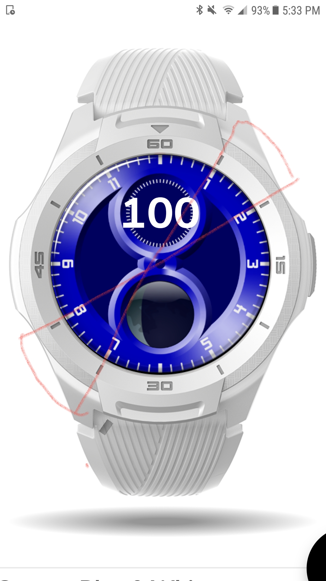
I did an example to let you see what I get, let me know what you think about it.
There is a text on the top with the % of effect.
Let me know if you think that I have to put it or not and the better % to get a good result.
Thanks you in advance and sry for my bad english
That was a very clever way of doing that example. Well done. I’d say start at 40% and see how it looks with everything on the watch. Also I would recommend adding a shadow in the opposite areas to the highlights. Shadows are just as important if not more so. Put black in the area I drew here. And see what you think.
It’s looking good. As far as the %, this is going to be a preference thing. It depends on the type of material you want it to be. How shiny (aka reflective) do you want it? That kinda decides most of the time. The more reflective the higher the %. Does that make sense?
Awesome, I’ll check it out when you update it. The most important thing that I forgot to mention is that you’re happy with it in the end. I could give suggestions but ultimately you’re the designer of this face.