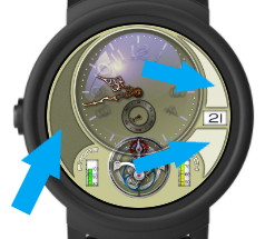
Hi everyone i decided to have a day of design rather than maths and came up with this you opinions would be great and any suggestions will be considered
Thanks Daz
Hi everyone i decided to have a day of design rather than maths and came up with this you opinions would be great and any suggestions will be considered
Thanks Daz
Hello, I like the “retro” feel. Maybe you could consider adding some texture to the unused areas (for example different patterns of brushed metal). Also could consider adding the tick marks in dim mode. Would help to read the excentrically placed hands.
thanks for your input mate hopefully i have addressed both problems
Gladly. I like how you did it. Even added some symmetry.
Looks real nice Daz, however, like petruuccios said, I think some texture needs to be applied to these areas  as they do look a little bare.
ok guys i made quite a lot of changes can you let me know if its better now
It’s brilliant mate, you’ve filled those areas nicely, great work 
What are the little Icons on the left though please? Kinda hard to make out with my eyesight sorry
day of week mate S F T W T M S
Then that’s a cool idea, still too small for me to see though sorry lol