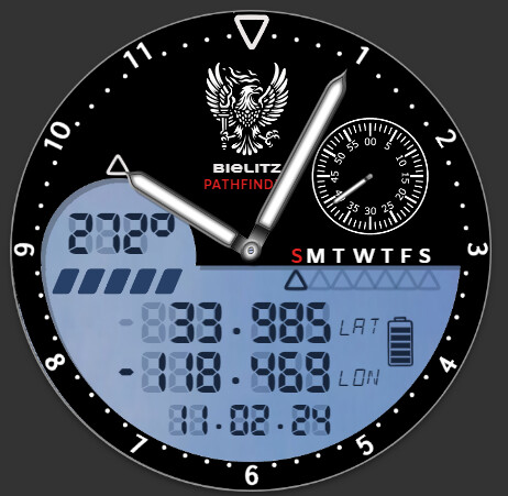
This is my latest Military Style watchface it has compass, latitude and longitude and it also tells the time! The seconds dial includes a last 10 seconds of a minute red segment. It also has two sets of numbers 0-12 (AM) and 12-24 (PM) which change at midday and midnight. If either the GPS or Compass is not available then the readings are replaced with an icon. I’m not sure how accurate the compass and lat/lng readings are, but, I definately won’t be using them to navigate through a jungle anytime soon! In any case I never have understood what the compass is showing. As a military watch it is useless but I like it anyway - particularly the blue LCD.
2 Likes
It works, looks ok, but that Digital Font really spoils it in my opinion sorry ![]()
Any criticism is welcome ![]() can I ask what you don’t like about the font? It’s a bit faint I think - maybe that is it. I like your designs so I would appreciate knowing how you think it might be improved.
can I ask what you don’t like about the font? It’s a bit faint I think - maybe that is it. I like your designs so I would appreciate knowing how you think it might be improved.
1 Like
Maybe a more military looking, bolder font
When searching for fonts update the text preview box with 0123456789:
To better preview fonts
2 Likes
I think that indeed would look better ![]()
2 Likes
Yes, that Military Font looks better: it’s just that Digital Font looks too thin, faint, and weak to me sorry.
I think you dont like digital fonts in general Gizmo.
I bet you would not like it even if it was bold and thick ![]()
1 Like
Oh… that’s much better. I searched and failed to find an LCD font with a ‘degrees’ symbol nevermind a bold and fat font. I would appreciate its name if possible. Thanks for the guidance.
Beware, its purpose built one, so it does not contain all characters and some are in crude form.
Brilliant - thanks very much!
That’s very promising, and I like the name. Why not use different shades of black to separate the Bezel? Some emboss and additional shadowing? Maybe a light camouflage pattern somewhere? Digital part could have a green digital screen effect? On the digital screen some line separators? Instead of the half circle embedded onto the digital screen, why not use a different design there to emphasize the compass?
Sorry if I made a lot of suggestions, I have to stop ![]()