If I keep publishing 2 a day like I have been it should publish late on 20 June.
1 Like
Nice little challenge Rusty, and thank you very much for making these hands available. I happened to make the bones with this last week, and it seemed like a natural fit, so I made some adjustments to make it work.
Tilt the watch > 4 degrees and the screen changes to:
4 Likes
Cool . I have seen your WIP collection :::)))
3 Likes
Nice one Brad . Good to have a Nice Collection of Bones about .
3 Likes
Thanks @russellcresser. I noticed that with the curvature of the half circle part of the hand around the hour tick, it kind of puts the hand really close to the next number. For instance, if it is really 1 oclock, the curvature of the hand extends it really close to the 2 oclock position, which I personally found confusing. To counter this, I added in a dot in the middle of the circle. Same with the minute hand. I think that works much better. It’s reflected in my preview above, but not in the tilt view as that was an older snapshot when I took that.
3 Likes
I took both images and put them through Paint dot net and adjusted the rotation so the leading edge of both were straight up in the center of the pic. Just like it would be touching a very thin watch hand in the layer above it.
3 Likes
@mrantisocialguy @bradtc I was responding to a poor bit of reference and got no feedback from the original Requester . I have a couple of faces where the tip of the Hand is Vague . I like the dot . Plenty could be done round that . Thanks for picking up the Baton and running with it , Both of you :::)))
3 Likes
I never liked these “abstract” faces. Tried out to make the rings equally thick, it turned out to be ugly anyway.
Also no way to make it informative and look any good for me. Even my favorite color seems not to suit it
I am not in mood to publish it.
5 Likes
Yes, it does tend to limit the possibilities for a lot of flexibility in creating a watch face.
3 Likes
Despite the limitations of the hand, I like what you did with it @petruuccios. The orbiting digitals really make it easy to read. I also like the faded edges. Nice one.
3 Likes
I am sorry Peter I do not know what I was thinking making a challenge out of such a thing . I know what you mean about Abstract . But all the work so far has been fun and surprisingly good looking .
2 Likes
I’d like to play around with these too, but can’t get on my laptop for quite a while sorry.
2 Likes
Always there if you need them or something similar when you are ready. No deadlines. :::)))
2 Likes
Thanks guys for your words, cheered me up to make final touch and see what happens ![]()
3 Likes
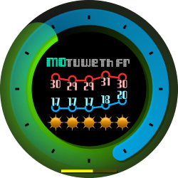
I have been inactive for a while, but looking to get back into it. I know this isn’t the same, but this is my most abstract design to date.
3 Likes
Very different, but it works well, nicely done and welcome back ![]()
2 Likes