Good Morning all,
I’m trying to add a battery progress bar to a minute hand.
Unfortunately, the battery progress bar doesn’t run in sync with the minute hand.
is it possible? Or do I just have a misconception in the formula?
I would be grateful for any help or advice!
1 Like
Hello, it should be possible, but the misconception is not in rotation formula, but in the placement.
The progress bar is aligned to its upper left corner, and also rotated around it, so you would have to orbit its position shifted few degrees.
1 Like
You will be able to get that to work. It is a brilliant Idea. Give us Battery Gauge as well.
As @petruuccios said the only way to do it is with the Cos Sin orbit formulas for X and Y positions. Once you have these mastered you can do a ton of wonderful stuff.
The problem you have is progress bars and rectangular shapes have a strange zero zero point and you have to compensate for them.
I often use an imagege to do that sort of thing then you can chose the Zero or pivot point.
I am not on my PC at the moment. If you are still stuck later call in again. and we will get it sorted.
1 Like
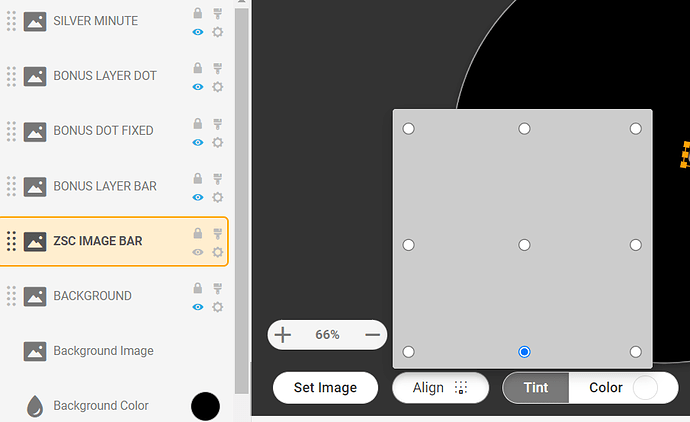
Like @russellcresser suggested I would use small white square image instead of the progress bar, align it for example to bottom midle point and stretch it to width of the hand and height of #BLN#x1.01. Then simply use #DWFMS# for rotation and for placement something like this:
X:
(160+27*sin(#DWFMS#*3.14/180))
Y:
(160-27*cos(#DWFMS#*3.14/180))
2 Likes
Good to see short form PI Again. Like an old friend . It is interesting when you start to recognise the style of a Coder. The Peters Descriptive style is very recognisable .
You guys will have to Forgive me breaking Rule One of the Community Code.
You do not have to Inspect it . Some platforms give you Round ended Progress bars and the axis is on centre .
1 Like
Thank you for your suggestions.
I do not know,. if I can still do it correctly today.
Anyway thank you @russellcresser and @petruuccios
I wish you all a Happy New Year
3 Likes
As you go in your own time . It is good to get any response. The Topic has a good Title. Others will find it easily and may benifit. The Community works best that way.
Please keep us updated with you progress as and when.
Happy New Year to you and all those visiting this Topic.
2 Likes
First of all, a Happy New Year to everyone,
@russellcresser I like your idea of the “images”.
Only I have a problem with the size of “BONUS LAYER BAR”.
I have now produced quite a few different sizes…
either it is too small (100% of the hand is not filled in - see minute hand) and/or the hand is not filled in AND it protrudes slightly beyond the hand - see second hand.
I’m going crazy 
Can you tell me what size you got…
Thanks in advance…
1 Like
Listen @daredevill I am so sorry I got carried away . Being a bit of a smart ass . but it will help you to get a good handle on what is going on .
The bonus Content just makes things mor complicated .
(160+(26*cos(rad(#DWFMS#-90))))
x or y position for the bar . See the number 26 is the only on you change . You will see it is 6 px further out than the standard bar . That is because it starts at he centre of the static dot .
On the Bar height
((#ZSC#)/(10000/73))
73 is the distance in Px that it will travel obviously not as far as the standard because of the dot .
I meant to post the resources .
The bar has to come to the edge of the image .
This stuff is not that easy .
I will get back after dinner .
You need to check the Alignment of the image .

1 Like
Thank you very much Russell, I haven’t really noticed this field/button until now.
Thank you for your help.
PS: Bon appetit
1 Like
Note I changed a few numbers .
I wondrred if you would go for Battery . Good call .
Dot X Y
(160+((((#BLN#)/(100/84))+24)*cos(rad(#DWFSS#-90))))
So you know 24 is the new radius and 84 is the new distance travelled .
I am sure you can adjust the other tags OK . You seem to have a good handle on it .
Having your draft Inspectable is essential in this kind of work .
1 Like
What do you think of this design?
1 Like
Ha Ha very good . Some of the numbers for the dots need tweaking but you have got a good handle on that . I was half expecting the Shoe to change colour . I love you reactive Numerals . Sadly the average Facer user does not recognise the work that goes into this sort of thing and they are not that popular Sync wise .
1 Like
WOW, you have a very good eye for the subtleties!!!
That was the first draft!
Now the functionality on the clock is tested first.
The fine tuning comes afterwards…
1 Like
Yes. Thanks for showing us your WIP . If you needed a slightly more chunky hand . Let me know . The second hand must not be one of the colours that appears on your minutes hand .
1 Like


