has anyone got any advice on my designs? text size, colors etc, anything to change in previous or new designs coming to make them better
The best thing to do is to post a single design to get feedback about it and you will get great help here … in my experience, all nice people here.
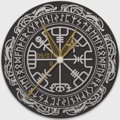
With a rough overview of your publications, I can only give one general tip from a graphical point of view: never use more than two different fonts, including the fonts of your background images.
1 Like
1 Like
1 Like
This is how I could imagine it, for example.
The font fits the theme better and the colors taken from the logo look calmer. Likewise, the pointer in a form that fits the topic.
1 Like
Wow thanks raven, that look heaps better, i cant believe a simple color change and hands made simple could make al the difference.
1 Like
Gladly, as a newcomer I am happy to try to help if I am still at the beginning myself
1 Like
@scottjones1979 and @upgrade-gd
You both seem to be sorting this out nicely, well done guys
And welcome to the Community Scott 
1 Like
I tried a little with your “Norse” … But in my opinion the design is only suitable for a purely analogue display, as accommodating digital displays is rather unattractive.
1 Like