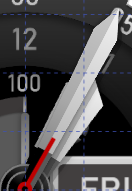
My newest watch
Looks great!
If I may, the only thing that bothers me a little bit are the 2 windows for date and temperature. I would move them out a little to cover the 45 and the 15. But that’s just me…
Interesting that you put the hour hand above the minute hand…
Welcome back to the forum. And a great start, beautiful face.
Especially the hands, good contrast with this background and strong. Solid look.
Yes Tom has right, i agree. You could leave the 45 and the 15 out. When one uses small digits and you cover them partially it looks a little confusing… When you have big digits, i could agree… But you must in any case do your thing and have a listening what others say.
BC
I do like the design and the broadsword hand but yes, @tom.vannes I agree with you.
The hour hand should be bottom always. If you shrink the width of the minute hand to below 200 it fits nicely above.

Definitely shrink the temp and date boxes to show your bevel numbers left and right.
The only thing I would add myself is to identify your content so Temp. Alt+0176=°

And maybe a small indicator on your battery dial.

No criticism on a great design. Just my thoughts and preferences.
Thanks @tom.vannes, @pbervoets, @rob.fisk for the feedback. I will use that when making Blackstone 110, a more refined version. It has been a while!
About hour hand being on top of minute hand - it has been a feature of all my watches since the start!
There is an important mechanical reason why the hands on a Clock Face are in that order . Two concentric tubes and a rod for seconds . It is all down to the gearing . But on these Virtual Faces It is up for grabs . I think it is interesting but I will always want the Seconds on top .