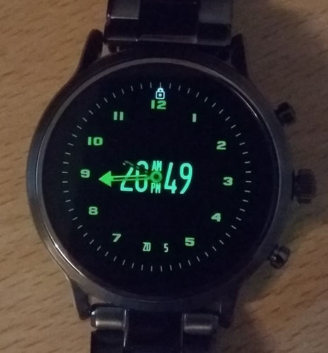
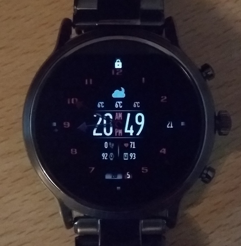
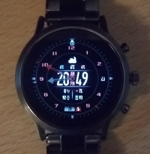
Here’s my last take on “hybrid” smartwatch faces  This one is fairly simple, in that the only “hybrid” functionality is simply the main time hands/needles spin out of the way upon screen wake up. The rest is fairly straight forward o/
As always any comments, suggestions, criticism, anything is welcome 
Update:
- Added Min/Max temperature next to Current.
- Made Digital time be 12/24 based on user preference.
- The “AM/PM” will light up in between the digital hours and minutes accordingly.
- Cleaned up the interface/colors a bit.
- Weather Condition icon now shows a Moon at night when appropriate.
- Adjusted numbers placement slightly.
- Improved performance slightly.
- Replaced the “3” with a
Seconds box (it’s still a 3 in AOD mode).
- Improved performance by another bit (lag due to element count is killing me…).
Note on “Performance”: I like to keep my watch faces as dynamic as possible as far as “elements”/“layers” goes, so instead of one big baked background image, it’s usually a ton of elements that simply makes it easier to tweak and customize… However as I’m starting to learn, there is a cost to how many elements you have, and that cost is the watch face being rather laggy/clunky once downloaded to an actual watch.
So now I’ve been trying to consolidate a few different elements/layers into a single one using images, so as to find a middle-ground between everything is one image and everything is its own element. The result is the watch face is now quite a bit smoother, but, it is still kinda laggy. I apologise for that 
New B model; slightly fancier/busier 
5 Likes
Great job, nicely done for the beating heart 
1 Like
As a designer wannabe, I can appreciate the effort you put into balancing visuals, features and performance. Looks good!
1 Like
Thank you! It’s good to hear those things may mean something to anyone other than myself  A hint that I’m not just wasting my time
Right now I’m working on the next bit of performance boost; the custom weather icons are using “duplicates” with their colors set to pitch black to simulate a “shadow”, just because, you know… easiest way to do that lol, but now I’m baking the shadows straight into the images, so that will be -2 elements in a short bit. It’ll at least make up for the couple new elements to display the seconds in that box lol.
Okay there it is. It’s actually a lot smoother now, at least from the very first version I published lol. Merged quite a bunch of “layers” into single images where I could and where it wouldn’t make things just unnecessarily more difficult to deal with. I think this is as good as it gets unless I wanna start outright removing elements/features 
Nice features, it runs smooth on my Fossil Gen 5. It is however too dark for it…
I can’t see the minute hand in dim view, and barely in active view.
The shadow on the date is also too dark on my watch.
I have mine set to 24h and both AM and PM light up, I don’t know if this is intended.
I like the hands spinning around when triggering active view, been messing with that as well, but haven’t got fully to it yet.
All in all, a nice complete watch face.
1, 2- You don’t have to make me an alt version, I got this watch last Christmas and I’m experimenting with Facer myself. I’m changing watch faces like every 20 minutes 
Here is how it looks on my Fossil with auto brightness (not the exact colors, but the contrast is as in real life):
3- Ah, ok, as a 24h user, I wasn’t expeting an AM/PM anywhere
4- You’re welcome
Also, good to know about the performance. I have some watchfaces with a lot of elements. So far they run well on my watch but are starting to become a nightmare in the editor (both performance as well as organizing them).
How does one go about testing them for multiple watches?
OH, I misread what you wrote, I didn’t see you mentioned both AM and PM light up lol, that is definitely not right xD I’ll look into it, thanks! (and for the picture that showed it to me xD)
I’m not sure what’s happening on the 3rd picture? is it just the brightness cranked up to max? But yeah that’s all very odd, especially that hand in AOD mode… that should be a tone of green, not almost black 
I’ll look into all of this tomorrow (it’s 11pm here in Spain :P), maybe something I overlooked. Thanks a ton!
Np. The 3rd pic is some auto brightness when i take the watch off.
And same timezone, Netherlands here.
Something may be amiss with the colors of some elements because that hand is just plain wrong lol, but the overall brightness… I don’t know… Just as you see the watch face on this page, it’s even brighter on my Active 2 lol, I wouldn’t really know how to make it fit other watches considering I only have/use this one.
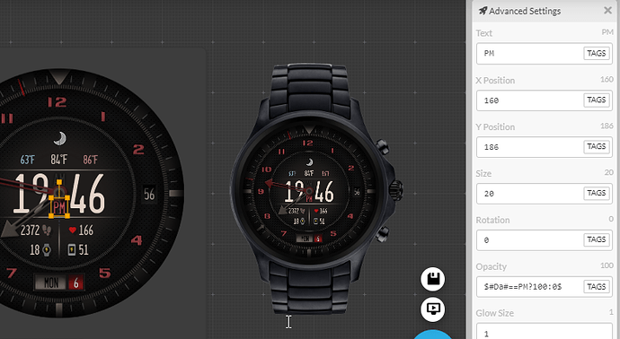
Sooo… not only there’s nothing on my “hands” code or even any opacity to them that could be causing anything remotely similar to what you’re seeing, but the AM/PM “lights” are using a simple $#Da#==AM?100:0$ code (reversed for PM); there is no way both of them could be active unless something’s wrong either with your watch, or your connection to it, or… maybe the companion app on the watch itself, I’m not sure… – If it is something I’m doing wrong, then I don’t see it, completely blindsided lol, so I apologize in advance, but, yeah, not really sure what’s going on. Sorry Mattie 
Edit:
Maybe it’s the “glow” value? Which I’m using as a shadow rather than glow, so the glow is pitch black, still doesn’t make sense how everything else seems to be a lot darker for you, except for the one pitch black thing appearing super bright xD But I’m willing to test that later when we’re both on, if you’d like.
The issue is localization, on my watch it is a.m. and p.m., not AM, PM. You should use #DH#<12 instead of #Da#==AM and #DH#>=12 for PM
Oh! That didn’t even cross my mind that some watches would type that differently… Thanks I’ll give it a go right now.
Edit: There it is @ThaMattie – see if that’s working better for you now? it should!
Thanks for that tip again, Mattie 
New B model release 
 This one is fairly simple, in that the only “hybrid” functionality is simply the main time hands/needles spin out of the way upon screen wake up. The rest is fairly straight forward o/


 (and if you don’t mind, I’d like to see a picture if how it looks for you, if you don’t mind?)


