I would like to make an appeal or invitation to all watch face creators, partners or not.
I often see watch faces that I really like and try to download them to my watch, but once I have them on my watch I have to delete them because they are unusable.
Why? Simply put, they’re illegible because the fonts are too small.
Hence my appeal/invitation. Dear watch face creators, please also think of those who are no longer twenty and no longer have the eyesight of a hawk. We exist too. I don’t even want to wear reading glasses every time I have to check the time.
Thanks to anyone who accepts the invitation/appeal.
12 Likes
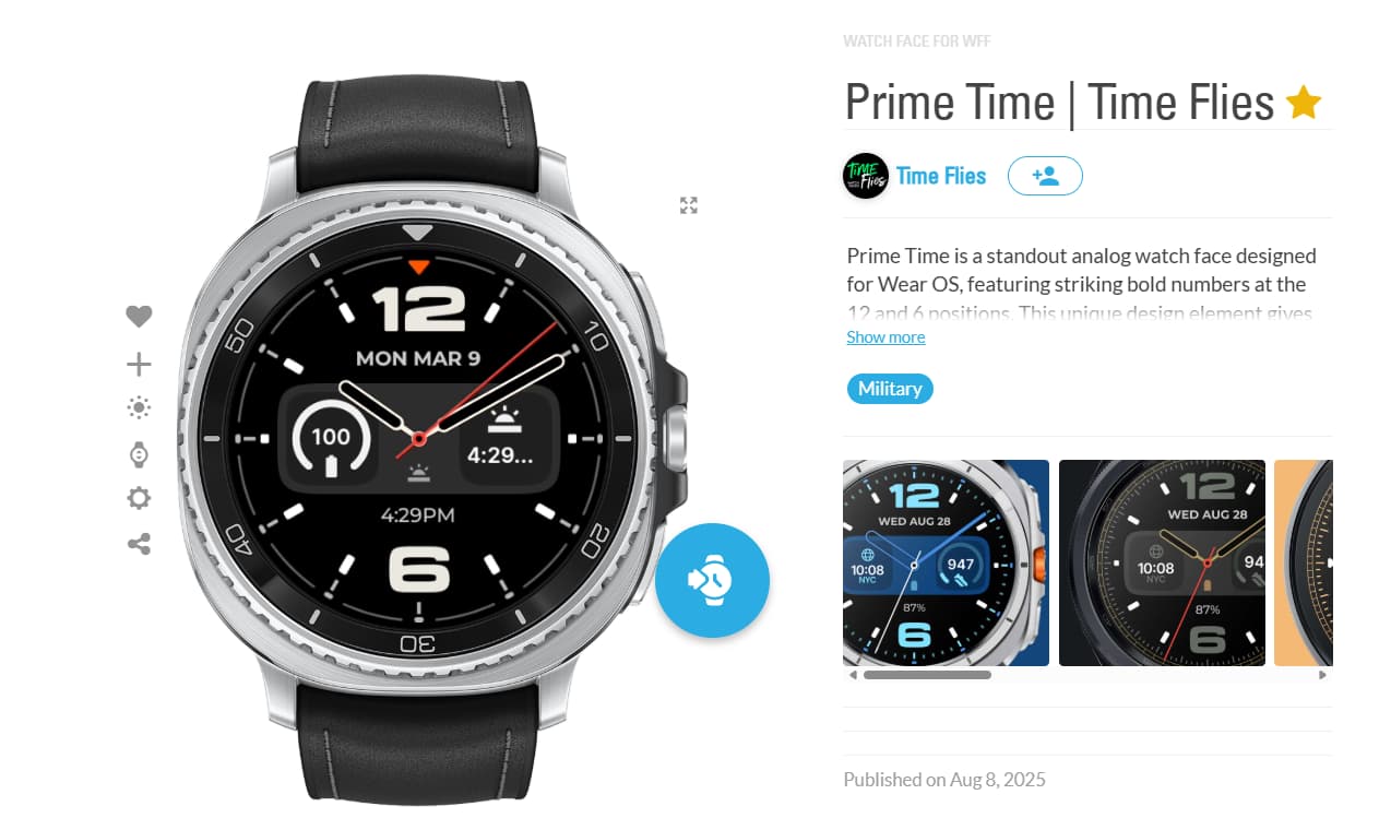
I use this one all the time and it suits my eyes just right ![]() Time, Date, and Battery, simple.
Time, Date, and Battery, simple.
3 Likes
I agree 100%
4 Likes
It is always compromise between readability and amount of information on the screen.
I assume that for analog time glasses are not needed. Also some faces have really big digits
Then it is question what else info do you want to have permanently on screen.
It also can be made so, that the info cycles.
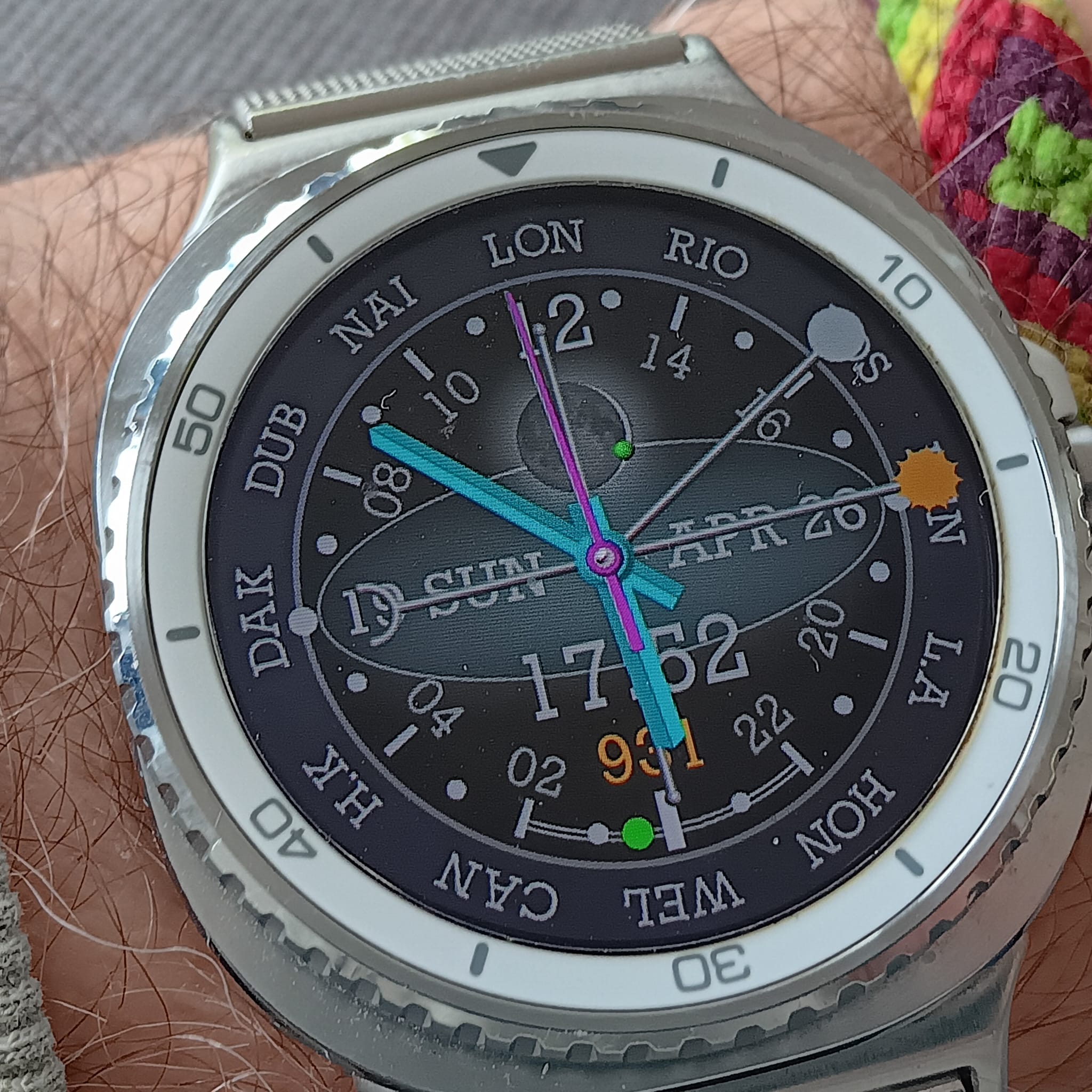
Is this too small?
3 Likes
3 Likes
This is my Personal Face . I like to be able to read the Digital without my quite strong glasses . I am an analogue person really so it is easy for me to read most analogues .
As Peter says it is a Balance between a mass of data and readability .
.
3 Likes
@diavo
I try very hard to make all my faces for us older people. I’m 70 and I want to be able to wear any of the watchfaces I make. This is just one example of my “for older eyes” style of watchface.
3 Likes
This my watch i wear at night …
And this one if I dont remember what day it is ![]()
4 Likes
Well, I like to use wheels for dates and such because it translates well into my HTML versions. This one has fairly large date numbers -
This one used fairly large numbers as text fields.
Me, I like big easy to read time and leave all the rest of the date to easily accessible tiles.
3 Likes
I try to make all mine easy to read. I no longer have 20/20 vision either.
3 Likes
Thanks to everyone who responded, some of whom provided examples of very bold watch faces.
Well, I’m 75 years old and I said I wear reading glasses, not that I’m half-blind.
I have 12/10 distance vision and wear 2 diopters reading glasses.
I agree that often, perhaps too often, illegibility is due to too much information being included. I’ve often wondered if it’s worth including more information than a dial can hold. But that’s another story. Of course everyone is free to create what they like.
Me too, like @russellcresser, I’m for analog or hybrid watches. A few rare attempts at fully digital.
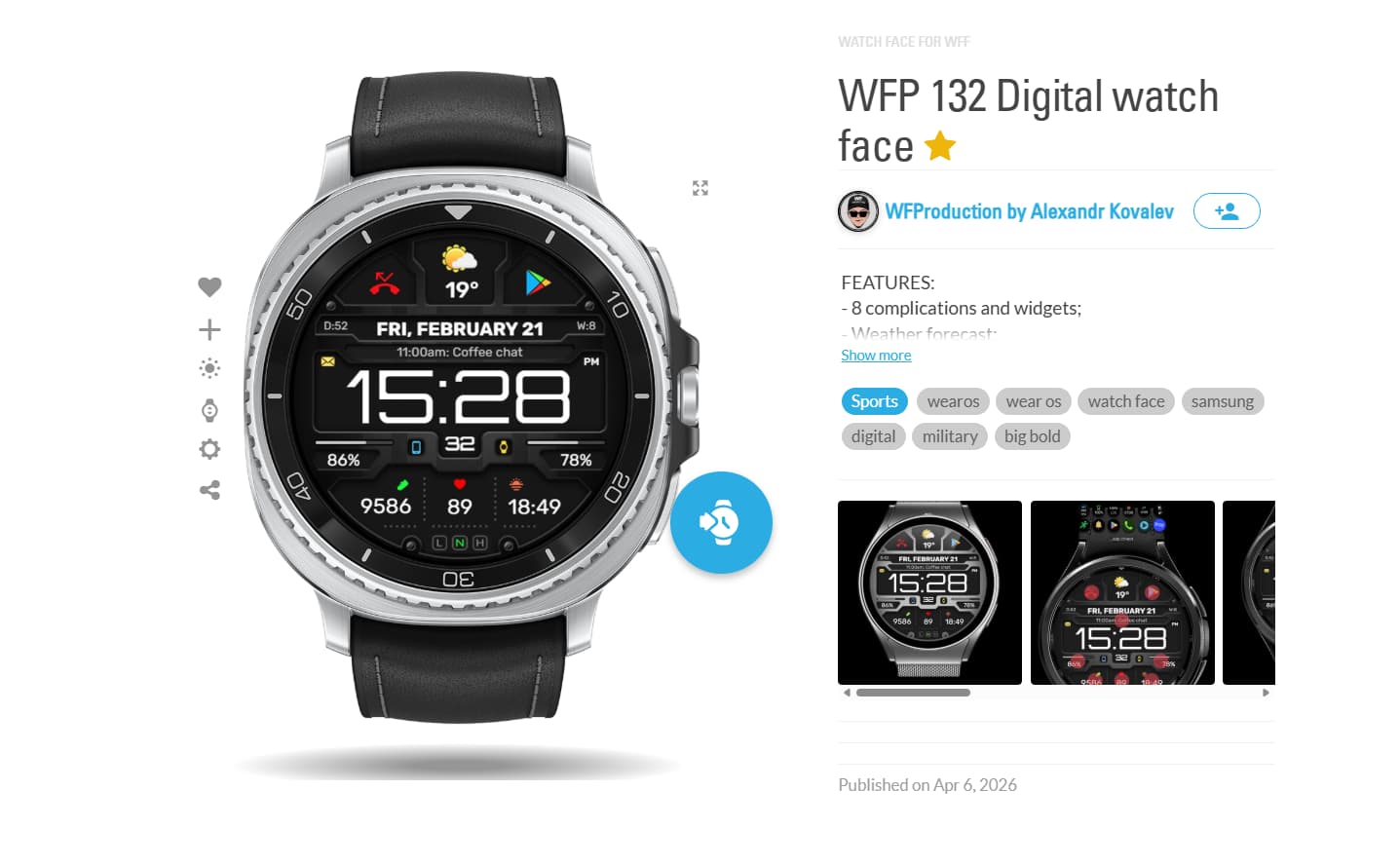
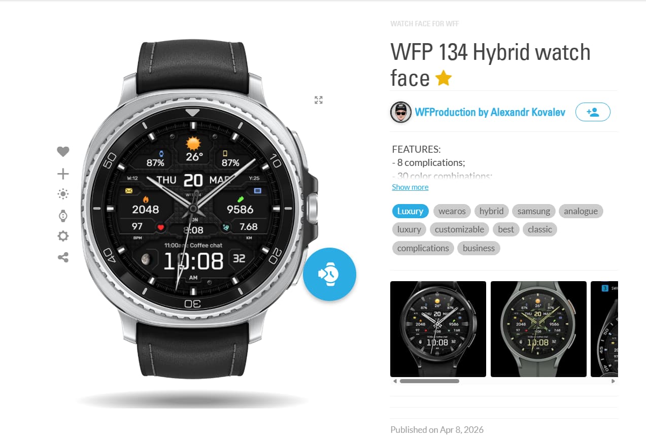
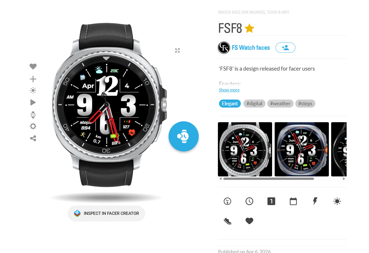
Just to give you an example, here are some dials that, in my opinion, strike a good balance between aesthetics, information, and readability.

2 Likes
Yeah I find the Small stuff on those is too small for me .
1 Like
It’s interesting that your own designs all have super tiny complications.
1 Like
I prefer Analogue faces because when I take my glasses off I can’t really see the largest of digital fonts. I usually wake through the night once or twice, and wanting to know the time I wear my watch to bed, analogue ensures that , although blurred, I can make out the time.
I reuglarly wear this one
Or this one for that very reason
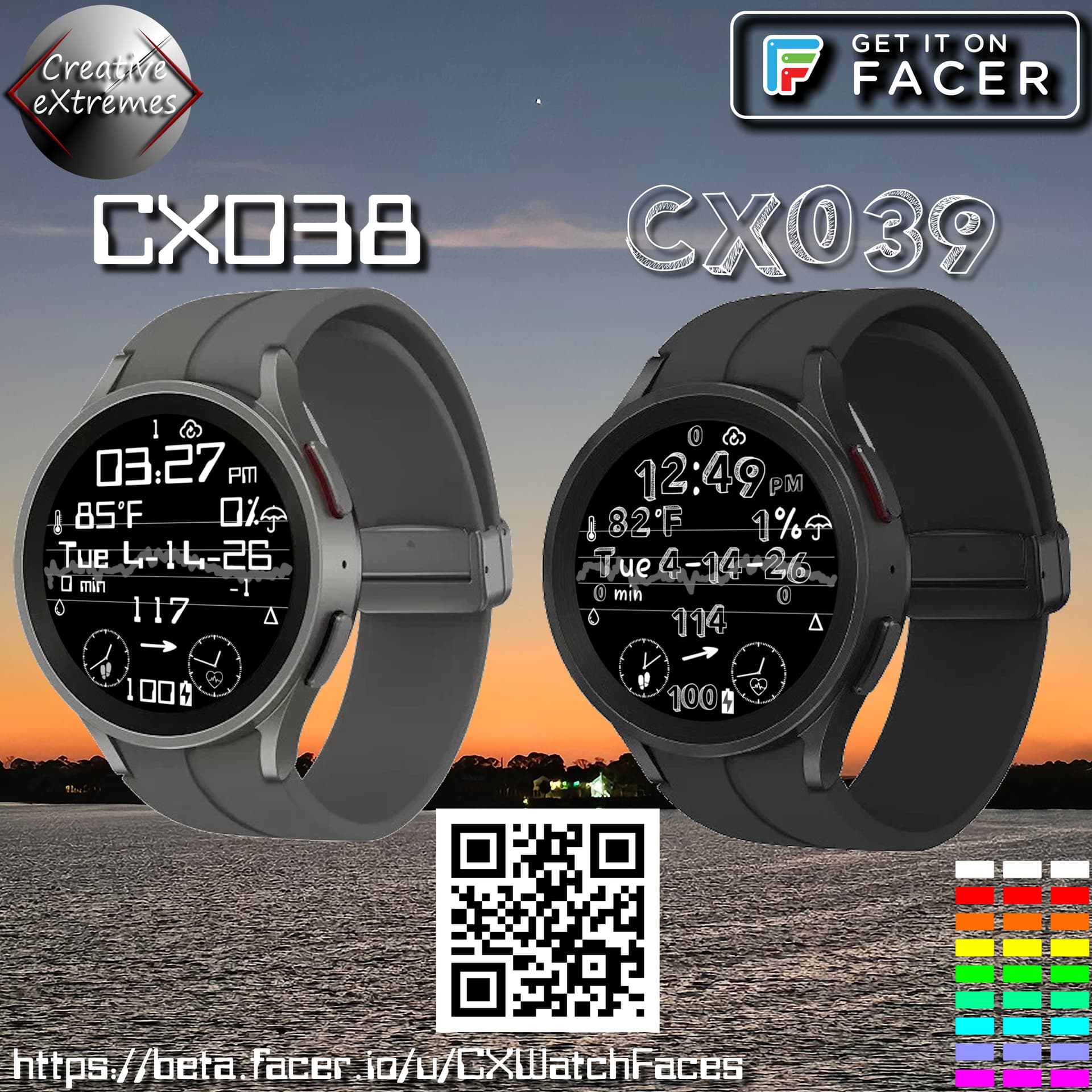
CX038 - Creative eXtremes - CX038 ʷᶠᶠ - watch face for Apple Watch, WearOS, Galaxy Watch, Pixel Watch, Huawei Watch, and more - Facer
CX039 - Creative eXtremes - CX039 ʷᶠᶠ - watch face for Apple Watch, WearOS, Galaxy Watch, Pixel Watch, Huawei Watch, and more - Facer
1 Like
I make a bunch of easy to read faces since I need glasses as well, but also stuff with tiny info for everyone else.
2 Likes
Never forget your Tik Tok using, Tide-pod eating, looks-maxxing market. They don’t need reading glasses. ![]()
![]()
![]()
![]()
1 Like
IS this ok mate
2 Likes
Haha, I love that!
3 Likes
Look, unfortunately, I can’t see very well up close anymore, either, so I set all my faces for maximum readability even without glasses.
This certainly makes them less appealing. I also make them for personal use, specifically for readability reasons, so they’re not very well-made or graphically appealing.
They’re all free; if you find one that shows the data you’re interested in, feel free to download it.
Bye
3 Likes