Whenever I do one of these types of faces using pictures for the digital display it takes a long time getting everything working together. But the outcome almost always is worth it in the look of the digital display.
I count about 64 Layers there so Far. Beautiful Font . I love the way it tis there but it is not . Will you please dump those Facer Icons :::)))
OK fine, I’ll dump the icons since they seem to bother everyone so much! 
They are just so shitty compared to the rest of the work . Some shiny bits on the Steel would be nice . If you want me to make some shiny bits I will have a go . I think the Lightning is ok but in 3d . I like the two Shoes for steps .
I’m just going to go ahead and publish it like it is now. I’m just making watch faces for my own entertainment. There comes a point on every watch face where it starts becoming work instead of entertainment. I think I’m at that point on this face now.
I understand Entirely . I some times try stuff that makes me feel clever . I always come up with the same Answer :::)))
I like that one also … Might even look good in a shiny Purple smiles
OH NO! Purple again!?!? 


I know exactly how you feel there!
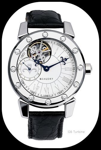
One of the faces I made is a recreation of an expen$ive watch I am quite familiar with and had seen in person. I did it for the entertainment and because I wanted to figure out how to handle a visible balance wheel (which was a pain). It was complicated because it’s from a former employer who has been in serious litigation for quite some time (which means I can never publish it) 
@kourosh. If you are not going to make any money and mention the owners name. You are covered by the Educational Lisence to show an artistic representation of the Watch Face. You are just teasing us now. At least you could show us a picture here.
I can’t post the recreation because of ongoing litigation (per the IP owner’s lawyer), but no issues pointing to the watch itself:
Below is what I had been experimenting with for the balance wheel. I originally started with a 10-frame animation, but I wanted it to be in sync with the second hand and started experimenting with various different ways of rotation. Anything faster than this (once per second) didn’t look good on the GW1 so for now I’ve stuck with once per second. I also wanted the spring to compress and decompress. Inspection should be on.
Wow. I think for me the hair spring compresses a bit much. Jolly good.
((sin((#Dsm#-#Ds#)*6.28318531)*10)+70)
Yea, those values leftover in the test face were high. I have lots of Excel spreadsheets playing with numbers for this and other face related issues (like tachy and telemeter scales).
The final values I ended up liking are actually very close to what you posted above: 10 for amplitude and 65 for offset, spanning the spring’s size from 55px to 75px: ((sin((#Dsm#-#Ds#)2pi)*10)+65)
I just ran another set of tests for the rotation frequency on the GW4 (it is faster than the GW1). I still prefer the smoother motion of 2pi even on the GW4. With 4pi it’s choppy, and 3pi just looks goofy besides stuttering.
Yeah Excuse me for being Cheeky . At the end of the day It is how it looks on a watch Big and Small Look different . They have rules in Cinematography about how fast stuff crosses the screen . Nice to be able to tweak the Variables on the Watch . 
No cheekiness detected! And yes, it’s all about how it looks, which is why I wanted it to be in sync with the second hand. My remaining issue is the moire of the spring, probably need to tweak the thickness/color/etc of the spring to minimize the effect.
Unfortunately you will have to make the spring thicker and a little Fuzzy . Excuse me again I have cloned it . I have made it white . I think there is a chance to make it a less distinct colour and opacity . I feel if there is something moving correctly there it does not have to be horribly Distinct . You are Telling a Story not Building a Monument . I am supposed to be doing something else but I will do a quick test of what I am talking about . Your white Background does not help .
I got the spring rotating . The spring is a bit more of an Impression here . Still a bit of a moiré pattern .
