Nicely put together but I’m not sure the Hands go with it 
I know what you mean. I Go through the watch hands that I have saved and usually pick the first one that looks “close enough”. This one wasn’t quite right. Hopefully the hands I replaced them with look better now. 
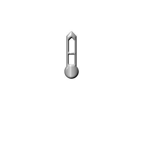
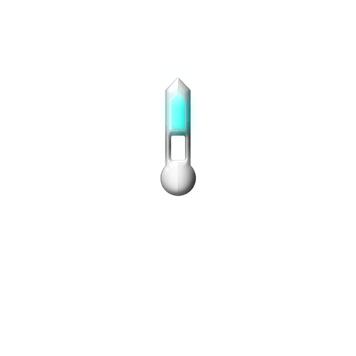
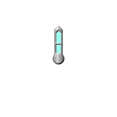
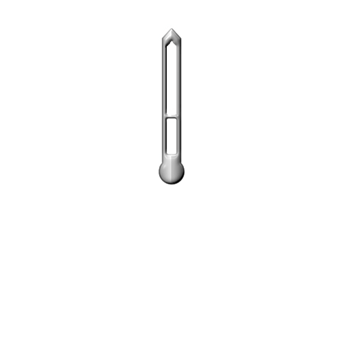
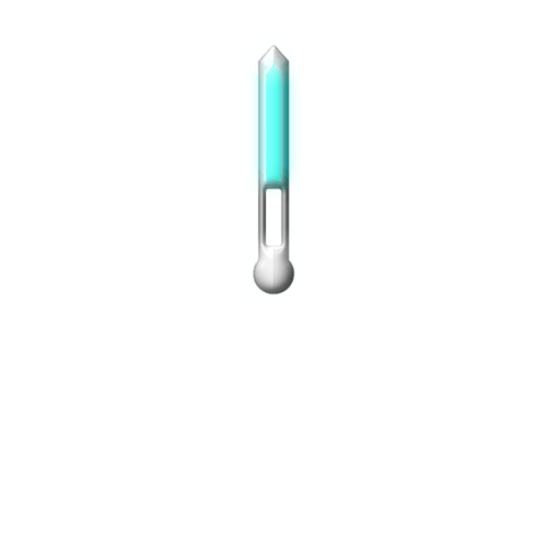
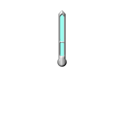
They do look better yes, but do you mind me suggesting filling the tips in with a blue colour like the background? Or maybe even use Hollow Hands like these -
Hour Hand:
Minute Hand:
Nice! Now that you have posted them, I’m going to “appropriate” them!  Thank you for making them available!
You’re welcome, I thought I’d posted them before, but I just added some colour: you can obviously do whatever you want with them.
I changed them to the hollow versions of your hands. I do think it looks better. I like using hollow hands whenever possible because of not hiding the element writing below the hands so bad. I also have “favorite” styles of hands and a lot of non-favorites. I’ve added your hands to my favorite list. 
Nice, I think they’d look good in Black too, or a darker Grey at least.
If the background was all the same as the top half I would agree on the darker hands. With them having to cross over a black background for the hybrid portion that would make them much harder to see. I’m just trying to split the difference and find a happy medium.
I also added my AOD dim mode cover below the hands to make the background darker and the hands not darkened in ambient mode. It makes them stand out much better that way.
Excelente trabajo @Mr. Antisocial Guy
