And now for something completely different. ~Monty Python MAG 1502
First of all, good work.
The upper part of the clock with the light grey is on the same level as the rest of the clock, as is the lower digital display…There is a lack of spatial depth.
Only my personal opinion
Otherwise NICE
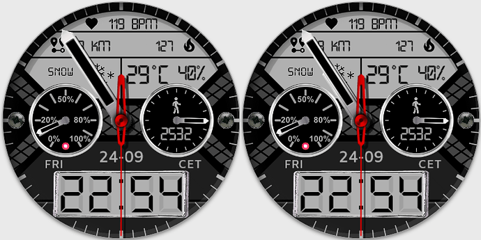
I hadn’t noticed that, but now that you mentioned it I can’t un-see it. I went back in and added some shadow to the upper LCD area to give it that depth. It’s sometimes amazing how you can look at something and not see it. 
simply looks better 
Very nice Sir, impressive even 

I always liked hybrid watches. And this one combines well rich info with simple analog time.
What I like not that much, is that the biggest info is redundant one, and the bottom time display “border”.
 but that’s just me. (I have seen, you can do better
It’s a nice watch face, the preview on the forum doesn’t do it justice. It looks better a bit bigger.
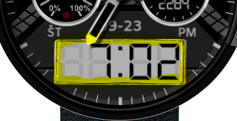
I would also like to throw in my humble opinion on something… I’m not a fan of the minute hand being wider than the hour hand… It feels like it is just an upscale of the hour hand now, and when the minute is above the hour, you can’t see the hour anymore:
Nice work! I like it… Cheers Rich
I used premade hands that I have saved and stretched the minute hand to be closer to the edge. By doing it that way I was forced to make it wider also to keep the “drive” end rounded. I wasn’t paying attention to how wide it was compared to the hour hand. Just another instance of me looking at something for a long time and not seeing the obvious…also probably won’t be the last time either. 
UPDATE: I went back and made the hour hand larger to more closely match the size of the minute hand.
looking better 
