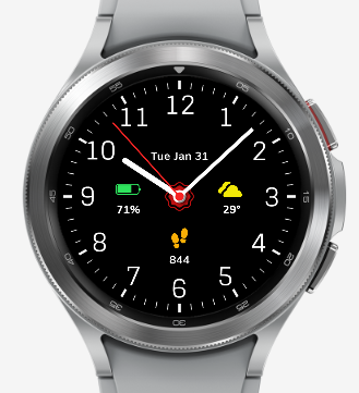
Please have a look at my first watch face. Any suggestions appreciated. Thank you.
2 Likes
Nicely done - congrats. Here are some considerations/suggestions for you:
- Make the text font bigger.
- Add heartbeat next to steps - and maybe eliminate steps? Seems to me people should care more about heartbeat than steps.
- Be aware that anything shown in white uses 3 times as much battery power as the same thing shown in red, blue, or green. I used no white in my face and I get around 4 days of battery life even though I use the Running screen for 30 min. every day. (Bold&Brave3)
- Change the Z value of of the hands to be below text/icon objects. The hour numbers and tic marks should be at the lowest Z value.
- Lengthen the hour & minute hands so the minute hand is just short of the hour numbers.
2 Likes
Normal display looks great, but yes, larger text would be better.
AOD: definitely larger text again, and the Font for the Digital Time should be changed as well, just my thoughts though, it’s your Face remember ![]()
1 Like
That is interesting. I had a request for the exact opposite. The request was for a digital watchface with an analog AOD mode.
2 Likes
Looks great. I was actually thinking of trying that with all my faces. Just a basic digital for aod. Much easier than configuring a busy face with a lot of compilations.
1 Like
Because the AOD on my Active was Rubbish I never Bothered with AOD and just plonked a Big Digital in there. Now I have had a look at a GW4 I am behaving myself a bit better but still think a Digital is best in ECO/AOD/DIM mode. I wonder if there was a MAG Poll on the popularity of AOD :::)))
2 Likes
No, at least not yet, but…![]()
![]()
![]()
2 Likes
I will be Very Interested . A nice AOD is like Making Another Face . I did Feel it a Waste of time . There are still issues even on the GW4 but it is so much better on there .
1 Like
I have been very inconsistent in regards of AoD. Sometimes I let there just the main digits or hands, sometimes I just placed shading layer over the background to make it bit more dim. Once I even made analog dim mode for a digital watch on direct request. I am still searching for my truly preference, as I do use the dim mode very seldom. My suggestion would be, if you use some info on dim mode, place it close if not on same place as in the active mode.
1 Like
I just posted an AOD poll on the Facer Facebook Group just to see what kind of AOD use that people expect from their watches. You can find it here: Facebook AOD Poll
2 Likes
I do not use and will not use facebook - it’s a matter of priciple for me. However, all my designs have a digital AOD be they analog or digital. I am also interested in what other users do - could you please post your poll results here too
1 Like
Here is a screen capture of the poll with all the options currently. You will have to open it into a new window or tab to really be able to read it.

2 Likes
Good Poll ![]()
1 Like
Firstly, extremely sorry for not being able to reply you since I was away from my hometown. I really appreciate your valuable inputs.I’ll surely try to avoid using white color. I’ll check the Z value of hands and keep it at the lowest. For your last suggestion, if I lengthen the hour and minute hands, then one would not be able to differentiate between the hands based on the length as in case of traditional watches.
Sorry for not being able to reply you earlier.I would definitely increase the text size as this has been suggested by lot of our friends here. I have selected this font for digital time on purpose. As far as I know, this kid of font (dotted fonts) would reduce the risk of bur-in. Anyways, thank you for your time and suggestions.
1 Like
Sorry for not being able to reply you sooner. My purpose was to create a traditional looking watchface and hence this design.
1 Like
Thank you.
1 Like
Sorry for replying so late. Thank you for your suggestion.
1 Like
I guess the suggestion was to lengthen them both, so that they reach closer to their values - minute hand should end close to the minute marks and hour hand close to hour numbers, like that they will
1 Like