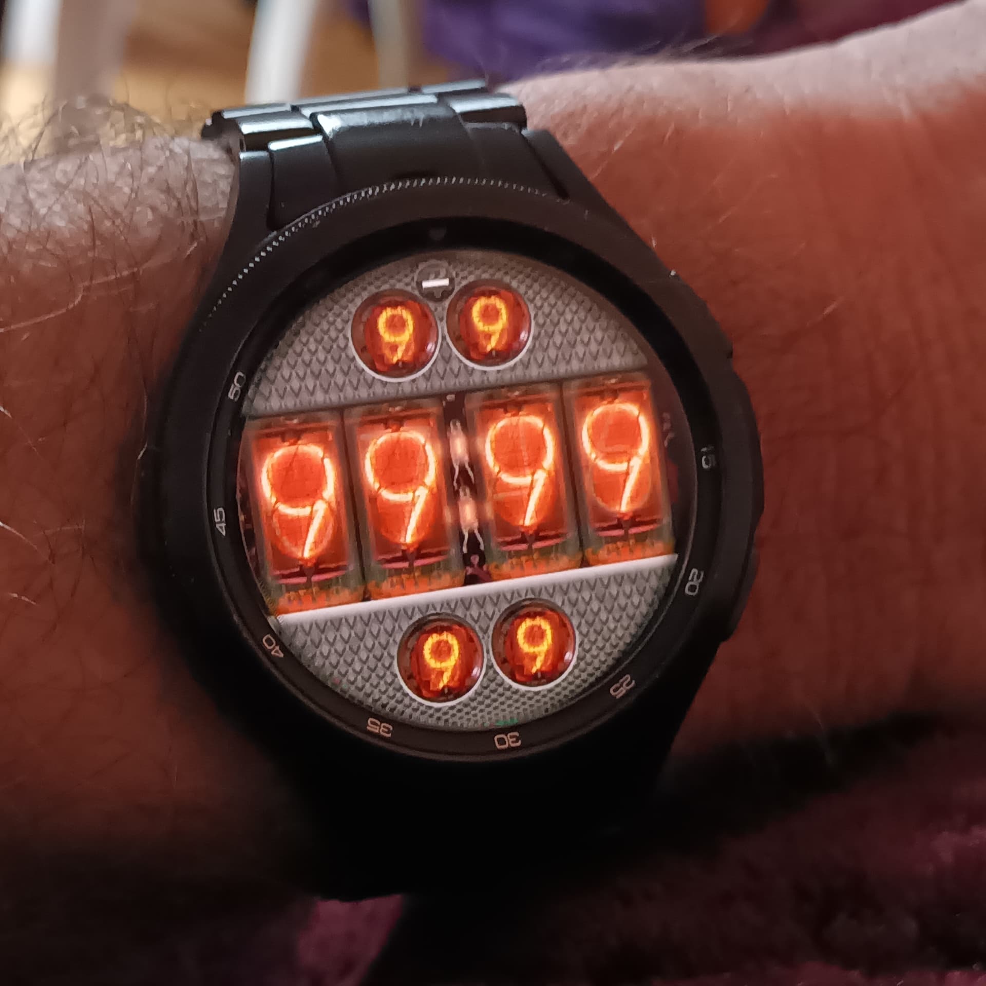
Hello, this time I used images instead fonts, but somehow I cant get satisfied with the dull look of the main tubes in compare with the small ones. I guess they would need some sharper fake shine effect, but I am not good at making such overlay.
Battery level is in top digits (at 100% the logo lights the P)
Date is at the bottom.
I guess the overall resources size stored in the face could be huge and some kind of counter on the creator page would be nice to have some overview when adding more and more images to the scene.
6 Likes
It is not Important to balance the lighting of the Different tubes. They were notoriously difficult to balance. Your Tube test on Wake is stunning. I hope you are vrry Proud of that.
3 Likes
Looks pretty good to me. Yes, the shine is something I’ve been trying out too. One of the reasons why I did not publish mine yet. I like your wake-up number thing there, nice!
2 Likes
Thank you guys, I had this unfinished since my first nixie attempt more than half year ago.
Just went impatient once it got noticed on my other post recently.
2 Likes
In your comment on the Watch Publication you say you feel you could have done better with the Graphics . That is classic for a true Artist . I would be interested to know how you think things could be improved .
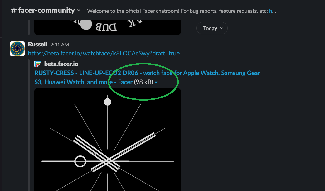
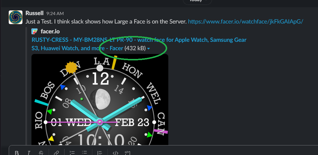
One way to check the over head of your design is to post the Link on SLACK . IT shows a number . The BIG on here is getting near the Limit as it takes a while to Load . I added some more stuff to it and it started to get a bit Crashy .
.
.
.
.
.
.
2 Likes