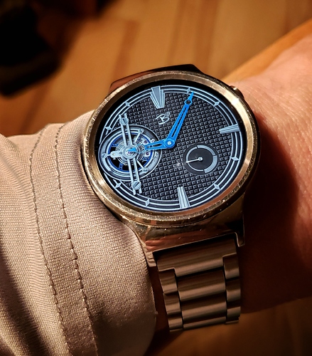
I’m working on a few new designs at the moment including this art deco tourbillon piece. …The one bad thing about the H1 is how exaggerated the case scratches look in photos. It looks almost brand new looking at it in person, but man the light catches the scratches in photos and makes it look like it washed up on the beach!
4 Likes
I enjoy the color scheme of that watch face, especially the blue balance wheel. I also really like the proportions of the reserve indicator as well as the hour markers.
thanks! This one started with the tourbillon and the texture and then it began to unfold with some Deco leanings so I ran with that  It’s got 3 color themes and a Hybrid Mode, but I can’t implement those in Facer yet
