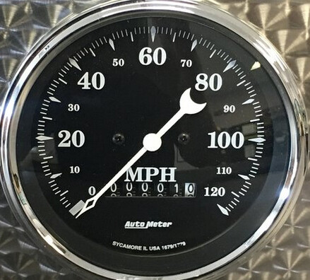
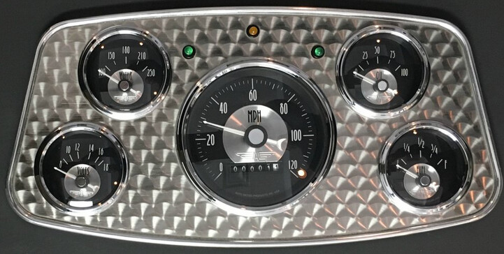
I had this idea to make a watch look kinda like a old airplane dashboard splitting the analog hands to imitate the diff gauges with needles
But the part with the hands are difficult to see
Also I hope to be able to start working on more watch faces …I had to take a small break …had a death in the family and a close friend also passed away … hopefully I will be able to get a few watch faces made for the holiday season
2 Likes
Condolences to your Friends and Family.
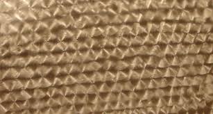
Like the Textures. Every thing could afford to be a bit bigger for us Oldies . A bit mor Contrast for the hands and numerals please . Texture kind of irrelevant in the dial .
Try a bit of glow in the centres Lighter or Darker.
640x640 Glow |500x500
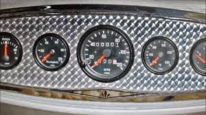
The first look is very nice, and as a whole it really looks like gauges on a board. It is perfectly ok as it is.
My personal notes:
On the second look I notice it is hard for me to read the info.
The small dials do not have actual gauges on them (no marks, no numbers), but more important flat black or grey or white dials background would be more natural, and the unused space around them could be used to make some of them bigger.
Shiny “bling” panels are more typical for old cars than any planes.
But I like this old style of needles, maybe I’ll make me one such one day for my watch
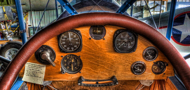
Btw. very old planes had dashboard made of plywood 
1 Like
I’m working on figuring out how to do it all as gauges with hands or needles but I have not figured out how to make it work … ideally I would like to use a gauge look for all of them
Thank you Russell …I am also working on making thinks bigger maybe moving the pods around a bit and mabee changing the shape of a couple but still trying to figure out how to do that
1 Like
So is you background all one Image.
If you are looking for a serious comment here try turning Inspection on.
Here ar a couple of pics that show Engine Turning which is a classic way of finishing Alluminum panels on Dashes and Aircraft Etc.
made a duplicate to try some changes on made it with inspection on
1 Like
Looks good @viperh1020 but here’s my thoughts: maybe add a second white, slightly larger text to all texts, underneath, to add an outline, as the blue you’ve used doesn’t stand out too clearly; and I know the middle row of dials are seconds, minutes, and hours, but maybe include an indication of what they are 