Sure thing. I will think about it in my next design.
1 Like
@ddelote . Part of the Issue is that the Power saving Strategy have changed dramatically in the last 6 months . Before that with the older watches like myself the cell In the watch hardly lasts a day without AOD / DIM on . The old Tizen did not allow you to have an Illuminated AOD face . So yes . Some of the Nice Faces are a bit old now . Any Free Maker will modify their work for you . I am sorry you do not get a response from some Makers . They have gone to I other Platforms and Dumped thier Facer Work . Shame . I am very glad you are getting the most out of your Watch . Sadly I insist on having GPS and Weather on mine . If you are not Syncing Google Faces and don’t want weather Stuff you can switch all the coms off . If you do not use Bluetooth you will not be interested in your steps Either .
1 Like
Tom, you’re the best!
2 Likes
Definitely, only for timekeeping. So aesthetics is important. I’ve got an apple watch for steps if I need it. I appreciate all the input and education. This is a great community. ![]()
1 Like
Tom, I have another ask, can you make the AOD of your “TX-CR76 Speedline IV” the same as the original face as well? Thanks.
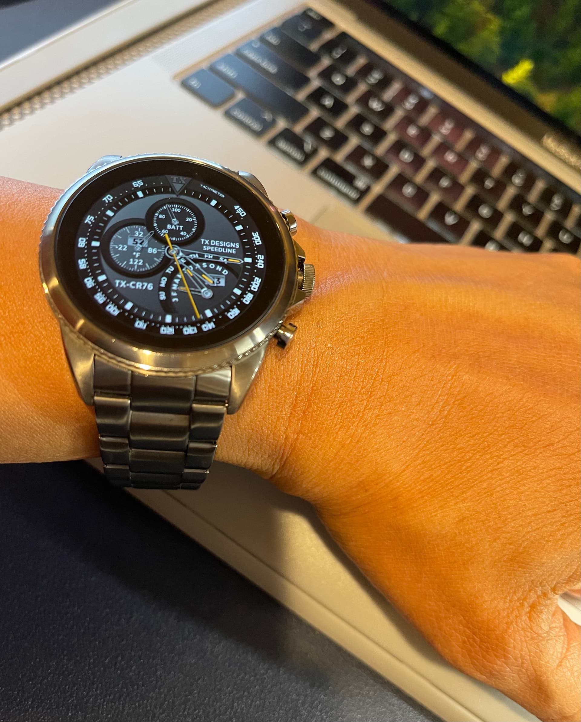
1 Like
In my opinion, AOD should be as minimal and dimmed as possible!
1 Like
Here you go:
2 Likes
I have never quite grasped the purpose of AOD, those that use it, do you tap the screen to display the normal face. I have my watch face set to, wake on wrist turn, but I wonder if all watches have that option.
1 Like
The AOD is there to enable anyone to view your watch face without having to flick your wrist. Could be a big battery drain if the AOD is not oled friendly.
1 Like
I do not have AOD ON . My watch is set to wake on Wrist Action . It can also be Woken with the Home ( Top ) button . Also a Tap on the screen . Facer even seem to have dealt a bit with the annoying jump on Wake . But of course it can never completely go as it is the display on Sleep that it must Display initially . While we are talking about power consumption the last Update on My Watch ( GW4 ) as Brought down the consumption to about 3/4 what it was 3 months ago . From around 4%ph to under 3%ph .
1 Like
You’re the best. It looks super sporty. Thanks again!
3 Likes
When designing a watch face that uses minimal battery power it is important to understand how the watch screen actually works. The key point is that every pixel on the screen (or face) is comprised of 3 sub-pixels: red, green, and blue. The watch firmware controls each of the 3 sub-pixels by applying a separate voltage to each one. The voltage is digitally controlled and in most cases will have a value varying from no brightness (the sub pixel is off because it is receiving no power) to maximum brightness (it is receiving maximum power.) This is the case because the firmware has 256 different voltages it can emit. 256 is the maximum value that one byte of data (8 bits) can contain.
What this means is that the lowest power consuming colors are either red, blue, or green. Any other color (like yellow, which uses 2 colors) or shades of grey (which use all 3 colors) consumes 2 or 3 times the power of a single R, G, or B color. All black, of course, consumes no power because it displays nothing. All white (the Flashlight) consumes the most power because all pixels have all their sub- pixels running at power level 255.
So, if you want to design an AOD face that uses the minimal amount of power you need to do 3 things: (1) minimize the number of pixels used to show stuff, (2) make those pixels red, blue, or green, and (3) use the dimmest value for that color that you think is readable on an all black background.
Many people think that blue is the most visible color for a given sub-pixel power value, but it’s not clear to me this is true. It might have more to do with the actual construction of the pixel grid itself, and this is proprietary data belonging to the screen manufacturer.
3 Likes
I can’t speak for everyone, but green is the easiest for my eyes to see. That is why green “light pipes” on weapon sights and green dot parallax optics are so prevalent in shooting sports.
2 Likes
I know it is a mixed colour but CYAN is Brilliant . Thank you @birkb . I always thought Greys were Economical . On WFS the ON pixel ratio for AOD is 15%. Oh and I meant to say Hooray for Hexadecimal :::)))
1 Like
I can believe that - thanks. I remember years ago I saw a diagram of how one manufacturer arranged pixels on their LCD screen. They used more green ones that red or blue. If I remember right this was called the Bayer arrangement. I sort of think no one really knows how our eyes actually work. Or maybe it’s our brains. Or both.
2 Likes
Color has a powerful subconscious effect on our brains. I read once, that the color green has a very calming effect so that’s why a lot of hospitals and prisons use shades of green to paint walls etc,. Conversely, reds and yellows have the opposite effect creating a level of discomfort. I don’t know if any of you remember going to a MacDonalds in the 80’s but I remember everything was yellow and red designed to get you in, and then just as quickly get you out. Done purposely I would think,
2 Likes
Then of course there is #ccff00 . The forbidden Colour . You really don’t need much of that to get someone’s attention .
1 Like
I’m partial to 00FF00😄
2 Likes
Let us not Hijack this topic . Having too much Fun .
.
.

1 Like
I use #CCFF00 which is called Optic Yellow used in safety vests and #00FF00 a lot. I figure if I need something to be green or night glow, those are my go-to colors.
2 Likes