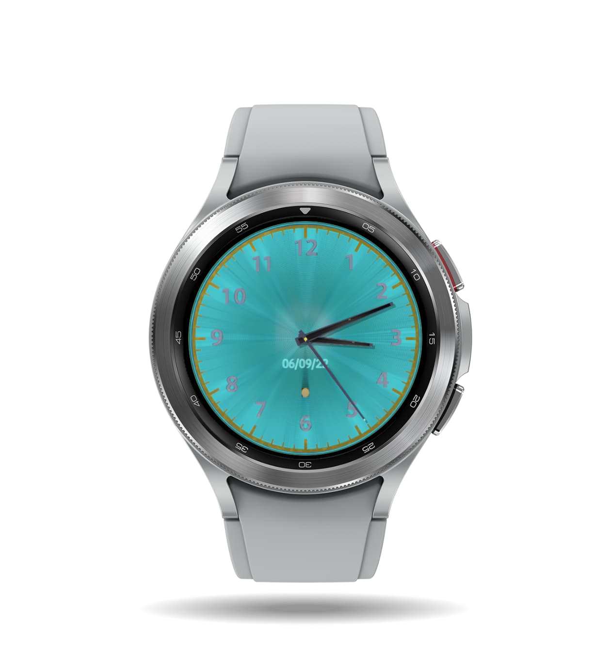
Analog Watch i made with blender, cyan glow background with metallic spirals
3D design thought about how to improve and feed back will be greate ![]()
3 Likes
That looks quite cool, nicely put together ![]()
Maybe add Battery Percentage Text somewhere ![]()
2 Likes
Love the face effect. I think the numbers are a bit hard to read (maybe a darker colour?). Logo is too small too. I had to go into the editor and zoom in to 300% to even see what it was.
If you wanted to get adventurous, you could separate out the layers and have the background effect rotate slightly with the movement of the wrist. It would take your work up a notch… though probably wouldn’t get your more syncs. I speak from experience. ![]()
3 Likes
Thanks for the replies ![]() will surly try work it out if i have spare time for it
will surly try work it out if i have spare time for it ![]()
2 Likes
I agree with the guys here.
The numbers are too dark. Maybe have a high shine to brighten them up? Maybe a bit more darker slim shadow? Is the outer ring supposed to be Gold or Brass/Bronze? Maybe shit that up as well with a bit more of a shadow making it seem only slightly higher?
I also could not make out your logo.
Since it is Analog I would think making the Date a rotor kinda or look? have the rotors maybe be black with white numbers?
Is there some sort of transparent minor thing going on with the tip of the seconds hand having that white tip?
The Rotating turquoise background would be Super Cool if it rotated with your wrist!!
I also like to see my batter % or a meter on my face display.
=)
- W
3 Likes
Yes i need to work on the lighting in the render need to touch up some things, the outer ring supposed to be Gold, and the tip of the seconds hand have a glowing tip, for the background to move with the wrist i just need to do some digging in the docs try to work out the right tags ![]() thank you for the reply
thank you for the reply
1 Like
worked on the face a little more, now just need to figure how to fit the battery precentage nicly ![]()
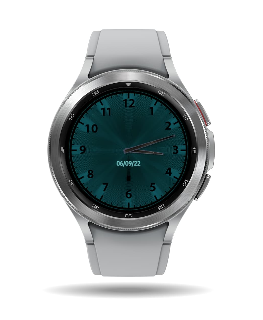
I actually preferred how it looked in the very 2nd pic you posted at the top ![]()
Yes I have to agree. I like the darker slick looking version myself.
I have an idea. Let me grab your picture and do a quick mock to show ya my thoughts and see if they help any.
- W
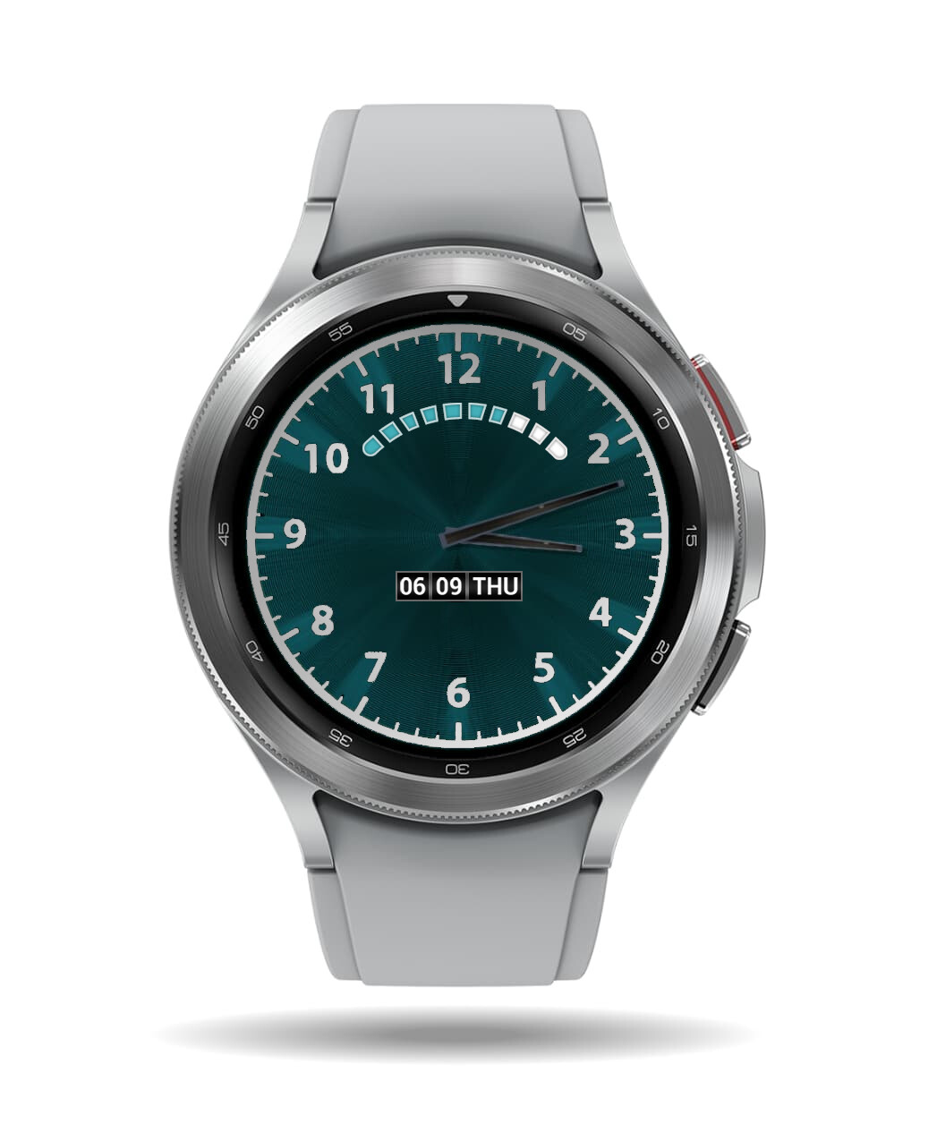
What about something like this? I’m a bit rusty using Illustrator and Photoshop but this is a quick mock-up using your picture.
Hmmm. Maybe even make the hands a different color? Chrome?
- W
1 Like
I’m off for a bit now, but I will say that that looks a lot better: Increase the size of the Date, and make those Hands stand out a bit more too, that’s all I can think of now.
1 Like
Yep!! TC
1 Like
I think this is what ICRLTD4 was suggesting. The Date is bigger and I am a fan of bigger easy-to-read stats like date and battery. For the hands I made chrome to Pop them out.
Hope it helps.
- W
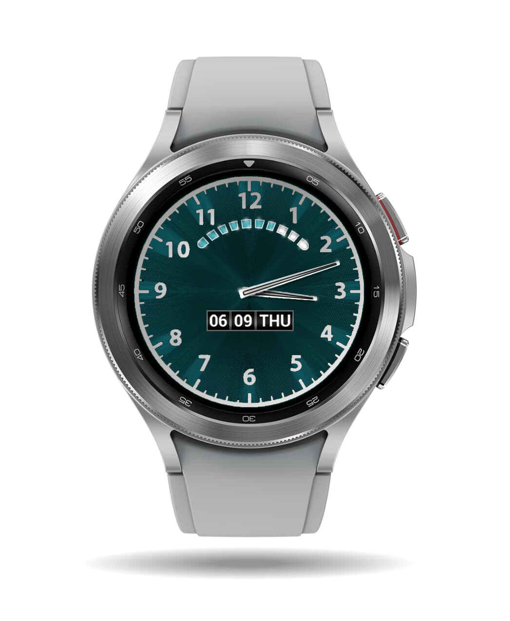
Hmmm Looks nice. I’d need to get a nice metal band for something of this style. =)
3 Likes
Welcome to the Community @wolfkazack ![]()
What you’ve done with this Face there looks pretty cool, nicely done.
Just needs the Logo from @adib4324 to be added just below the Battery Gauge now, or under the Date possibly, but I’s definitely make the Logo larger, with a higher resolution too, to make it more noticeable.
2 Likes
Thanks and I hope Adib4324 likes it or hopefully give him some other ideas to this effect. I would rock this face with the band shown in the picture. They look great together! Also indeed a logo. A logo is like a signature and speaking of logos I need to make me one for the watch faces I am working on… hmm.
- W
2 Likes
Not sure how I didn’t notice this before, but it looks like your numbers aren’t spaced properly. The worst offender is the number 7, but 5 looks a tiny bit off and maybe 4 too. If you look at the spacing at the top of the 12 and the bottom of the 6, there is something off between the two of them too. I can’t tell you how to do this in Blender unfortunately, but I’d look for a tutorial on doing watch numbers. There’s a definite trick to getting them all lined up.
Looking good though.
2 Likes
Thanks for all the replies !
great ideas from all of you guys this is my latest update, implementing some of the ideas
will continue to work on the face in my spare time
3 Likes
Coming along nicely: I preferred the black boxes for the Date though, and I still can’t make out what that Logo is sorry
1 Like