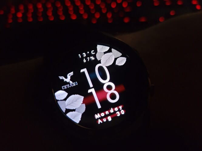
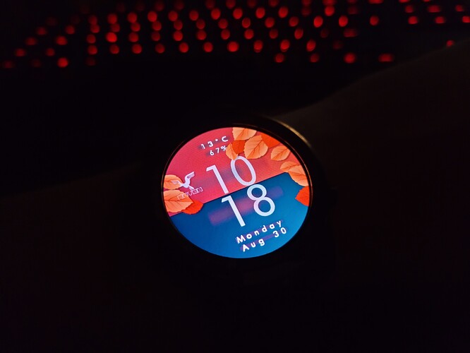
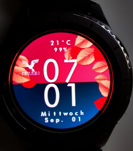
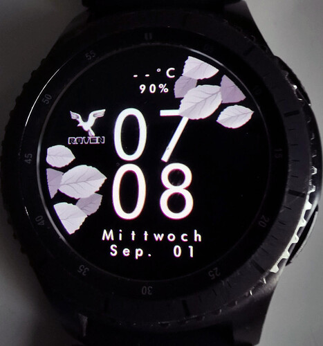
Digital clock in a simple autumn design with date display, temperature and battery indicator of the clock
That’s pretty, and it all works well, nice work 
Very nice, you seem to already have a certain recognisable style where I can see it’s a Raven watch face without looking at the logo. Kudos!
I totally share the way of thinking of my colleagues !!!
Very good your work and way of designing … 

Without looking at your logo, you have your watch face style !!! 

Congratulations!!! @upgrade-gd
Well done! I like your style, and especially color combinations!
Do you have graphical background of sorts?
I learned to be a photographer a long time ago
It was late yesterday so terribly sorry for not responding earlier, but I’ve noticed one issue.
It’s generally a good idea to avoid stroke/glow because of their broken state, at least currently. Until Devs address it, this is how it ends up:
I can only advise another text layer below the original one, moved a few pixels down and right to imitate shadow, or - if you have a font that has an outline as separate .ttf file - to use the outlined font.
Many older faces that you can still find around suffered because of this graphical bug and no longer look anything like in their preview.
Hope this helps because it doesn’t change the fact your execution here is awesome!
Changed that now and removed the shadows.
It’s a bug that’s just affecting some makes and models, so far no certainty why so if you want to have a reliable watch face that works on all watches, it’s good to avoid the two options until this is permanently fixed.
I’m waiting for Facer to address this cause these options are nice to use and bring more possibilities 


