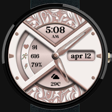
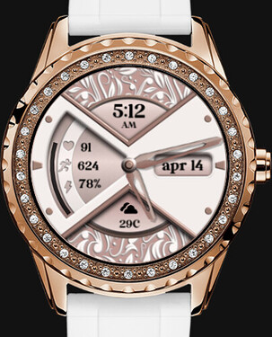
The latest design I’ve been working on.
Looks pretty kewl
Well done
Its very pretty and clean. I would try to emboss or engrave the symbols as part of the frame to separate the display areas little more

Thank you. That is a good idea. I appreciate the feedback.
Nice & clean, well done! ![]()
![]()
![]() . You’ll get lots of syncs with that one!
. You’ll get lots of syncs with that one!
Oh I love that one!
Just so much depth, I love the layers!
(There are days I hate my apple watch…)
I would totally wear that. ![]()
![]()
@alwaysbusy4family Keep your Apple Watch but get a different one as well, so you can swap and change whenever you like ![]()
One of these days I just might. Then I would have to ask y’all which one to get! ![]()
petruuccios. I did the cut outs and published it. Thanks again for the idea.
And everybody else, thanks for the compliments.
I have 2 smart watches. The first is a Fitbit Sense and the other is a Galaxy 4. Change off from time to time. It’s nice to have options.
Well done.
Now I noticed something subtle but maybe worth some attention and update.
The background shapes are casting proper shadows from top to bottom direction, while the hands have only the automatically generated faint diagonal ones from top left to right bottom.
I would suggest to turn off the automatic shades on hands and prepare one set of shadow hands, that you can play with and adjust their angle and opacity to match the background and make the hands to stand out bit more.
P.S.: sorry for expanding it, but I really like the base. What about battery bar in the left “window”?
