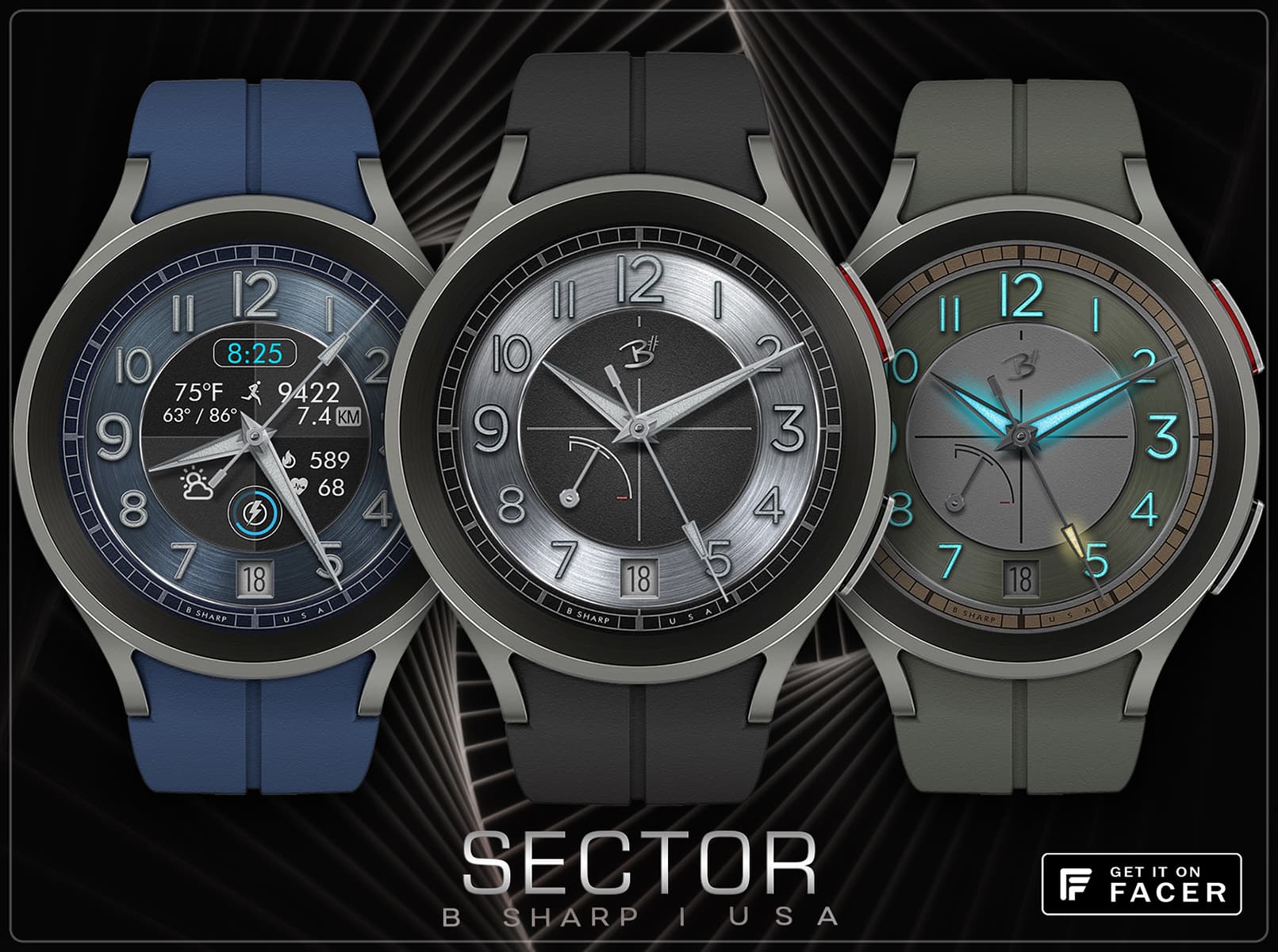
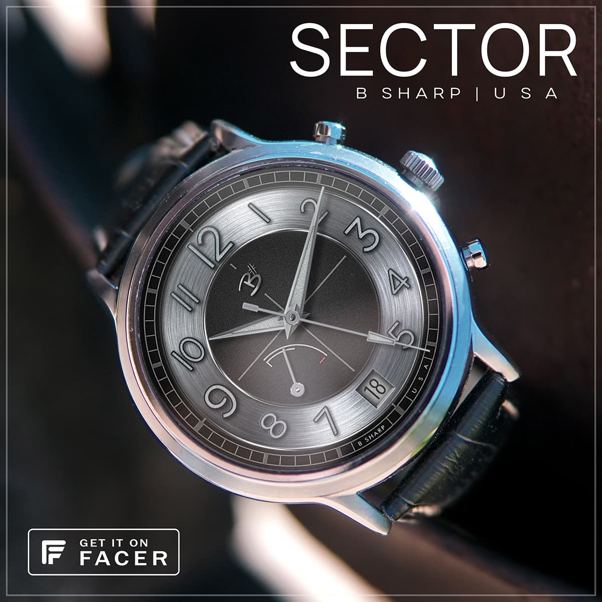
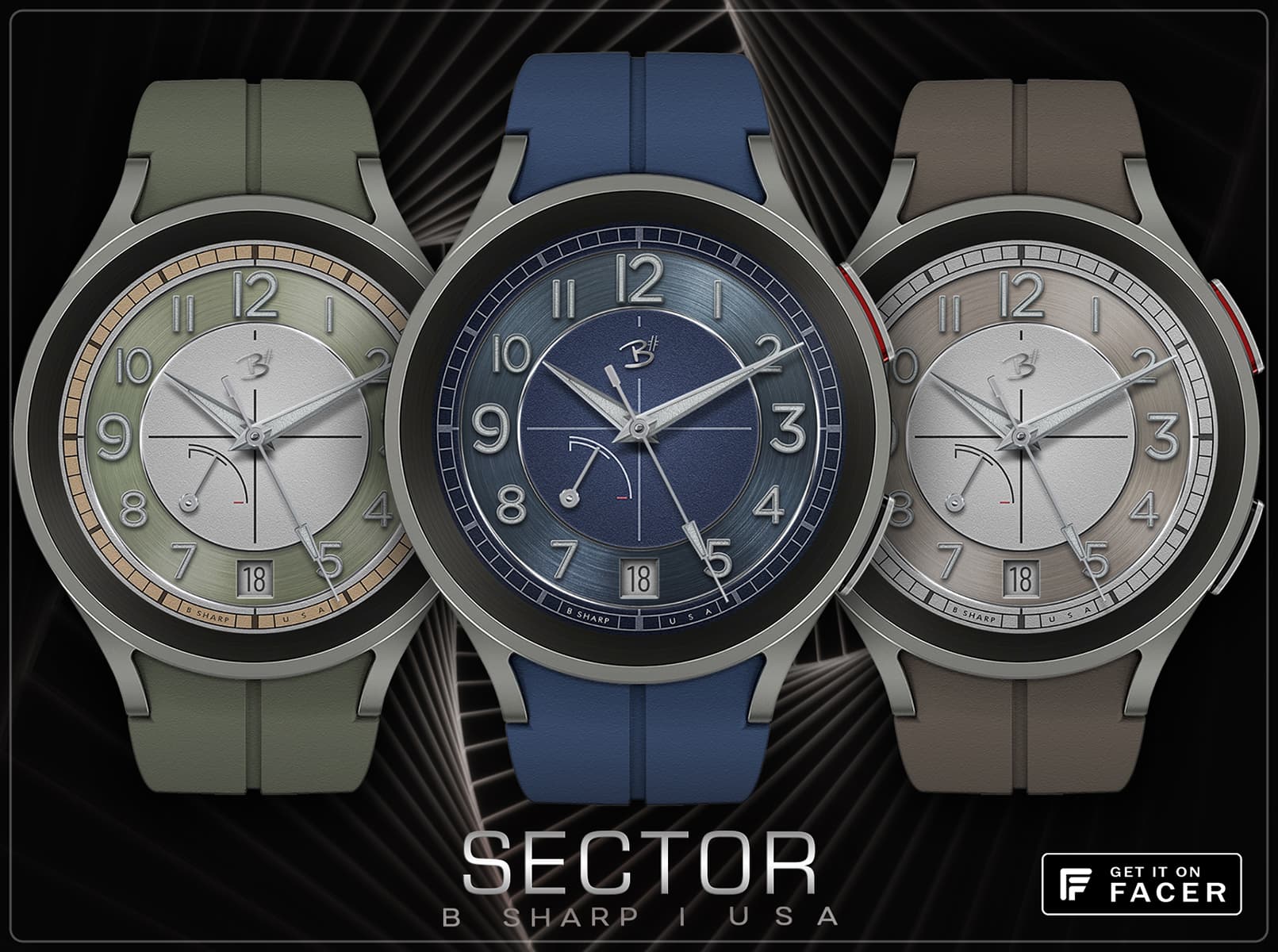
The Sector dial is a classic watch form. I’ve made some faces that had sector qualities, but this is the first design which is intended as a clear entry into that genre.
6 Likes
i find almost all designs really great.
Artistic top league …
I admire the work.
But I would still like to address once what often bothers me.
I always find the additional information quite difficult to read.
Partly because of the font sizes or because of the low contrast, I can’t see the values at a glance.
Well, I need new glasses ![]()
3 Likes
fair enough! I am amazed at how small the info is on a lot of very popular watch faces. I myself am like you and struggle to read if the fonts are small. I used to always use larger text in my Hybrid Modes but have gradually reduced it because a) it allows for more info, and b) allows for more design with placement/framing rather than purely utilitarian. As I make faces for myself to use, I have to be able to read the info or it’s no good. So for me this one is not a problem at all (with my readers on ![]() ) so it passes that test. And it’s still a lot larger than many of the designs that populate the top 10 charts. It’s always a balance though, trying to find the best look without sacrificing practicality. Appreciate your input!
) so it passes that test. And it’s still a lot larger than many of the designs that populate the top 10 charts. It’s always a balance though, trying to find the best look without sacrificing practicality. Appreciate your input!
4 Likes
Great work as always!
2 Likes