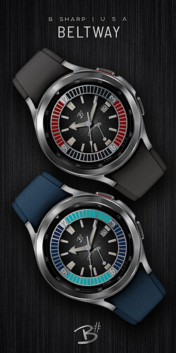
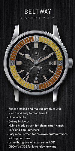
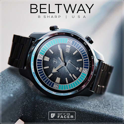
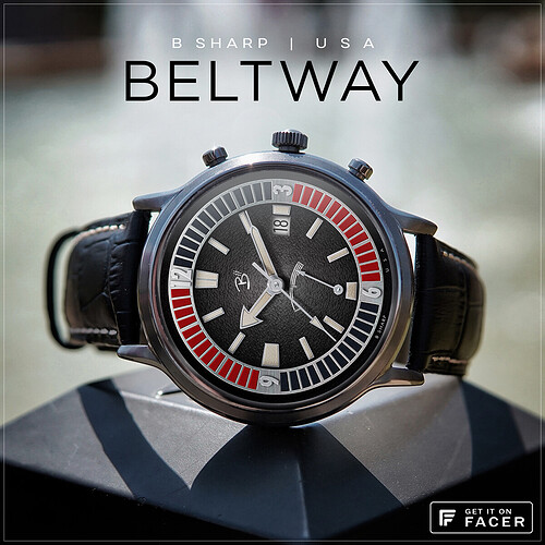
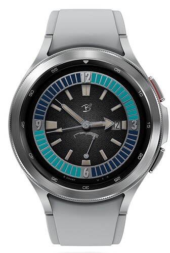
This is sort of a dive watch but also not really. I think of the color ring to be more of a chapter ring than a bezel, but if this were a real watch that element certainly would be assigned to the bezel.
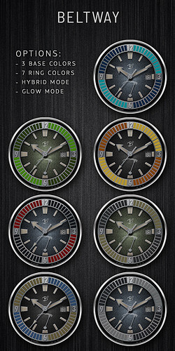
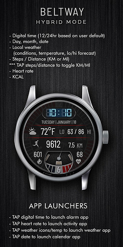
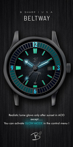
The design started with the hands and imagining a big lume, the rest was built to follow that vision. The colorways of the outer ring and the base dial colors can be chosen independently, I tried to experiment with colors for the ring that would look good against all three dial colors. There are some interesting colorful possibilities. And of course because this face was conceived around the lume, there is the optional Glow Mode for always-on glow. The other main feature is the Hybrid Mode with all the smart watch info.
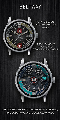
***make sure you check the watch guide pics for TAP instructions and more info.
Enjoy! And be sure to follow B Sharp to never miss a new release! And on Instagram: https://www.instagram.com/bsharpwatches
Smart watch faces for watch lovers!
6 Likes
Don’t be offended please @kvansant but yes, this is a good design as usual from you, but the whole display looks faded, out of focus, and grainy to me sorry.
hey, have you got a screen shot of that? There’s no reason this face should be any less hi-res than the rest of the B#'s You saying on your watch or how it looks here in the preview or app? It’s totally sharp for me wherever I look at it. Something must have happened when you synced it. Try again?
1 Like
I haven’t synced it sorry, it was how I saw it on my laptop earlier. Looking at it on my phone it still looks fairly grainy, but maybe it’s just me 
I think Facer was having some issues with their servers yesterday, when I looked at this picture you posted last night it looked poor quality, not just the face, but the whole watch looked very grainy. This morning the same picture looks sharp. Who knows, but either way I’m not worried about it, I’m 100% sure the face is just as high res as any other in my catalog.
1 Like
I love divers, very nice!
1 Like
