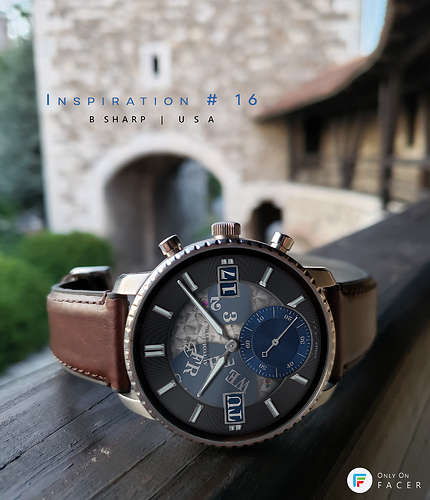
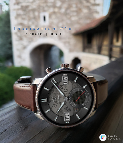
This is one I’ve had in mind to make something out of for a long time. It has some of my favorite visual elements: visible calendar wheels and a transparent glass. Both are fun to make and to me create a lot of interest to look at. It also uses larger day/date text which is generally what I prefer too as I have a hard enough time reading small text on the smartwatch screen even with reading glasses! 
May I ask you how you make your textures? I see you have watches with a guilloche texture as well as a stainless steel look. How would someone make/find these textures?
Thanks
Every texture, and for that matter every pixel of every other part in all my faces is something I made for myself from scratch in Photoshop. Some textures, like the starburst or the circular brushed pattern I actually made the current version I’m using about a year ago. Each is a fairly lighting-neutral blank that I can apply to any part or dial as needed and then just adjust the color/lightning/finishing detail. If you use Photoshop I can walk you through the basic steps to make those. I also have a handful of different guilloche blanks of different styles. Similarly I make a fairly neutral blank and then can place and adapt as needed. Making those is a little more complicated than the brushed metal textures and each style has a little different process but I could give you some tips on that too. If you don’t have Photoshop I wouldn’t know how to give you though. My guide is always real watches. I try to achieve photorealistic graphics so I always zoom way in to photos of my favorite watches to study the nuances of the textures and finishing details.
Very cool this Inspiration #16 (circle blue)
I am always amazed by your work.

