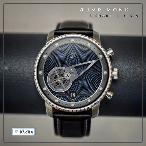
This watch is at once a novelty and a practical time piece that also looks great on your wrist!
Jump Monk is a composition by the great jazz bassist Charles Mingus. this watch features what’s referred to as wandering jump hours. The complication involves the hours wheel orbiting (wandering) around the center axis while simultaneously rotating on its own axis at the top of each our (jumping). This assembly is itself the conventionally sweeping minute hand. For all its novelty, reading time is still very intuitive. There is also a large date indicator, and to further the theme, a battery indicator that “jumps” the date window. The bar to the right of the date shows progress from 100-50%, at 50% power the bar to the left of the date begins to indicate the remaining 50-0%. There is no gap in the progress bar as it “jumps” the date.
There is a version with lume (this preview) and also a no-lume version that simply darkens slightly in dim mode.
Expect to see more variations of this one, and hopefully a future version equipped with the B Sharp “Hybrid Mode” for smart watch info!
Enjoy!
7 Likes
Very nice work…
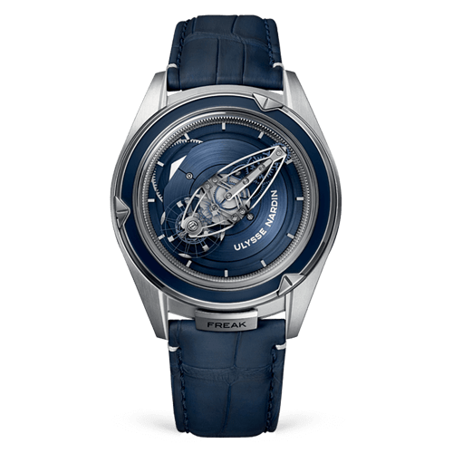
It reminds me of the Freak watch made by Ulysse Nardin a few years ago…a beautiful timepiece
4 Likes
I love the UN Freak watches. There are actually many variations since they introduced the first in 2001, seems like almost every year they bringing out a new version. But, it has neither a jumping hours or wandering hours complication.
The thing about the freak is the entire functioning works of the watch is visible and built into the minute hand. The hours are still displayed by a what is essentially a conventional rotating hand but it’s the entire dial plate rather than an arm.
If you or anyone else are curious about wandering hours look up the NHC Ottica. That watch is designed by Vincent Calabrese who I mentioned earlier. My (limited) understanding is this pairing of wandering/jumping was his invention. In all of Calabrese’s designs the hours orbited closer to the outer circumference of the dial and were themselves the minute pointer. But the idea of putting the hours wheel into the tail of the minute hand is a variation on the concept I’ve seen a couple of times. I’ve always wanted to make one myself too, so here we are! 
1 Like
Nice one! Would love an 24h version, but the dial would be too small for that :P, some easing would be nice too, but then it would not be as much of a “jump” probably
1 Like
Thanks! Ideally there would be a little easing, just over a second or less at the turn of the hour. Mechanically it would be that way, but I don’t know how to code that and though definitely it would be a nice touch, it would go almost completely unnoticed.
24 HR wheel could be done just by replacing the wheel for the 13-24 but mechanically that would be unrealistic. To put 24 hours on one disc would make it too big or the font too small. So what you see is what you get 
1 Like
yeah I am working on a watch face that has 5 second easing every 30 min and 12 hours, and i think i have to add something to prevent the easing when going from dim to active mid easing or you get half assed jumping animations. yours would be more complex, it would have 12 transitions in 1 expression (i do like a challenge though  )
)
1 Like
I am a sort of oddball when it comes to quirky designs, so I really love this style. Style at times trumps function.
@ThaMattie that kind of coding is outside my paygrade! I’m always so happy when I can just get something like this to work at all on my own  I’m not sure if my solution here was the most efficient but it works as its supposed to!
@ircrotale If I have to make a choice I’ll almost always go with style over function. Or rather, I’m more willing to make compromises on function than aesthetics. Depending on the face a lot of times you can optimally have both. My goal is to have minimum time/dat/battery in the analog portion of every face. But sometimes the layout is simply better off without date or battery. But what I have not showcased yet on Facer except in my Montblanc contest design, is my solution to having what I consider to be essential smart watch info present without cluttering up or interfering with the primary analog design, a Hybrid Mode feature that is typically a part of almost every B Sharp design published on the Watchmaker platform and sold through Google Play. Each of the named B Sharp faces here (not the Inspiration Series) will have the Hybrid Mode added if ever I’m able to sell on this platform. But as I attempt to reach that level I’m just not willing to give away the store only to maybe still not get there.
Like I said, like a challenge, and it was actually a lot simpler than I thought. I used 5 seconds to make it more visible but you can change it how you like (inspection enabled):
((#DWFMS# - #DWFK#) - interpAccel((#DNOW# % (60 * 60 * 1000)), ((60 * 60 * 1000) - 5000), (60 * 60 * 1000), 1) * (1 / 12 * 360))
Explained:
-
(#DWFMS# - #DWFK#) would be what you have now I assume, current seconds and then reversed hour rotation
-
(#DNOW# % (60 * 60 * 1000)) is the current timestamp modulus an hour (so it goes from 0 to 3600000 ms in a loop)
-
((60 * 60 * 1000) - 5000) is the starting time of the animation: 5 seconds before the end of an hour
-
(60 * 60 * 1000) is the end time of the animation: the end of an hour
-
* (1 / 12 * 360) is the travel distance of the easing, which is 1 hour
The interpAccel outputs 0 to 1, before the “start” it is always 0, after the end it is 1 (but the end is an hour, and it all starts with 0 again in this case).
Hope this makes sense 
2 Likes
@ThaMattie that’s brilliant! looks very cool. I never would have been able to come up with that. My brain isn’t wired to be a natural with coding, and I’m also still very unfamiliar with Facer expressions and syntax. But I’m a good improvisor and good at re-inventing the wheel  so I can often find my way to a solution. My way of jumping the hours wheel was through multiple layers and opacity since I didn’t know who to code the rotation. to jump 30deg at the top of the hour. (I assembled this one for myself in the Watchmaker platform first and there I knew how to code it but not to translate that to facer) As I say, if it works I’m happy but I definitely like this effect and much appreciate your effort and the continued education!
I’ll make the change later today.
**** UPDATED to include the hours wheel easing code provided by @ThaMattie - THANKS!!
Thank you @ThaMattie, I’m also working on a similar design, this is very helpful
No problem @kvansant / @ozarour, I love doing this stuff 
I try to provide a minimum of the same as well, but at times, I will make sacrifices. Very few of my watchfaces have premium features, all because they never seem to get many syncs. I figure that if my work ever becomes more popular, I will refocus on more mainstream designs. For now, I really have a good time creating the “out there” designs.


 )
) I’m not sure if my solution here was the most efficient but it works as its supposed to!