Happy New Year everyone!
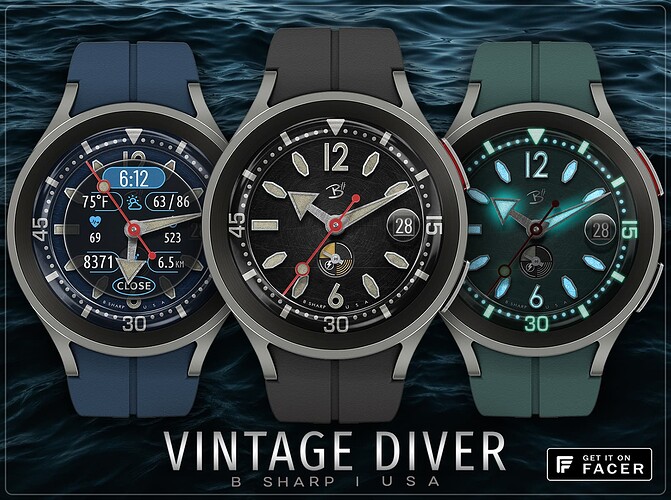
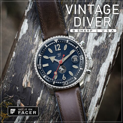
Here is one published today which I had a lot of fun making AND I think it is in the top 10 of B Sharp faces in terms of how good it looks on the watch.
On one hand this is just another dive watch using common elements from typical dive watch design language, but the fun for me was trying to “antique” the graphics. Funny thing is all that detail which I think looks pretty cool on the big screen gets lost on the watch screen, but somehow it all comes together to look really good and realistic on the watch screen, even if not showing the wear and tear.
***make sure you check the watch guide pics for TAP instructions and more info.
Enjoy! And be sure to follow B Sharp to never miss a new release! And on Instagram: https://www.instagram.com/bsharpwatches
Smart watch faces for watch lovers!

