'sup fellow designers!
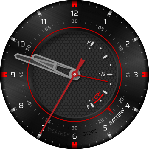
I’ve been on and off Facer in the last few months, with newborn baby and all that taking most of my time so what little I had, I used to create some faces. But this one is something I’ve spent the last few days on, figuring out the style, placement and how to make a premium version with interactive features.
So first, before presenting, I’ve found this on Facer and seeing it, I immediately thought “that middle
really screams to have some data in it”.
SHOUTOUT to P3PDesign for his/her/their idea and becoming inspirational for me!
So, Inspired by it, I’ve decided to try and make my own version.
I’ve been through quite a few iterations already - I’ve learned how to make somewhat brushed surface in Inkscape so I replaced the initial flat outer ring with brushed version. I’ve experimented with different ideas - like the battery level inside, for example, being marked by shrunk seconds hand:
Or the alternate version with internal and external triangular pointers that rotate on the red ring, outer one showing what kind of data is currently selected, while internal one pointing at its value/scale:
So in future, switching to “STEPS” will change the internal scale from battery to steps scale and the internal pointer will follow to display current value.
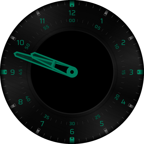
And a preview of AOD:
What do you think? Analog hand to point at scale or the internal, triangle pointer?
I also thought if maybe the internal space could be mocked up as LCD, like in hybrid analog/digital watches. Or maybe I should skip it entirely and leave the inside as it is? But then I’ve just pretty much plagiarized the original design, lol.
This seems like a really long time project as I want to perfect it until I’m satisfied so fire off without hesitation, I can rework it from scratch should the need arise.
Please forgive if it takes me time to respond, taking care of the baby is quite time-consuming.
All the best to All of you!
EDIT: I forgot to add I’m also thinking if I should leave the hands just be, or maybe try and program parking positions so they can get away when obscuring inside too much. Not sure, just a timed park, or maybe a toggle? I’ve seen some really nice, smooth iterations of this but sadly none of them allowed preview and my formula is quite rusty yet… Thoughts?


 I think I’ll keep the parking handles just for myself cause I like that sort of thing, haha.
