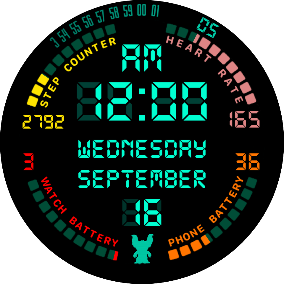
For me dont need backlight but dont needs hands to, it’s a nice digital one, love the coloured bars
Sorry . What is Backlit the Gauges . I like that . A bit less may be :::)))
i agree about the hands… they look out of place here. Maybe move the digital time to the center and see what you can use the upper space for. Also, if you’re talking about the backlit meters, I i think i’d like it more if they were less bright. but their presence is good i think for balance.
I, personally, like a braground fulll version on guages so you know where it starts and ends but tend to prefer them to be darker than the guage so that the guage level itself is the highlight of the show.
I also agreee on the hands being a detraction from the digital elegance but do like the zooming seconds. Possibly just try a quarter arc rather than a half. May work or not but worth a shot.
Possiblibly brighten the edge numbers a bit. Looks great so far though.
With Turquise not being as bright as white for contrast I would also suggest ditching the month, as most people know that and increasing the day name and number font sizes to fill that area evenly. Especially with an LCD font
Just my personal feel on things. Definately a great looking face.
If you had a dark backlight for the guages you could leave them on for AOD for battery at least. Lower it gets, less screen battery it is using. I generally go for a 50% opacity version of my low battery red for the battey empty background that just sits at 100% all the time.
I would drop the “backlight” to 50% opacity personally. Other than that, I would not change anything else.
I’d also plumb for that.
All my thoughts were about my preferences but everyone is different so it is always good to see additional feedback on the suggestions by myselves and others when people ask for it.
I still think a digital only version of this would work well though.
I do also know I do not needed to be reminded of what month it is (well rarely). Just the day of the week and of the month.
I hope I didn’t come across with overbearing feedback. If so, I apologise.
@rob.fisk You are not using “overbearing feedback”, you’re just passionate about your likes and dislikes. 
It is all about the passion here isn’t it. So glad the community has recovered to its old self.
It is why I hope I can also say, in nuetrality, and knowing that others feel differently than me, I am not a big fan of things that flash on and off regularrly. It has been said here before with overuse but the blink tag was removed from all internet browsers in the 90s for a clear design reason. I’m with that camp but there are others who bring it back by CSS or javascript voodoo because they like it so fair play.
Flashing on and off every half second would not go on my wrist but if it goes on a thousand others then it shows it’s merit.
The world of crowd sourced smartwatch design is still evolving and it is the people putting them on watches that cast the votes and most of them are non creators with free accounts.
I would adjust the “backlight” on the gauges to level of the digits background.
Or did you mean some other backlight effect?
I like that.
Understated yet visible backlight.
Increased font size on the date by moving Goku to the bottom gap
Have you thought of using a short form expression for steps to keep the size in line with other elements when it builds towards 10k, and possibly beyond? $#ZSC#<1000?#ZSC#:(floor(#ZSC#/100)/10)k$
100, 1K, 1.1K, 4.9K, etc.
Yes, I used similar expression in some of my earlier faces. This was just little play while making the gauges example, its not my face 
It’s a damned good play. Still haven’t tried the curved text in paint.net yet. Really need to do that.
Even Powerpoint is pretty fast
This looks pretty good @icrltd4 . I like it without the graphic background that you had before. I think the backlight levels and colours are great. I would get rid of the hands though, they are redundant. 
Hands gone on latest screenshot, though liked by some so there may be 2 versions. Liking the latest screenshot most.
Thank all of you for your educational input here, I will certainly be implementing some of your ideas as soon as I can. As for the Title of this Topic, there is a “Backlight effect” that Grows/Shrinks like it is slowly Glowing behind the central display, but I published this with it off, so it can only be seen if you turn it back on in Inspection Mode sorry, so apologies for that.
Ha Ha. Turn the lights on.
How do you do that?
Just put the right TAG in the Opacity box Rob, in this case it was ((sin(#DWE#*2))*30+30)
Thanks to Rusty-Cress for that by the way