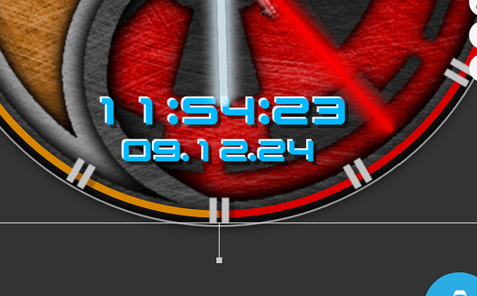
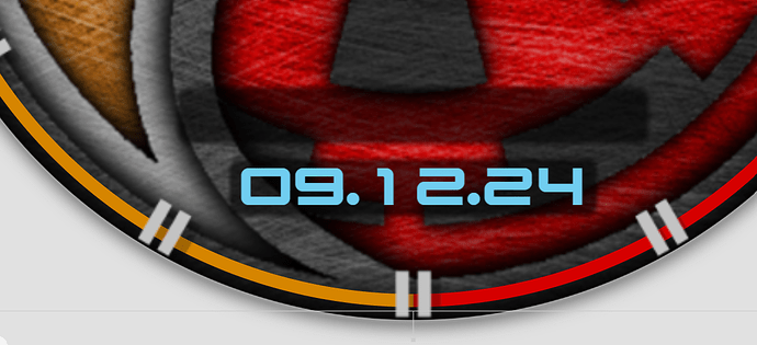
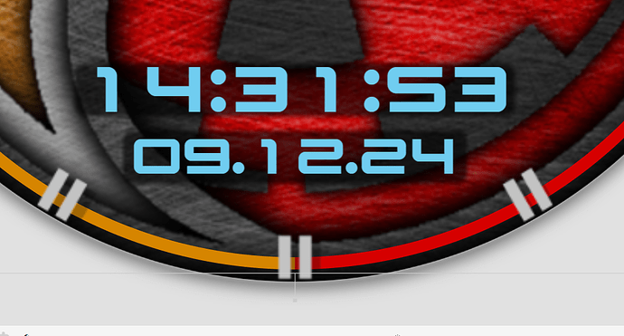
After watching the entire Star Wars series and the prequels, I was inspired and created a colorful hit parade. ![]()
![]()
Nice. I named mine Far Away to avoid the Marvin scrutiny but Mr Lucas and Disney don’t make watches so I guess it is OK.
I do like the detail and texturing in yours.
Tank you
Looks ok to me but I do think the Blue text doesn’t look right, probably be better a Light Grey or Off Set White, but that’s just me ![]()
maybe a level1 or 2 black stroke?
Intresting . A while back we were saying that Stroke and Glow were only reliable on Tizen . Sometimes hand made shadow and highlight layers offset can pop text on a Textured Background to you lighting angle .
There are so many colors in those movies and series that it gets lost here. Originally I wanted to make one of the swords blue but none of the swords mentioned had blue. The clock was also red but it blended in with the background. So I made it this blue that was in the Imperial Destroyer shards.
There’s no glow or stroke. It’s just a layer of shadow that I created specifically for the clock to create a bit of contrast.
Yeah . I should have invoked Rob . I was referring to his Comment . It is worth repeating some of this stuff for those who come along and don’t know .
Yeah Yeah . I could see that :::)))
Tha’s good. Just that extra contrast.
Hallo
Looks Great ! Where can i find those hands ? Thanks already
Hi.
Thank you.
I made these hands from the stripped base of a lightsaber handle.
Chinese for me ![]() To difficult
To difficult
Hi and welcome,
There are hundreds of hands available in the ‘resources’ section here and in many posts -just use the search box top right of this page - look for ‘Hands’ for example.
Have fun …
Thanks for Feedback ![]()
When you open the watch face and click on inspect, you can see how it’s all put together.


