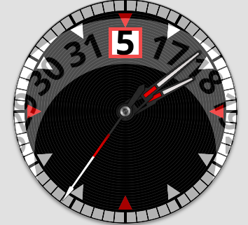
Nothing particularly outstanding about this one. I like to make real date wheels for dates because that translates to making web page versions. Trouble is, if you cram 31 dates onto a wheel you are limited to the size of the text. I like big numbers.
I decided to try two date wheels. The numbers can be larger because there are fewer numbers per wheel. There’s 1-16 and then 17-31 above it with a see through window. Not sure if I want to use three ever.
That is elegant solution to imaginary problem (since whole wheel is covered behind the dial, its hard to tell, whether the digit is on one big or two smaller wheels, or in text field).
Imagine the date window was on the 3h position. Then the wheels could be placed concentric, and have even less digits on them, one 0 to 9 the other _ to 3.
Don’t believe that holds for the HTML clock frameworks I’m using. Ideally I take the artwork from the watch and make a web page out of it.
The oldest clock code I have used assumes everything rotates from the center. I have found a couple others I searched out to make web pages clocks with sub-dials, not supported by that first one I was using. They may support that, but I have not tried it.
The first Javascript code I used to do sub-dials did not support hands that rotated from the center of the image. I had to edit the hands I wanted to use from watch faces so they could rotate from the end of the image. A bit messy.
You know, it finally occurred to me that the watch I was looking at was a jump hour watch. That would explain a large number window on a physical watch. Already made one of those a while back with a really big number window.
That’s a pretty cool bit of work there. However, one reason I use date wheels for my analogues is that I prefer to font sizes change depending on the date is to add to the realism. It is kinda silly though since no one would really even notice it…but I do it anyway.
I should try the advice of petruuccios at some point. It would not represent what is physically possible with a real watch, but it would solve a problem I have which is like yours.
I’ve found that Firefox renders date window text posted as text differently from Chrome and Opera. Those two show what I expect while in Firefox the same text field is positioned differently.
There may be some settings for different handling of text depending on the browser type you can get with a query in the web page. Haven’t tried that either, but a rotating wheel image certainly deals with that.
I just have to take the most versatile of the three or so clock drawing programs I use and try a wheel that is larger than the clock face.
I’m a fan of using date wheels rather that text too. But you probably know there is already a real mechanical watch solution to larger font size with the complication that’s actually called “big date” uses one wheel for the 10’s and one wheel for the 1’s so since there are fewer numbers on each wheel the font can be larger and the wheels smaller to still fit in the movement. There are many variations on the principle. I’ve made many of them Here is just one example. (pre-wearOS only I’m afraid)