Hey Folks, looking for some feedback on this design. I’ve really just started messing around with designs. By the way big shout out to the community for all the tutorials and help.
1 Like
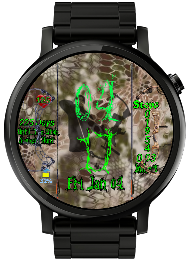
Cool face but I find it hard to read. It looks like a camo background(?) but can’t tell what’s in the middle. For sure, that tree font is really cool but it’s hard to see against the background. For example, there’s almost no difference between the 1 and the 7. Here’s the time rolled forward to 17 minutes. You can see the comparison of 1 and 7 in 17.
Can you do something different with the background and with the 7 numeral?
I agree with John Morga. It‘s to hard to read…
To make the time stand out more against the background, I’d probably duplicate that layer, change the color to something contrasting (black, yellow, darker green, etc) and shift the X and Y positions by 1 or 2 pixels.
Also in terms of balance, having the step count vertically feels “off” when compared to the left half of the watch.
I’d suggest putting the bows on a layer below the text but above the background. so the text is always readable.
2 Likes
Really appreciate all the feedback. I’ll work on cleaning it up. That was my concern with using that font against that background was making it readable.
I like the background with the bow hunter, deer and camouflage, but it is very hard to see. @cth4242 has a good point of creating depth to the different layers using the method he suggested by adding a second darker layer for the time and information. It may also help to make the background a little darker and blur the very back layer of the picture to make the bow hunter more prevalent. These are all suggestions for feedback and this is your artwork and creation, it is off to a very good start.
Enjoy,
~Sirhc
Made some changes. Added duplicate layer to make the numbers stand out better and be more readable. Also, ditched the vertical Step Count. It looks better, but I might have to find a different font.