Hello, I am trying to create a progress bar that centers itself based on a variable.
For example: a bar #Dk# wide by10 tall.
As #Dk# increases, it maintains it’s center at 160.
So basically, #Dk# would define width, and x position.
Any thoughts?
Thanks in advance 
Either have the position shift by half of the fill (so if it fills toward the right, have it move to the left by half of whatever that distance would be), or use two progress bars instead that fill from position 160 in both directions.
For what you ask if #Dk# is your width, then the formula for your X position would be
(160-(#Dk#/2))
If you are wanting to have something a little wider, let us know the exact width and we can figure out your formula for X and for Width.
Good to see you here @Zieneth . Also some are using an image of a rectangle instead of a progress bar . Obviously you will have to alter your Fill/Height formula to suit . If you are not sure we can do that here : )
To Continue
You will see that an image has options for Centre Orientation .
Yes, the two progress bars idea I believe may be the best solution. Thank you 
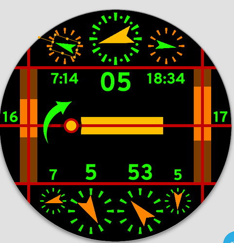
@russellcresser @crinolo.saloen @CC-Designs Using 6 back to back progress bars, here is what I came up with. Thanks 
A great face But sorry but this face needs context,
It looks good but the bars means little to anyone else. What do the bars measure? Also, you seem to have 2 hour dials with one that has a leading zero numericat the top and one that has a non leading zero at the bottom. I would pick one and stick to it. I, personaly am a fan of always using a leading zero on any text based time tome/date based text element.
The top one may be better replaced woth a weather or heart rate diisplay (current weather would fit well with the sundise and sinset)Tiy cab always oyt a 2 pixwk circke aroubd ur ti naubtain th symetry.
Maybe halve the widtth of the arrows and knock a pixel or two off the height?
All just suggestions and I am sure you will come up with your own updates, just did a wee mock up of some dial thinning:.
From the description:
Sliding bars on left, slide from midnight to solar noon. Bars on right, slide from solar noon to midnight. Indicators at top: sunrise, current hour (24), and sunset. Center bar indicates daylight time. Moving “sun” advances from 12am current day as shown on left date, to next day 12am right date. Lower numbers: first digit battery level, hour, min, second digit battery level.
This was just an idea I had, I wasn’t really keen on thinking someone else may be interested. I just do this for therapy.
I do truly appreciate the feedback 
My bad for not reading the desciption but no need to go all bold font on me 
I do think slimming your arrows is worthwhile, and also adding leading zros to rhe lower hous and minutes, purely from a face design prspective on the latter.
You also might want to considder a simpler expresion for the battery such as (180-(#BLN#1.8)) as long as the original arrow image points straight up, Possibly just `(-(#BLN#*1.8)) in your case. It seemed to work.
This is not negative feedback, just advice ging forward. You have a strong idea here and I am just offering imoprovement ideas for you based on experience using watch faces.
Haha, yea the bold was a copy pasta. I will add the zeros. I believe it adds to the linearity of it all.

