There remain issues with the stock weather icons. I never use them - I use “paid icons”, but I see the stock ones used (even on some partner watches).
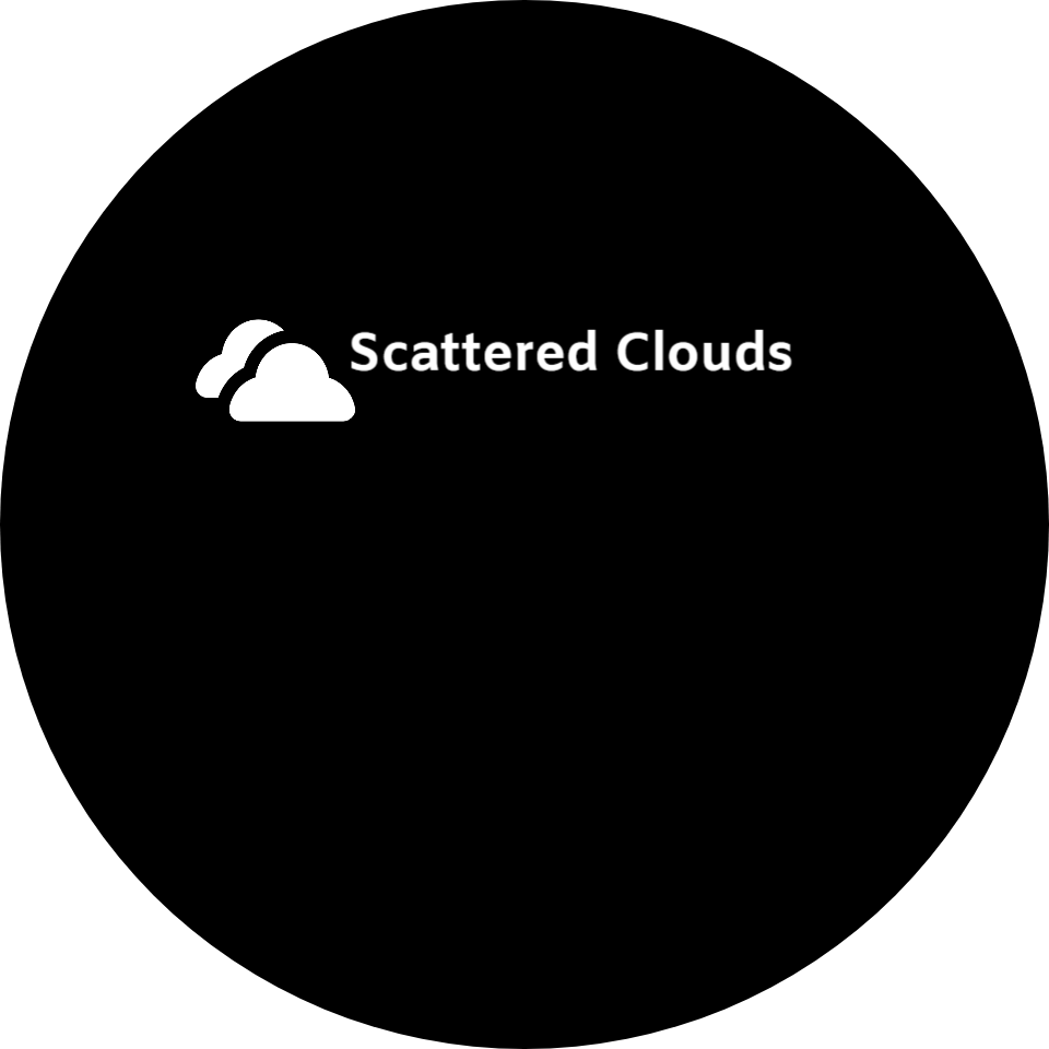
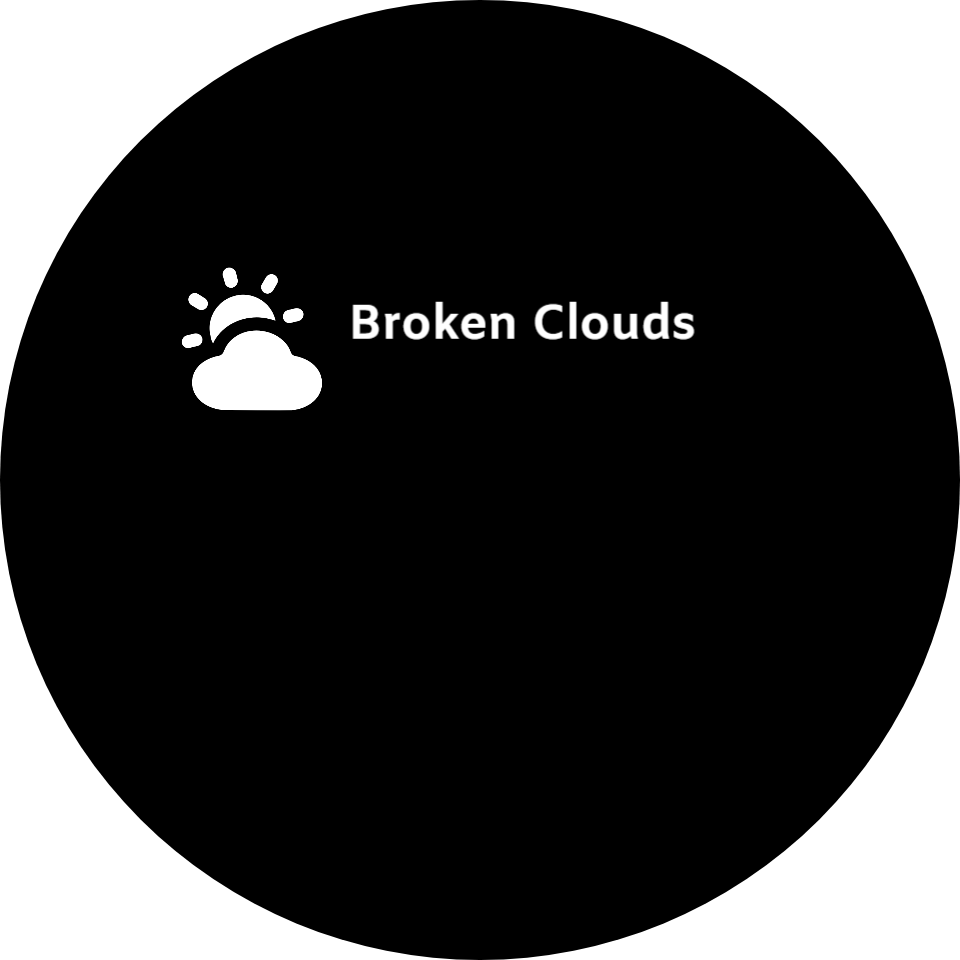
1st of all the clouds - The stock icons have the same icon for ‘broken clouds’ as it does for ‘few clouds’ (a cloud with a sun). The older non WFF set was better, but has double clouds for scattered and a single cloud for broken (reversed).
To be clear : scattered clouds cover 3/8 to 1/2 of the sky, while broken clouds cover 5/8 to 7/8.
I use a sun with a cloud for few clouds, one cloud for scattered, and a double cloud for broken.
The other problem with the stock set is with the fog/mist icon which doesn’t reflect that condition at all. I prefer to use a cloud with a few straight or curvy lines below.
Many of us are clear on this but I thought this post would help others that are not aware or are confused about it.
Thanks for your perspective — I totally understand that some designers prioritize differently, especially when text or a weather-app launcher is available.
That said, the purpose of my post wasn’t to say everyone has to fix it, but to help the people who do care about accuracy and may not realize the stock icons are technically misleading. Many designers (especially newer ones or those striving for realism) want their watch faces to reflect the correct meteorological terms, and the current icon set can cause confusion.
So even if it’s not a priority for everyone, I think it’s still valuable to have the correct information available for those who want to improve their designs.
As with using the Data update frequency Facer extole us to refrain from making Faces that look Broken by using Sequences and the like . I would assume Facer did not want the Beginners to appear to only make broken Faces . It would be a real compiment to those who care and have contributed to Topics on the subject to fix it ? I belive it would be remarkable easy to change it on the server .
Here is my vote for the mist Icon .
.
I think that weather and weather icons on a watch should be treated as a bit of fun and not taken seriously. For a period when designing a personal watchface i had SIX weather apps on my phone and none showed the same! Nor did they represent what was outside my window! This means that every time weather icons appear on one of my watchfaces they are basically a sort of animated decoration.
If only i could have my local rain radar - that would be something worth having.
Yes . Regarding Current Weather Icons . Try forecats 1 and 2 . One being today . Works for me . Remembering it probably updates 4 times a Day at best .
Ha Ha . I forget how many times we have coverd this . But like Professional Teachers they have to do the same stuff Yearly and congratulate thier Pupils when they make Ptogress .