Based on earlier experiences with depth, i made today this face, called ANOMALY.
It used some special techniques. For example the ticks looks like piano keys. They are standard hour ticks, but they bring depth to the face and are also animated with a different timing, making it like a round piano playing 
Then the hands are all made from shape elements (rectangles and triangles). Most objects are basic elements but used in a creative way. I added some special orange animation to the hands too.
And last, i used a moving triangle shape at the bottom, to inform you about the level of battery for watch.
Tell me your deepest thoughts about this face. They are all welcome.
Ciao
Beautychaser.
6 Likes
Very nice - The dim mode is excellent too (though I don’t think the flashing orange animation will function in dim mode), good work!
2 Likes
Interesting, I like that the effect is so “simple”, but works great. I mean with 5 layers you can animate 60 ticks 
3 Likes
Indeed. The piano key is formed by 3 layers of the same hour tick mark.
One black above, that moves inside as if it goes down! But it moves inside and is shortened.
The second, white, at the same speed, moving forward
Then third lies under white white, but looks like it is standing up, and gets covered by the white.
So it all looks af if they are moving down, adding depth
Then if gave the 5 layers a different speed. A round piano that plays, but helps no sound…
Thank you for your comment.
2 Likes
The piano keys are really cool!
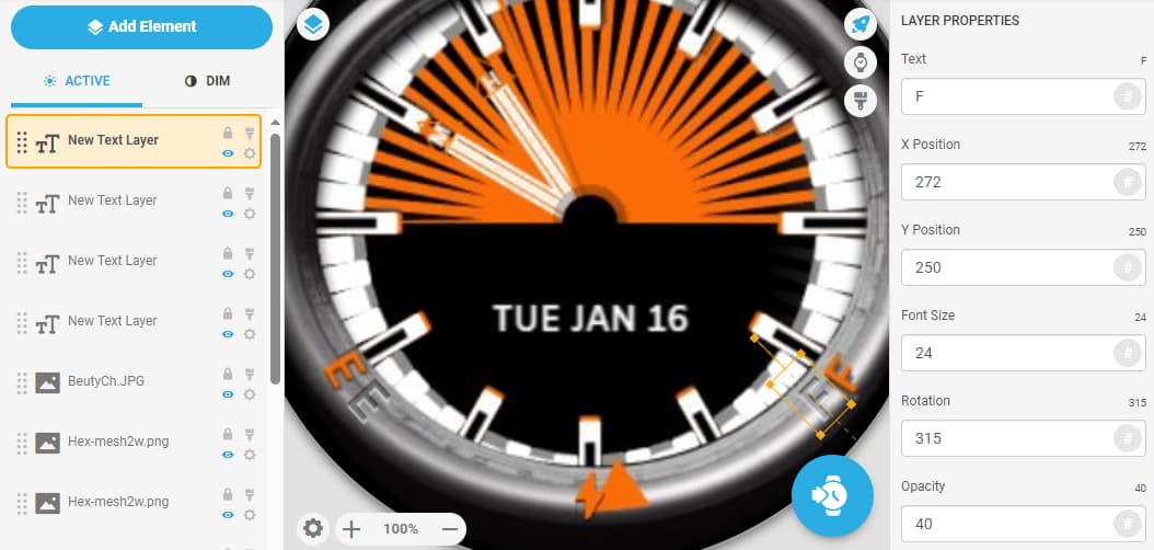
Something that bugs me a little is the “E”, “F”, the triangle and the power icon. They seem a little out of place. If they were punched in the rim that may look better. But that’s just me…
3 Likes
I like Tom’s idea, you can use same “cheap” method, two semitransparent letters above each other one white, other black, slightly shifted to get embossed or engraved effect
4 Likes
Well placing those inside means they need space to be fully visible and readable. Because of the oval form, there is less space and I don’t want the hands blocking data as they often do. But I will try to integrate the triangle. There is somehow a conflict between the oval structure and the circular movement. Have to tweak there the formula.
But otherwise I would agree with you Tom.
The fonts remark, I did use three layer with a displacement of two underlying fonts (black and grey = shadowing the letters. It is situated in the creator page. But not semi transparent, I’ll check that.
Everybody, thanks for commenting.
Rome was not built in 1 day. Takes many to build 
I’m having also a great time here in Rhemes Norte Dame, Italy. Few faces here.
Ciao Patrick
4 Likes
Hello, so i did some changes on that face of mine
Perhaps my wife loves me now … 
The power of the face maker…
Here are the changes
- deleted the oval covering photo. To difficult to adapt the movement of the battery triangle. Now it has a natural flow and more use of the face space… And added some nice flickering.
- replaced the letter F, E and the battery triangle, the latter i covered under an outer ring.
- because the background is partially orange and black, i alternated the color of the second hand. It turns orange when moving over black background and turns black when moving over orange background. I like this bicolor thing, i will use that more specially with bicolor backgrounds.
- i let the letters M (minutes) and H for hours alternate, so they don’t block each other. As said before, i very found on data animation, perhaps more than object animation.
Hope you like what i did. Let me know.
Thanks
Ciao
Patrick
4 Likes
Cool stuff. I shall wear it as soon as published and watch it in awe!
3 Likes
Wow Tom. Coming from you, this means a lot to me.
So much that i break my rule for you. Namely, i quitted publishing, mentioned that in a earlier post a while ago. But this one i will publish, for all you guys who supported me. As a thank-you. But only this one. Now and then, i bend my rules. Cannot be a stiff guy
Because i always try to better my work, i found there was still some room for improvement to do.
So i changed this
- i made the hands a bit larger, every component of it. Every hand consist off 7 components! 2 white parts, 2 orange animated parts, 2 triangles and a letter H or M. I adapted all. That improves readability.
- then i created a sun effect; the orange upper part moves gently and brings some extra bling to it.
- then i changed the warning flickering of the letter E (= empty battery watch). Removed that from the first layer, and brought it on the second layer. That brings more beauty and depth.
- last i made more precise the starting position of the swinging battery triangle (8 o’clock - 4 o’clock) and let it make the full swing towards its actual value, without flickering. After that movement, it does.
So, let me know if you are still in awe!
Thanks
Patrick
3 Likes
Its just really cool, love it!
3 Likes