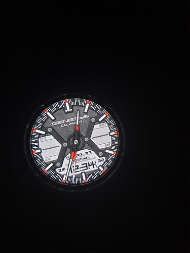
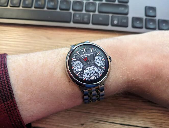
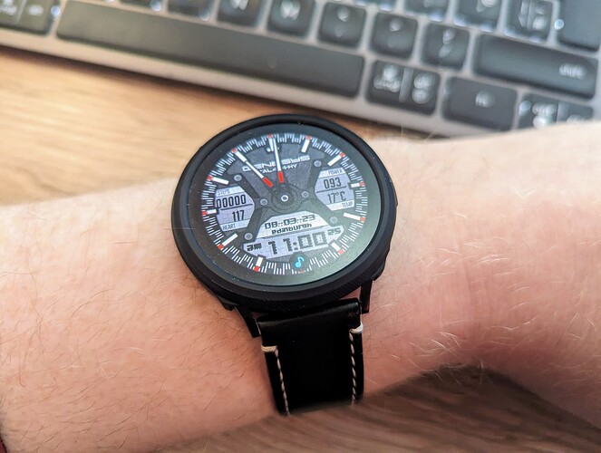
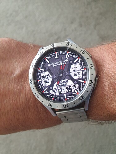
Just thought I’d showcase yet another great design from @safesz
Love those Hands as well, very cool ![]()
Yes, very nice. I like those tick marks, seen them somewhere before, but failed to make them. I don’t think I’ll bother. I can wear this watch face…
I have a ticket open with @Facer_Official, and they said they are working on it, about digital fonts not displaying or not being aligned properly on ticwatch. So not sure, but unfortunately, this watch face is not working either on mine:
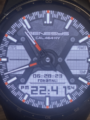
@safesz : can you tell me what font you are using? I’ll try it out, and see what is going on…
FYI Same on GW4 & Pixel
Sorry guys i dont know what is the problem. It works in the browser and on my 1st gen galaxy watch too…
Try another font type soon… pls stay close…
Good luck my friend, it’s a great looking Face ![]()
Can you check it now? The problematic data font type changed…
THNX mate! The font type was the problem… Enjoy it ![]()
Looking more closely, one thing I’d say is that the Date, Location AM/PM and Seconds are almost impossible to read - I think that that font doesn’t like being rendered small.
OK Later will modified too… just need a bit more time ![]()
OK i think its fine now… feedback would be welcome
Enjoy it bro!
I can confirm, looking good on my ticwatch too!
