Conditional issues in Android preview and on Fossil watches

Although my English Time face worked 100% in creator, in the web preview and on my Galaxy Watch,

the watch preview on Android had issues, which also carried over to the wearable device for some watch brands (e.g. Fossil).

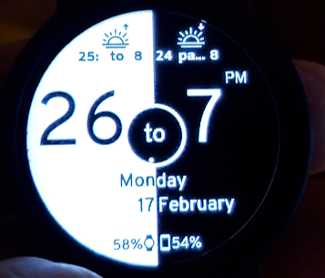
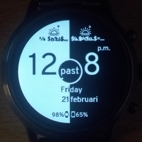
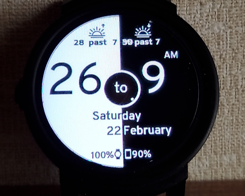
Android watch preview:

The left hand semi-circle position in the center is obviously wrong. Also note the right hand side digits for the main time as well as the sunrise and sunset times.
Not visible are issues with the left hand side digits. These only show under certain conditions also due to nested conditionals not working as expected.

I have worked around the issues (I consider all of it to be Facer bugs):

  • Right alignment does not work for left hand semi-circle image; Workaround: use center align and change X position accordingly.
  • Nested conditionals do not work; Workaround: Use multiple layers with simple conditionals in opacity and/or position fields

However, since I do not own a Fossil watch, I have to rely on what is shown in the Android preview and assume if it shows correctly there, it will be correct on a Fossil watch too.
@Fossil (Android Wear?) Owners: please sync this face and check if it works on you watch and report back.

I submitted a support call to Facer a week ago, detailing what I have found. Still waiting for a first reply from themā€¦
(Donā€™t know what the normal Facer turnaround time for support calls is, but I have another open call with them that is now on 20 days without any reply, with a follow up to request status from my side 6 days ago.)

More example detail:
All of the following work in Creator and on my Galaxy Watch for the main time right hand digit in the text field:
$#Dm#<=30?#Dh#:$$#Dm#>30&&#Dh#!=12?(#Dh#+1):1$
$#Dm#<=30?#Dh#:$$#Dh#<12?(#Dh#+1):$$#Dh#==12?1:$
$#Dm#<=30?#Dh#:$$#Dh#==12?1:(#Dh#+1)$
(combined with Opacity field: $#Dm#==0?0:100$

But this does not work in the Android preview and thus I assume not on Fossil (& some other devices) either.

The only way I could work around this was to avoid using nested conditionals completely.
Instead I used multiple layers with simple conditionals in the opacity and/or position fields.

Hope this helps others hitting this Facer quirk.

Of course the over aggressive Facer copyright bot added insult to injury by immediately deleting my revised face due to the update note I added: ā€œUpdate: revised logic to work around issues on Fossil and other watchesā€
Fortunately I made a copy before starting with the workarounds so had my original version, but still had to redo all the workaround changes from scratch! :rage: (Guess I could appeal to Facer, but am unsure if it is worth the effortā€¦
Thatā€™s what you get for trying to work around Facer bugs and inform users about itā€¦ So now I have a completely fresh new face, but at least it should be working.
Will be great if Fossil owners can confirm.
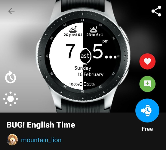
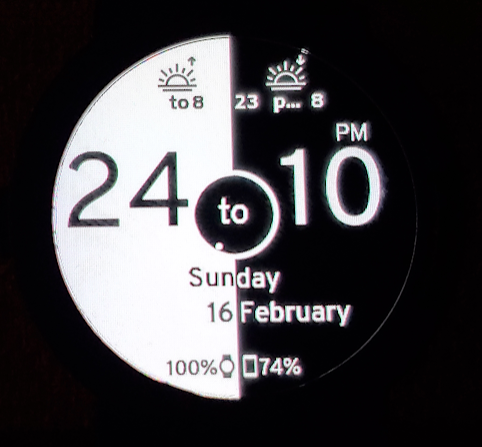
I loaded it on to my TicWatch E I use for testing and this is the picture of how your face rendered.

Capture

The sunrise didnā€™t show the time completely and the sunset showed that the pā€¦ didnā€™t have a large enough text area. (Itā€™s a common problem Iā€™ve discovered on the TicWatch, all text boxes have to be 1/3 larger than the text or it clips) Everything else appears to be showing correctly especially your center area where you were having issues before. Hope this helps!

1 Like

Thanks for the feedback @mrantisocialguy :+1:

I am glad that at least the issues with the main time has been resolved.
The sunrise and sunset times are difficult to test for correctness since these do not seem to be affected by the time machine in Creator.

The field widths I can understand; will see if I can tweak.
Since ā€˜pastā€™ is twice as long as ā€˜toā€™ I tried to be fancy by changing the field widths and positions of the values left and right accordingly. Might be better to adhere to KISS and just have a bigger gap for the ā€˜toā€™ case.

The missing field for sunrise time is more of a concern; there should at least be something.

A bit disappointing to have to deal with these kind of device specific issues. One of the advantages of an ā€˜independentā€™ platform like Facer is that the platform take care of the device discrepancies on behalf of the face designerā€¦

1 Like

Formatting tweaked and KISS applied. :slightly_smiling_face:

Please sync again.

1 Like

Whatever you did to the sunrise looks like it fixed it. But the ā€œPastā€ is still too small as you can tell from the pic. Like I said this TicWatch E is VERY picky about the text form length. Iā€™ve gotten to the point where I just make all my text layers 320+ px wide just to prevent problems.
Capture2
By the way. I personally wear a Samsung Gear 3 Frontier or an Active 2 as my every day carry watch. I bought the above refurbished TicWatch E off Amazon just to use for testing. I would never wear it as a watch just because itā€™s not very good, BUT it makes an excellent test bed for Facer. If it works on this cheap a## TicWatch, it will work on ANYTHING! :smiley:

1 Like

Thanks yet again @mrantisocialguy, much appreciated! :+1:

You are correct that wide text fields will avoid the clipping problem and there is no real reason to reduce field widths (other than easier layer selection when working in designer).
I have now doubled the width of all possible problematic fields in this face and tidied up the placement of the sunrise and sunset times.
I also found the culprit ā€˜:ā€™ in the sunrise time which showed on the TicWatch but nowhere else.
Should be very close to sorted out now.

It is always best to test using edge cases and your TicWatch E seems to be the perfect candidate for this.
Unfortunately the ZAR to US$ exchange rate plus shipping cost to South Africa kills the deal for even a used TicWatch, else I might have considered getting one for just this purpose.

I hope this is the final request to sync to your test bed :slight_smile:

You have it fixed now! I wonā€™t bother with a picture since it looks just like what you see. I can understand where exchange rates and shipping would be prohibitive for some cases like you are in. Maybe you can get lucky and find one already in country used that someone wants to sell to help them afford a new watch. :watch:

Thanks again for the help. :star_struck:

I hope Facer takes note of the various issues / bugs highlighted here. (I am still optimistic that they will eventually read and reply to my support call logged a week ago).
Ensuring device specific compatibility is the platformā€™s (Facer) responsibility, not the designerā€™s.

Bottom line at present to ensure that designs on Facer are universally compatible across watch brands:

  • Nested conditionals should be avoided as it does not work for all watches
  • Text field widths need to be much wider than you think you need
  • Centre allignment should be used for image placement as far as possible
1 Like

Hi, I tried this one again on my Fossil Carlyle (gen5) and I have some Font issues for the sunset/rise now:

And another one you can add to your compatibility list: ā€œreverseā€ does not work for progress elements on my Fossil eitherā€¦

1 Like

I doubt if that is font issues. No custom fonts used in this face.
Most likely expression issues.

I consider all of these issues to be Facer bugs. It should not be the face designerā€™s responsibility to cater for individual watch brand issues. That is the whole point of using a 3rd party platform like Facer.

Thanks fot reporting, but since the face now ā€œworksā€ in Creator, web & Android preview and on most watches, I am not going to spend more time working around Facer bugs. This is a free face after all.

1 Like

Capture

I synced it again just to make sure and it is acting a little weird. You can notice in the picture a little bit of ā€œsomethingā€ in the sunset time. It says 30 past 7, but it looks like something doubling with the 30. I would have to agree itā€™s probably something with the expression, but I donā€™t think you can fix it. You might ā€œupdateā€ the watch face on Facer with a note saying some WearOS watches have an issue displaying the face correctly. I do that so people will know in advance there might be an issue.

I have one expression I like that shows the day of the week using just two letters instead of one, three or the full name.

$#DE#==Mon?Mo:$ $#DE#==Tue?Tu:$ $#DE#==Wed?We:$ $#DE#==Thu?Th:$ $#DE#==Fri?Fr:$ $#DE#==Sat?Sa:$ $#DE#==Sun?Su:$

It works great ā€œexceptā€ on my test TicWatch. It tries to move out of position along with the placement in the expression according to the day. Sunday shows fine, but Saturday is positioned to the right too far. Each day moves position just a little farther to the right until Saturday. Itā€™s a royal PITA! (Pain In The A##)

I have to agree with you, you just have to quit working on some faces and just say ā€œhere it is, if it works for you great, but if not, oh well itā€™s a freebieā€!

Thanks for checking yet again @mrantisocialguy

I had another look ā€¦
I cannot explain what @ThaMattie has on his watch and am not going to attempt to fix it.
BTW, @ThaMattie when last did you sync the face? Are you sure you have the latest version?

However, what @mrantisocialguy reported made sense and pointed to a bug on my side. :blush:
The English time face should never have any time as ā€œ30 pastā€, it should be Ā½ past!
Same for Ā¼ past & Ā¼ to.

When I first published this face, the logic was much more complex with single expressions controlling the values to the left and right of ā€˜to / pastā€™ for each time (rise_left, rise_right, etc). These expressions used complex nested conditionals.

When the problems surfaced on non-Tizen watches, I redesigned all the logic to use simple expressions with multiple layers instead.

So now half past has its own layer for each of the times with only ā€˜Ā½ā€™ in the text and opacity controls when it should display using a simple conditional statement.
ā€œnormal timeā€, i.e. when minutes is not 0, 15, 30 and 45 also has its own layer but because the conditions under which it must display is more complex and nested conditionals are to be avoided, a combination of x, y and opacity is used to either move the layer off screen or hide it when it should not display.

With the various modifications to the face there has been several copy&paste operations between fields.
A relic of this was that the condition that was supposed to hide ā€œnormal timeā€ at 30 past for sunset time, was using the sunrise tag, which obviously will not work and caused both 30 and Ā½ to be displayed, one on top of the other. Now corrected.

Face updated with YMMV (your mileage may vary) warning.

1 Like

Hi @mountain_lion I synced it yesterday and today. I do not recall the issue with the font the first time I tried the watch face (when there was the center circle alignment issue)

Did you use a different font since then? Is it a custom font?

Never had any custom fonts on this face.

Font was supposed to be Overpass Regular for the larger text and Overpass Bold for the smaller sunrise and sunset text. However when I had a look now, I found a few fields that were still on the default Amiko font (now changed). Overpass and Amiko are very similar though and both are standard Facer fonts.

The way I would work around that, is to have 7 layers, one for each day and switch the layers on/off with a simple conditional statement in opacity e.g. for Monday: $#DOW#==1?100:0$ ( or $#DE#==Mon?100:0$ if you like that better :slight_smile: )

Should not be necessary and for me it just ā€œfeels wrongā€ to do it that way, but until Facer fix their bugs, multiple layers are what is required to get as close as possible to universal watch compatibilityā€¦
(Debatable which of the 2 implementations adheres best to KISS :wink: )

Be carefull with #DE#, it is localized to the users language (for me a 3 letter week abbreviation does not exist, it is already 2 letters). #DOW# is much safer.

1 Like

Thatā€™s what Iā€™ve been doing lately, but it takes 7 layers to do what one would do with the expression.

I only use a one letter or two letter day of week on analog faces with small day/date windows. On most digital faces I use the three letter or full name day of the week.

I think what @ThaMattie is saying (and I agree), is that for compatibility across localisations (languages) #DOW# should be used in the conditional to test which day it is and not #DE#.

Iā€™ve updated my notes on expressions using all the forms of #DE# to #DOW#. I didnā€™t realize there would be compatibility issues with the others. I would be nice if @Facer_Official would make note of those kind of issues on the Tags - How can we help? page. Like they do with the #Db#, #Dh# and #Dk# tags for hour in the day.