So you’re finally making the coolest watches on planet earth. Now you want them featured on the front page of Facer right? Here is a quick guide to help you make sure your watch won’t be sidelined.
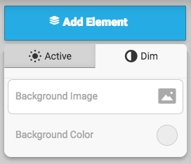
 1. DIM mode
Make sure your watch has a dim mode with all the necessary info. Dim mode is located in the editor above the layer list as a tab.
2. Contrast
Make sure your watch face has enough contrast. A lot of watches come in with busy backgrounds that make the watch hands hard to read. Make sure your hands stand out are can be seen at a glance.
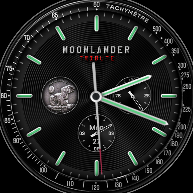
Good example of watchface with good contrast:
3. Make it unique.
We get a lot of submissions every day. If you make your watch face look or function differently from everything else you see you will have a better shot at getting featured.
4. Limit the number of fonts/sizes.
This is a general design practice, but if you have font sizes all over the place your watch won’t look as polished, so stick to 3-4max fonts.
5. Readability
Make sure your watch is readable. are the fonts appropriate size? They should be! We get a lot of submissions that look great overall, but sometimes the fonts might be too small or in a strange font that makes them hard to read.
6. Functionality
Make sure all your dials and information are functional. Decorative dials aren’t very useful so make sure they actually do what they look like they are supposed to do. This can make your watch feel buggy or broken. Adding placeholders is generally a bad practice for watches that are meant to be seen by the world.
If ever in doubt. Look at some of the past watch faces that have been featured, these are good gauges of quality designs.