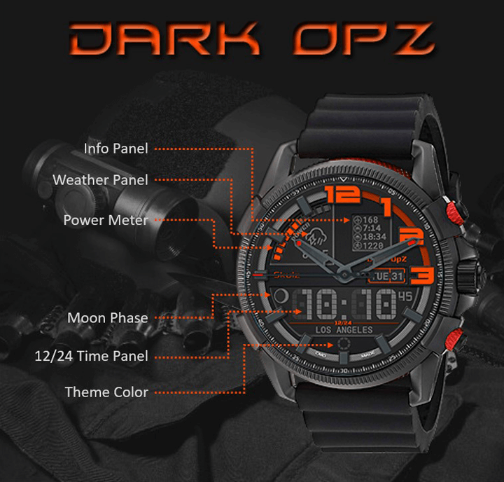
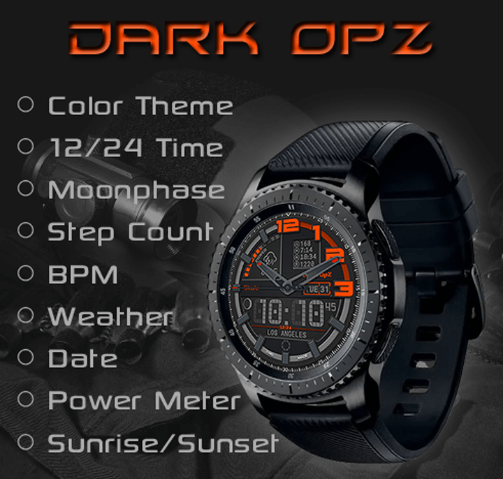
Just wanted to share an upcoming release, a military style of the Skulz series:
Let me know thoughts, ideas and feedback!
~Enjoy - Sirhc
Just wanted to share an upcoming release, a military style of the Skulz series:
Let me know thoughts, ideas and feedback!
~Enjoy - Sirhc
Looks great!
Love it and the dark/orange palet as well !
What is the font used for the digital time ? It fits very well to the design.
Thank you for the kind words @jeberuth, the font is called DIGI-Sirhc-Regular. I created the font for my watch faces because most DOT fonts are not a fixed width for LCD.
Enjoy, ~Sirhc
You created the font yourself? That is next level dedication. My respect!
However if you did, maybe you welcome a tiny bit of criticism from a perfectionist?
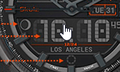
Looking at the “off”/background numbers on the screen it would seem like the screen/font simply can’t do sharp corners/angles around the top and bottom like the ones showing in that 1, yet the 1 itself has very sharp 90º angles. The 0 would be correct though, and so would the “middle” part of the 4 and 5 o/
Aside from that tiny nitpick, that is a lovely font on top of the already lovely watch face!
Hi @AllenMiquel, Thank you for the honest feedback!
Let me explain the process and thoughts for the design; The font was created using a 24 dot design:
When creating the numbers it was not meant to be a perfect LCD font as in the real genuine LCD watches back in the day. When creating the font I choose more of an aesthetic compromise for the look and feel on the watch. I use the zero for the shadow instead of the full 24 dot shadow for the aesthetics of the look and feel, the full 24 dot was too heavy (busy) and did give the authentic look of the genuine LCD, but not the look and feel I was looking for. Sometimes perfection has a compromise for the look and feel the artist and or creator is looking to gain. I choose a middle road with the font and will likely create others as well that are more genuine LCD looking for older style watches. Hope this makes sense! As always enjoy, create and carve your path with your style!
~Sirhc
Gotcha. It’s great  That nitpick was just something that stood out to me precisely because I liked the font quite a bit
  not that it looks bad or anything, it’s just that in the act of staring at the numbers, I happened to see the background 0 didn’t quite match the shape the 1 was taking xD
Very sadly I can’t use this type of watch face on my Active 2 because the watch itself “looks” bezel-less, but in fact does have a bezel that just limits the real estate of the screen; when I wear this type of watch face it just looks like the watch is missing parts lol.
I appreciate the feedback. Thank you for sharing that information about the Active 2, I have the S3 with a bezel and never thought about the fact it would look that way on a watch like the Active 2. I will take that into account when creating future watch faces and have to accommodate something into my designs. I could create the design so that the outer indexes can be turned off for these type of watches. Maybe even convince my wife I should get a newer watch like the Active 2 to make sure the design looks good on both types! 
Enjoy!
Haha that’d be swell What I usually try to do is make it so the outer part of my watch faces try to end up fading out to black so to speak, adding intense shadows, but don’t think that would work for all cases, especially for designs with so many nice sharp angles and shapes like this one.
The idea of turning off the outside indexes sounds good though 
very nice font ! Correct, most of the dot font I found aren’t fixed which might be a problem for having the LCD background digit…
Did you use a font editor then ?
Hi Jeberuth,
Yes, I used an online editor called Calligraphr. You can use their templates and create the font using .png images. You have to have a paid account for the advanced settings, it worked rather well!
Enjoy! ~Sirhc
I just wanted to ask,you @cdownie1967 how did you make your dot font.
I’m now in the middle of a process of doing same thing… Made already number and they look good, but I need also letters. That is long proces, but possible.
However, I need to put them into text, long text, actually, 30 sentences… And making it “by nand”, letter after letter is crazy…
I will check Calligraphy…!
Yes, check it out you can use the free version, but can not left or right justify the font.