Hi Guys,
I’ve seen similar threads that related to text layer being offset (aligned to its bottom instead of middle) so I hoped to find an answer there, but my situation is a bit different.
I won’t describe what the element of the face looks like, instead, here it is 
I would like the text layer to follow the red triangle day marker, but since text is aligned to its base, the whole thing is offset slightly higher up. And if I try to counter that offset by changing X and Y origination points, the whole thing starts to move separately from the triangle, changing distance from it.
I won’t bore you to death with what I’ve tried, I simply failed at resolving this so would be greatly thankful if one of you encountered this before and managed to find solution for it, and decided to share the wisdom 
If not, I’ll just cheat my way with seven text layers turning on/off as the days change, but still would like to find an elegant solution to it before going full savage 
Thank you in advance!
2 Likes
Hi, try increase the angle for the date text box. For example put 63 instead 60 in its x and y formulas.
4 Likes
I just checked this out and it’s a simple fix by just playing around with 2 things ok.
.
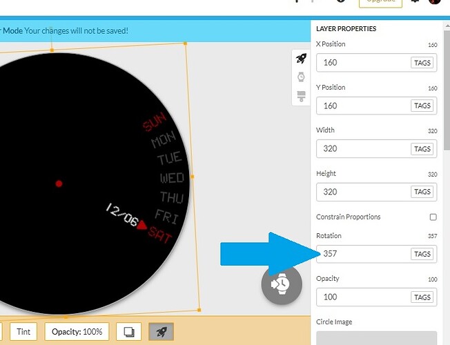
First, put a 357 Rotation on your weekday.png, here -
.
.
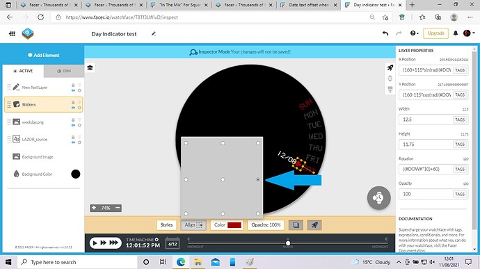
And then just change your Sticker Alignment like this -
.
.
I just checked it all out and it works just fine for every day like that ok 
3 Likes
Thank you both, @petruuccios and @icrltd4!
It’s funny that you both offered pretty much the same solution, just on different elements!
Anyways, I gave it a shot and that simple 3 degrees adjustment works in both cases 
Off to another challenge, but that’s something for separate thread, I believe 
Once again, thank you both for taking the time to investigate and respond 
2 Likes
Ha ha, well done petruuccios Sir, your simple Math change works perfectly 
Your reply came just a minute before I commented 
2 Likes
You’re most welcome akar.zaephyr, lots of helpful people here in this awesome Community, and I’m still a noob myself, my Math sucks big time 
Good luck with your other challenge 
1 Like
Buneos dias Amigo Gizmo!!
yo tambien estuve experimentando … 
Yo buscaba a traves del texto calendario…
Y al final, la respuesta estaba en otro lado…
Eres un genio amigo!!! 
1 Like
Gracias Cardozo, todos vemos estas cosas desde diferentes perspectivas, así que es genial que tanta gente trate de ayudar. Obviamente la solución de Petruuccios es la más fácil y rápida de hacer, así que bravo a él 
1 Like
I am glad to help. But often before I manage to compose my answer (my English is not very fluent), somebody posts better formulated solution. This one was simple.
3 Likes
It was so simple, I forgot that the rotation of the text is handled separately hence you can add a few degrees to adjust position. Thank you again, I have incorporated this very rule into what I was working on:
Need to keep in mind sometimes simplicity is the answer.
Cheers!
4 Likes
That’s a cool design, nice work 
1 Like


